MY A-LEVEL ART TEACHER, MR HUSSEIN, would always talk about the importance of composition when it came to paintings and drawings. In fact he went to far as to spend one entire lesson showing us how to find the geometrical shapes in classical paintings, then he encouraged us to use the same techniques in our artwork.
 |
| Da Vinci's Vitruvian Man can be used to demonstrate how the Golden Rectangle works. |
There was also much talk of Golden Triangles, and Golden Rectangles, and even something called the Fibonacci Spiral, but I'd stopped listening by that point. It wasn't until I became involved in the magazine industry years later that I began to grasp the basic building blocks of design and was astounded to realise how this all played back into Mr Hussein's art class back in 1971.
 |
| You can even apply the Fibonacci Spiral - another way of interpreting the Golden Rectangle - to the Vitruvian Man - but we'll get into that a bit more later. |
Then, when I started writing this blog and looking back at comic covers throughout the history of the medium (who hasn't thrilled to Separated at Birth - A comic covers interlude and Separated at Birth 2 - Another comic covers interlude?), I began to notice similar patterns beginning to emerge.
These were most noticeable, at first, on some of the DC covers, possible because they are simple and direct. But as I became aware of it, the geometric shapes the artists were using to create their covers around just leapt off the page.
 |
| I think this was the first comic cover where I noticed a strong geometric shape - c'n you tell what it is, yet? |
At DC, during the early Silver Age, the editors mostly dictated what they wanted the covers to show. Often, the covers would be created before the interior story and art, and the covers would dictate the interior content. Some editors would recycle cover ideas, Julius Schwartz probably being the worst offender. But to the best of my knowledge, there wasn't an Art Editor laying out cover designs and handing them to the cover artists. Some artists had a good nose for design, and some didn't.
Over at Marvel, in the early part of the 1960s, there was no formal art editor, either. Stan Lee would check over covers - which were usually drawn after the interior art - as they came from the art department (headed by Sol Brodsky) and make suggestions, order changes or even reject cover art. It wasn't until later that first Marie Severin and then John Romita would create design layouts for cover artists to follow.
So I think it's fair to conclude that at least in the early part of the Silver Ager, cover artists at both DC and Marvel were just trying to create striking and attention-grabbing cover art, and probably were adopting these geometric cover layouts without much conscious thought.
Here then, without too much comment from me, are some of the more obvious examples. You can probably have a lot of fun looking for the hidden layout shapes among your own collection, and see whether you can spot any trends.
TRIANGLES
For me, I think, the easiest shape to spot behind the layout of a single image, like a painting or a comic cover, is the Triangle.
 |
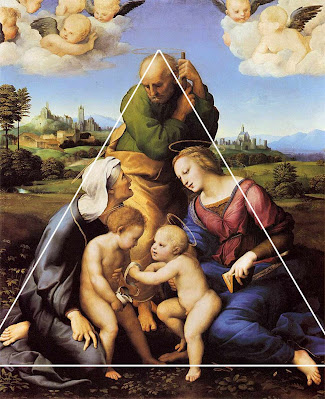
| The Canigiani Holy Family by Renaissance superstar artist Raffaello Sanzio da Urbino (better known as Raphael), painted between 1507 and 1508. |
This is one of the strongest and most common layout configurations. Often used to convey a sense of strength, balance or stability, it's so predominant that I doubt the artists knew, in many cases, that they were using it.
Meanwhile, over at Marvel, Jack Kirby would often use a triangular layout on his covers, most noticeable on some of his most powerful cover designs. The earliest example I could find was the cover of Journey into Mystery 85 (Oct 1962), which introduced Thor's arch-enemy Loki in an eye-grabbing example ...
 |
| The triangular layout definitely brings a touch of power and dominance to the scene of Loki's challenge. |
And look at this Kirby cover, depicting Thor in a simple, but powerful, take on the triangular design.
 |
| Journey into Mystery 125 (Feb 1966) shows a powerful image of Thor ... graceful, stable, the classic immoveable object. |
On the Captain America title, Kirby would return again and again to the triangular layout, conveying a variety of different moods ...
 |
| Once Captain America took over Tales of Suspense, Kirby cut loose with some wonderfully arresting covers, some of his best ... |
It was so effective that Kirby's successor on Captain America, Jim Steranko, would also use the same geometric layout style.
 |
| Jim Steranko has always displayed an eye for graphic layout. Here, his deceptively simple covers would have just leapt off the newsstands. |
And on Fantastic Four, too Kirby was working that triangle. Look at these fabulous covers, for examples of how strong the layout can be.
But the technique wasn't exclusive to Jack Kirby ... others also, besides Steranko, used strong triangle configurations in their cover art.
 |
| Here's Gene Colan, John Romita and Herb Trimpe all grabbing a piece of the triangle-shaped cover fun. |
Beyond the simple triangle, there's also a more complex shape, often referred to by classical art scholars as The Golden Triangle ...
 |
| Dogs Fighting in a Wooded Clearing by Frans Snyders (1579-1657) demonstrates the more complex Golden Triangle layout. |
... and I found a few examples of comic covers that fit that class of geometric layout, as well. Here's a Superboy from the early 1960s:
 |
| The mighty Curt Swan makes this cover design look deceptively simple, but when the Golden Triangle shape is overlaid, you can see how clever the design is. |
Here's an example from Jack Kirby ... I wonder if Jack even knew that this was a Golden Triangle. Probably, as he did briefly attend The Pratt Institute in New York, though I've not been able to figure out which department of the School of Art Kirby was in.
 |
| Unconscious or deliberate use of the Golden Triangle ... you decide. |
And here's a later example from Marvel, John Buscema on the cover for Avengers 51 (Apr 1968):
 |
| I think its fair to say that John Buscema more than any other comic artist (except maybe Burne Hogarth) was the most influenced by classical art. |
And finally, remember that Superboy cover I showed at the start of this section? Well, that uses two triangles as its basic layout, just one example of how shapes can be repeated, or even combined to produce something a little more complicated or interesting.
 |
| Although I'm sometimes critical of the content of DC's covers, I've always loved Curt Swan's draftsmanship. On Superboy 109 (Dec 1963), he also demonstrates that he's a master of design. |
No one ever said you couldn't have more than one geometric shape underlying a picture's composition. In fact, artist will often repeat shapes, or even combine different ones to achieve a striking visual design ... but more on that later.
CROSSES
Another common type of layout is where the major elements in a picture follow the lines of a cross. It's not hard to find strong examples of a cross composition in classical art.
 |
| The Swing was commissioned from Jean-Honere Fragonard, to depict the mistress of a member of the French Court. I don't think it's a coincidence that the lines intersect where they do ... |
Once it has been pointed out, you can quickly apply the same principle to comic book covers, where it's often (but not always) used to evoke a sense of conflict.
I found a couple of early Silver Age examples of the cross composition from DC ... and wouldn't you know it? The artist is Carmine Infantino ...
 |
| I think these two examples from early issues of The Flash make a good illustration of the concept. |
But it's Marvel that I'll focus on ... and where better to start with a conflict-based concept than Sgt Fury and His Screaming Ab-Dabs, and these classic early covers by Jack Kirby?
 |
| I can see a circle in the layout of Sgt Fury 6 as well, and I'll offer some examples of compound compositions later on in this entry. |
Kirby would also apply the cross composition to superheroes comics, as well. Here's a couple of examples from Journey into Mystery with Thor.
How about these Fantastic Four covers, all showing a strong element of conflict, or threat of conflict?
To round off, here's a couple of Amazing Spider-Man covers by the first two artists to draw the series, the late great Steve Ditko, and his worthy successor John Romita.
 |
| It's quite remarkable how two artists who'd never worked together, and probably hadn't even met, could come up with two such strong cross-based designs for the same character. |
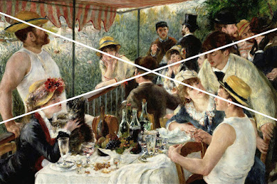
And because my classical art example at the beginning of this section was a bit cheeky, here's a stronger version of the cross-composition by Renoir, where all the eyelines quite literally line up.
 |
| The Luncheon of the Boating Party by Pierre Auguste Renoir, painted around 1881, is a hugely influential painting and a keystone work of the Impressionist movement. |
CIRCLES
In this context, not all the circles I'll show you will be perfect circles ... some will be more oval. But let's not quibble ... for a design which swirls around a central point is probably one of the most effective, and probably my favourite. Let's start, as always, with some examples from classical art ... something a bit newer, this time.
 |
| Henri Matisse painted "Dance" in 1910, a commission for Russian businessman Segei Shchukin. It's considered a key milestone in Matisse's career and in the development of the Modern Art movement. |
Looking first at the DC comics of the first half of the 1960s, I came across quite a few that showed a strong circular composition. Look at these covers from Gil Kane and Sid Greene (who's probably better known for his inking).
 |
| While you'd expect Gil Kane to turn in a well-designed cover - and he did many - who knew that inker Sid Greene was such a deft draftsman? |
And, of course, it wasn't hard to find examples from the top two DC artists of the day, Curt Swan and Carmine Infantino.
 |
| I did like Curt Swan's Superfamily covers of the early 1960s ... such a shame that DC's Dark Overlord Mort Weisinger plastered them with inane speech balloons. |
And at Marvel, we find Jack Kirby leading the charge, using the technique to great effect on the first Marvel team books.
 |
| The first three covers on The Avengers series from 1963 look nothing alike ... until you realise that all use a circle as their underlying design ... |
It's almost like there's no other way to go, when you have a large number of characters to feature and limited space to do it in.
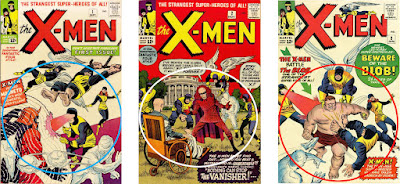
 |
| And it's the same with the first three covers on The X-Men, which came out at exactly the same time as The Avengers ... |
But Kirby would happily use the same composition on the solo character books. Here's a run of Captain America from later in the silver age ... just one circle after another.
Then, though I'm not drawing any conclusions from this, I came across the pencils for a Kirby Captain America cover that were heavily reworked into a circular composition by John Romita ... a rare example of Kirby missing an opportunity.
Just so we're clear, John Romita was no stranger to the circular design concept when it came to comic covers. Here's a few he did during his extraordinary run on Amazing Spider-Man ...
 |
| It's quite difficult to find a bad John Romita cover, as he was a natural designer, but these covers are among his best, ranging from 1966 to 1968. |
And to end on, a random sampling of Jack Kirby through the years, working that circle like there's no tomorrow.
 |
| And if any more proof were needed, here's a gaggle of Kirby covers that span the years 1963 to 1966, all effortlessly crafted for maximum impact. |
It may be that I find the circle the most appealing of these layouts because that shape is the most organic, occurring naturally both in our world's ecosphere (see what I did there?) and in the wider universe.
COMBINATION COMPOSITIONS
While I was trawling through my collection and the Internet, looking for covers that demonstrated the use of the geometry in laying out a piece of art, I kept coming across illustrations that didn't fit comfortably into any of the three pigeonholes I've described above. There were even pictures that seemed to fit into more than one category. But classical artists have been using combinations of shapes to lay out their art since the Renaissance, pretty much.
Speaking of the Renaissance, let's use a famous painting by Botticelli as our example of combination shapes underlying a picture's structure.
 |
| Nascite di Venere was painted by Sandro Botticelli some time during the 1480s, and is probably one of the most popular examples of Renaissance art. |
There may well be a few covers I've shown above that you might think could be used to illustrate combination compositions ... but here's a few I've singled out as the better examples.
 |
| What could be more bonkers than a later Silver Age Superman cover? But forget that, and concentrate on how the simplicity of the design makes a complex artwork accessible. |
Towards the end of his tenure, it seemed that Weisinger's editorship resulted in ever-more outlandish situations. One is among the best (or worst) examples of that, was Superman 184 (Feb 1966), where primitive humanoids wave doritos-on-sticks at the Man of Steel. This was why, by 1966, I was a full-on Marvel reader.
Meanwhile, though DC editors struggled to understand what the fuss was about, Marvel were using the same techniques to creat more arresting and - to be fair - saleable covers for their comics. Here's a couple of early Avengers that would have made my ten-year old self part with his pocket money.
 |
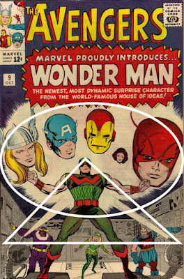
| Could it be any clearer? The goodies are in the oval shape and the baddies are in the triangle. Shut up and take my money. |
The art for Avengers 9 (Oct 1964) demonstrates how effortlessly Kirby was able to knock out a cover that told you exactly who was in the story (all you really cared about when you were ten) and gives you a pretty broad hint at who is on which side.
 |
| Kirby is once more using the geometry of the cover to show you who is fighting who is fighting whom. Good and clear, great sense of danger. |
A couple of issues later, Stan put his top solo hero Spider-Man up against The Avengers (or, spoiler alert, so it seemed). Yes, I know diverse hands were involved in tinkering with the art - names from Steve Ditko to Bob Powell have been accused on being involved, but it's reasonable to say that the basic composition of the cover is Kirby's.
SO ... ABOUT THE FIBONACCI SPIRAL
Leonardo Bonacci, also know is Fibonacci, was a mathematician of the Middle Ages, credited with bringing the arabic numeral system to Europe and introducing the concept of zero to modern mathematics. The Fibonacci Sequence is a series of numbers where each successive number is the sum of the previous two. Omitting zero for clarity, the sequence goes:
1, 1, 2, 3, 5, 8, 13, 21, 34, 55, 89, etc ...
You might be thinking, "Yes, and?"
Well here's the thing. The Fibonacci numbers also appear in biological settings, such as branching in trees, the arrangement of leaves on a stem, the fruit sprouts of a pineapple, the flowering of an artichoke, an uncurling fern, and the arrangement of a pine cone's bracts. Spooky, huh? And the sequence also turns up elsewhere in maths - computer algorithms such as the Fibonacci search technique and the Fibonacci heap data structure, and graphs called Fibonacci cubes used for interconnecting parallel and distributed systems.
But wait ... the sequence also shows up in classical art as a basic for the composition of many pieces of art, from different parts of the world, possibly - though I can't confirm this - without the artists even knowing they were using it. The sequence has been used to create the "perfect" rectangle, sometimes referred to as the Divine (or Golden) Rectangle. Here's an illustration of it (nicked from WIKIpedia):
The longer edge is 34 units and the shorter edge is 21 units. But look how you can start drawing lines and each smaller square is part of the Fibonacci Sequence. Now, to create the Fibonacci Spiral, you open your compass to 21 units, place the point in the bottom right corner and draw a quarter circle from bottom left to top right. The make your compass 13 units and draw another quarter circle from top left to bottom right. Carry on like that and you end up with:
And that is the shape that turns up again and again in the composition of classic art pieces. Here's a classic (no pun intended) example:
 |
| La Grande Odalisque by Jean Auguste Dominique, 1814. |
But you can go back and apply it to Renaissance pieces like:
 |
| Mona Lisa by Leonardo Da Vinci, c.1506 |
And even paintings from completely different cultures, like Tsunami.
 |
| The Great Wave off Kanagawa - more popularly referred to as "Tsunami" - by Katsushika Hokusai, 1831. |
Admittedly, when it comes to finding comic covers that look like they are based on the principles of Fibonacci, it's a bit more challenging. Is that because comic covers are by definition simple and direct? Possible, but even with a fairly casual search, I managed to find a few examples that look like a pretty good fit.
The first one I found was an early Ditko Spider-man cover ...
 |
| Amazing Spider-Man 10 (Mar 1964), by Steve Ditko. |
What do you think? Convincing? How about this one?
 |
| Amazing Spider-Man 15 (Aug 1964), by Steve Ditko. |
I thought these two Daredevil covers, both by John Romita, made a pretty convincing example, as well.
 |
| Daredevil 12 (Jan 1966) and 15 (Apr 1966). |
And I think the classic cover for Fantastic Four 48 (Mar 1966) is a strong contender as well.
And finally, these two covers from different periods of the Silver Age ...
 |
| I always loved the cover to Strange Tales 142 (Mar 1966), and now I think I know why. The cover for Thor 182 (Nov 1970), just at the outer edge of the Silver Age, is a nice example, as well. |
None of these are exact fits to the Fibonacci Spiral, but they are pretty darn close. I could spend ages working my way through the Grand Comicbook Database, scouring for ever-more convincing examples of covers that conform to classical art composition ... but I do have things I need to do, like eating and sleeping.
WHO SAYS COMICS AREN'T ART?
There's no hard rules about any of this. You could argue that I'm just seeing structure where none was intended. But at the same time, I think it's not an unreasonable position to say that artwork that follows some kind of underlying geometric design is more attractive, effective and easier for us to decipher than a picture that is just a chaotic collection of artefacts on the page.
That said, I'm conscious that not all the components of any of the about art fits perfectly to the geometric designs I've been looking at. And I think that's an important point. If the artist did try to place the elements exactly to a geometric shape, then I think the artwork wouldn't work as well, perhaps becoming a bit mechanical in the rendering. It's those little overlaps and deviations that make the final piece arresting.
So that's it. I don't want to labour the point, but you can have loads of fun, trawling through the covers reproduced on the Grand Comicbook Database, and spotting all the various shapes for yourself.
Next: So what does an Editor actually do?


