Showing posts with label Don Heck. Show all posts

Thursday, 9 November 2023

Marvel Comic Covers: Invasion of the Floating Heads

I'VE LOOKED AT THE ARTISTIC QUIRKS of Marvel Comics covers before in this blog. So here's another one for your collection ... Floating Heads.

Yes, it's an odd one - pretty much exclusive to Marvel, I'd say. I'm hard-pressed to think of any examples at other companies ... though you, dear reader, might prove me mistaken. And of course, we were much more likely to see these on team books, where the artist had to squeeze a lot of characters into a very restricted space.

It's a common problem. You only have so much space on the cover of a comic, but you need to fit in nine characters ... what are you going to do?

The first recorded example that I can discover was on the cover of Avengers 9 (Oct 1964), which was drawn by Jack Kirby. And because of this, I think, many Marvel fans have assumed that the idea - which would become a bit of a Marvel trope - was Jack's idea. But I'm not so sure.

You know what it's like ... you have ten super-powered characters to fit in to a 7 x 10 comic cover, plus a teen sidekick and a shedload of blurb ... what're you gonna do?

It certainly wasn't Jack's go-to solution for when he had to fit dozens of characters onto a comic cover. For example, one of the great cross-overs of the early Silver Age was the two-part Fantastic Four-Avengers bust-up in FF 25 & 26 (Apr & May 1964) - eleven characters and never a floating head to be seen.

Here's another trick to fit eleven characters into a standard-size comic book cover ... the metaphorical giant villain cover.

A couple of months later, Jack had to accommodate the FF and the X-Men on the cover of Fantastic Four 28 (Aug 1964). Did Jack reach for a cliche? Of course he didn't. One thing we know about Jack is that he didn't like to repeat himself. He took pride in coming up with new ideas for every situation. Here, he depicted the villain as a giant and the heroes as tiny ... not a concept that was supposed to be taken literally. I covered this particular artistic trick in another blog entry a while back.

So, as we'll see, Jack didn't return to the Floating Heads idea very often. In fact after the first couple, most Floating Heads covers were by Other Hands. This makes me wonder if this wasn't a Stan Lee or possibly a Marty Goodman cover solution, both of whom had very firm - and sometimes fixed - ideas about what a cover should be.

Still, the next cover to feature floating heads would be another Jack Kirby effort.

The composition is a little awkward, but I don't think it would have been any kind of improvement to place the Frightful heads at the top of the cover of Fantastic Four 41.

Okay, maybe the heads weren't quite floating on the cover of FF 41 (Aug 1965), but it's only the tiniest variation on the theme. It does seem like a strange choice, however. The upper image - with the tortured figure of Ben Grimm towering over his team-mates - is the best part of the cover. The heads of the Frightful Four floating at the foot of the cover almost seems like an after-thought. If it's meant to convey the idea of the influence of the Wizard and his allies over The Thing, it's not working. Maybe it's just intended as a way to get the Frightful Four on the cover. It does accomplish that, at least.

The Swordsman would occupy a fairly important role in Marvel history, as Hawkeye's teacher and later a bona fide member of The Avengers. This is a powerful cover by Jack Kirby as befitting that role. I don't think the pasted-on heads compromise that in any way.

The very same month, Avengers 19 (Aug 1965) sported a floating heads cover, this time with Kirby pencilling the figure of The Swordsman and the production department adding the Don Heck heads later ... it's a terrific issue, one of my favourites of these early Avengers. It's not recorded why Stan, or maybe Sol Brodsky, decided to add The Avengers to the sides of the cover. But I don't think it's a tragedy, just another instance of what was already starting to shape up as an overused trick.

Clearly not wanting to left out, DC Comics dipped a toe in the Floating Heads pool ... predictably enough on Justice League, another book with a large cast of characters. In this instance (and again the following year) cover artist Mike Sekowsky would use the trope to show readers all the characters involved in that year's Crisis cross-over, typically involving The Justice League, the Justice Society, and a complementary array of matching super-villains. But it wasn't a solution DC would use very often.

When you have a cast of 29 and not a great deal of space, then there's only really one way you can go ... JLA 38 (Sep 1965) and JLA 47 (Sep 1966).

The next time we'd see disembodied heads on a Marvel cover, it would be the cover of Journey into Mystery 123 (Dec 1965), which had Vince Colletta inking Jack's terrific pencil art, and gave us the supporting cast orbiting around a dynamic and powerful figure of Thor. Yet, when I came across a repro of the original art, it looks like Jack had nothing to do with the floating heads. These were almost certainly added during the production process, by Sol Brodsky and his team.

Here's the original artwork for Journey into Mystery 123's cover, along with the finished version. I'd say that showed signs of production department tinkering ...

The Odin headshot is taken from the previous issue's cover. The Crusher Creel head is from Journey into Mystery 122's splash page. The Loki head is taken from Journey into Mystery 121 page 6. The image of the Demon is a bit of a puzzle. There's no drawing like that in any previous comics (or either of the next two issues the character appears in). Also, the detail of the mask isn't exactly how Kirby has drawn it inside the book. The inking of the Demon illo looks like Colletta, so my guess would be either Brodsky pencils and Colletta inks, or all Colletta.

A few months later, we'd see another floating heads cover from Marvel. The credits for the X-Men 18 (Mar 1966) cover are a matter for some debate. But most agree the layout was Jack Kirby, with Werner Roth either pencilling or altering Kirby's rough pencils.

The consensus is that Jack Pencilled the Magneto figure, Werner Roth pencilled the rest and the inking was Sol Brodsky, with perhaps Dick Ayers inking the Kirby parts. Whichever way it happened, it is a bit of a patchwork.

With Fantastic Four 50 (May 1966), Jack went all floating heads again. It's not a great cover layout, so there's a good chance there was a bit of editorial interference going on here. How much stronger would the cover have been with less clutter and the strong figure of the Surfer as the focus. I'm not mad about that inset panel at the bottom right, either. I think it would have been better as a text box, as I don't believe that drawing of Johnny Storm walking through a University campus adds anything.

This cover design could have used a little simplification, by losing at least one of the elements. My vote would be for deleting the inset panel at bottom right.

Later the same year, X-Men 22 (Jul 1966) would sport a similar cover layout to that of issue 18, again by Roth but this time inked by Ayers. As far as I know, Kirby had no input. This one also folds in the trick of squeezing in extra characters by keeping them small, adding the trope of a metaphorically giant villain. As such, it ends up being a muddled conflation of ideas with no strong focal point.

Werner Roth had been drawing romance books at DC when he jumped the fence to freelance for Marvel on X-Men. Action wasn't Roth's strong point and he later returned to DC to draw Lois Lane.

It was a bit of a sore point with me ... these mid-1960s X-Men issues were among the weakest in the Marvel lineup. While Roy Thomas battled manfully with the scripting, the results were hampered by bland pencil art from Werner Roth. Roth would remain as an on-and-off penciller on X-Men until issue 55 (May 1969), both on the main strip and on the "Origins of the X-Men" back-up stories, but for occasional fill-ins by Dan Adkins, Don Heck and even Jim Steranko. Then, with Roth committing more and more of his time to DC, Stan hired Neal Adams and gave him X-Men to play with ...

The same month, Avengers 30 also sported a cover with vignetted heads, pencilled by Kirby and not a million miles away in design from his Journey into Mystery 123 cover, with its powerful central figure of Goliath and the orbiting heads of the supporting cast.

Pretty much identical in layout to Avengers 20 and Journey into Mystery 123, Avengers 30's cover has a literal giant and bunch of orbiting hero and villain heads.

The inking is by Frank Giacoia, whose work I always liked on Kirby, and most pundits agree that the figure under Goliath's arm was added in production by John Romita. It does have the look of an after-thought so that does seem plausible.

Meanwhile, a month after X-Men 22, Kirby turned in more floating heads for his cover for Fantastic Four 54 (Sep 1966) ... or did he?

Other than the addition of a white frame device, this is no different to the cover of Avengers 20 ... strong central heroic figure? Check. Rest of the cast as floating heads around the outside? Check. (Click on the image to expand - you can see the paste-up clearly.)

This one's a pretty good way of featuring a record twelve characters and still include an impactful Human Torch figure as the main focus. Only Medusa seems a bit awkwardly placed. When you look at the original artwork, you can see that once again, the heads were pasted on after Jack delivered his art ... as was the figure of The Torch. So it's likely that Kirby's original design was simply The Torch flying straight at the reader. The alterations would have been made at Stan's direction, I'd have thought. And what about Prester John, for me the most interesting character in this issue ... how come he didn't make the cover?

Marvel managed to go a few months without any floating heads anywhere, but it was X-Men 29 (Feb 1967) that broke the run. And it looks like another production studio paste-up job.

Did we really need the five heads down the left-hand side of the cover? The big red logo at the top of the cover tells us whose comic this is. And if that's not enough, there's the corner box. So editorial fussing winning out over common sense here ...

It's possible that penciller Werner Roth didn't turn in cover art that showed just The Mimic scrapping with the Super-Adaptoid, and that the Production department didn't say, "Hey ... where's the X-Men?" But I don't actually think so. The composition of the two combatants is too studied, and it seems unlikely that an experienced artist like Roth would have thrown the composition out by adding unnecessary heads to the side of the artwork. But like I say, I could be wrong.

But the following month, on the cover of Avengers 38 (Mar 1967), an experienced artist did exactly that.

I'm leaning towards a Kane-drawn alteration asked for by Stan Lee. The way the Enchantress is a cramped into the tiny space by the spine makes me think Kane moved the Hercules figure to the left to accommodate the floating heads.

Gil Kane had been working at DC - one of their star artists - for decades. Yet one of his earliest covers for Marvel used an artistic device that was never seen at DC. That struck me as a little odd. Whether the heads were added by the production team is not known, but they are certainly Kane-drawn heads so maybe, on this occasion, it was an editorial edict to the artist.

Gil Kane was also involved in the next floating head cover from Marvel. the artwork for the cover of X-Men 33 (Jun 1967) had a convoluted conception. The first version was done by Werner Roth, but was, in my opinion, a pretty poor job. That may not have been Werner's fault, of course. He may have been following a brief. But, certainly, editorial weren't happy with the result and assigned Gil Kane to create a new cover from scratch.

The first version, by Roth, is a bit of a disaster. The Juggernaut figure is poor, and does nothing to maximise the threat. I think I would have rejected it too. The Kane replacement is much better. I wonder if it actually was rejected by the Code, or that Marvel editorial just thought it would be ...

But the replacement version - with its floating heads and growl-y close-up of the villain The Outcast - was deemed too scary by the Comics Code and Kane was forced to make alterations. The final version replaced The Outcast with The Juggernaut, and re-used the Marvel Girl and Cyclops heads from the initial Roth cover art. The Beast head looks like a Kane original to me. Others have suggested that the Juggernaut is by Roth with John Romita alterations or inking. I agree that The Juggernaut doesn't look much like Kane's work, but I would think that Romita would have done a better job of it. I think it's a production department cut and paste job.

Another incoming Marvel artist would bring the floating heads to his first cover. John Buscema was just starting at Marvel and got The Avengers as his first regular assignment.

One of my favourite Silver Age Avengers stories - it might seem a bit obvious in hindsight, but I loved the idea of a Soviet version of Captain America. And it didn't really bother me that most of the Avengers weren't really featured on the cover.

Once again, it looks like Marvel editorial got spooked when Buscema turned in a cover that showed only one regular Avenger on the cover, so either got Buscema to draw the heads of the other Avengers or they sourced and added them themselves.

John Buscema has a history of redrawing artwork, often at the request of Stan Lee. Stan really liked his artists to lay stories out in the same way that Jack Kirby did, but Buscema often tried to take a different approach. Later, on Silver Surfer 4 (Feb 1969), Buscema recounted, "I thought, 'This is one job I'm going to get away from the Kirby layouts. I'm going to try something different,' which I did. I think it had a different look about it from the previous stuff I'd been doing. People were congratulating me on this particular issue. Stan tore the book to pieces! He started with the first page: 'Well, okay, not bad.' On and on and on. Every second page he ripped to shreds. 'This is not good, this should be done this way...' I walked out of that damn office of his; I didn't know which way was up or down. I was completely demoralised. I walked into John Romita's office; John looked at me and saw that I was very upset. I said, 'John, how the hell do you do comics?'"

So given that account of not wanting to do things the way Marvel always did them, I'd have thought it would be pretty unlikely that the floating heads on Avengers 43 would have been Buscema's idea.

At a time when the X-Men title was struggling to find a workable direction, John Buscema was turning in some superb covers. This one puts a different spin on an old idea. I even like to sly reference to the worst excesses of contemporary DC books ...

As 1967 rolled over into 1968, the floating heads began to float away. The sole X-Men example, issue 42 (Mar 1968), wasn't really a traditional Floating Heads design, more a variation on a theme. Not surprisingly, the artist was John Buscema.

Over on Fantastic Four 75 (Jun 1968), Jack Kirby was also trying a variation on the floating heads idea.

No danger of this one being a production department paste-up. You can see that Kirby designed the cover this way. Simple, striking and effective.

Although appearing similar to an old-school floating heads cover, this was more like Buscema's X-Men idea, with the heads reacting to either the scene depicted or something "off-camera". And the trend was continued on Buscema's next cover using the concept. Avengers 56 (Sep 1968) had disembodied heads, but also reacting to the cover scene.

The 1968 Avengers comics had what was probably John Buscema's finest artwork. Though John didn't much care for George Klein's inks, I thought that he was by far the best inker for Buscema.

Then finally, the last Silver Age floating heads cover I could find - Avengers 60 (Jan 1969) - was John Buscema doing a more traditional design, though it doesn't appear to be a production paste-up.

Buscema's penultimate issue of the 1968 run featured a cracking storyline from Roy Thomas and another cool floating heads cover design.

After that, the floating heads design appeared to fall out of favour with Marvel cover artists. If the idea did turn up in later comics, it was almost always used in an ironic - or a nostalgic throwback - kind of way. By the time we got to the 1970s, the concept had more or less disappeared.

Avengers 117 (Nov 1973) art by John Romita, 128 (Oct 1974) art by Gil Kane and 135 (May 1975) art by Jim Starlin were just three examples from the 1970s.

The last few stragglers, exclusively on the team books, included The Avengers and The Defenders, all under the watchful eye of John Romita, who was Marvel's Art Director from 1972 till the end of the 1980s.

Defenders 51 (Sep 1977) art by George Perez, 65 (Nov 1978) art by Keith Pollard and 68 (Feb 1979) art by Herb Trimpe.

The cover style would crop up here and there during Romita's watch, but those instances fall outside the scope of this blog. Feel free to go looking for them yourself on The Grand Comicbook Database.

The Avengers 154 (Dec 1976) - Jack Kirby's farewell to the floating heads cover? However, with the layout (and inks) credited to Al Milgrom, maybe this is in fact a tribute cover.

Then - almost as a coda to the whole thing - Kirby came back to Marvel in the late 1970's and contributed one last floating heads cover to The Avengers, a fitting postscript to a peculiarly Silver Age phenomenon.


Next: Yee-haah, you rannies!

Saturday, 4 March 2023

Captain Marvel: Part 2

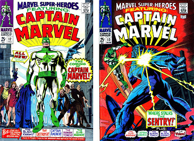
MARVEL COMICS MIGHT HAVE OWNED THE NAME CAPTAIN MARVEL, but I'm not entirely sure writer Stan Lee quite knew what to do with the character, after publisher Martin Goodman insisted the superhero be added to the company's lineup. After writing the first appearance himself, with the ever-capable Gene Colan on art, he handed the reins over to Roy Thomas, for me an indication that Stan didn't have a great deal of faith or interest in the project.

The first appearance of Captain Marvel in Marvel Super-Heroes 12 was scripted by Stan Lee. With the second appearance, Roy Thomas took over as writer.

For the origin and background of Captain Mar-Vell, Stan drew on the concepts of the Kree, an alien race first mentioned in Fantastic Four 64 (Jul 1967). And in setting up the background for Mar-Vell's story, he fell back on one of his favourite devices, the three-way romantic triangle - The Captain, his love interest Medic Una and the dastardly commanding officer Colonel Yon-Rogg. 

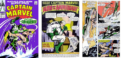
There's not a great deal of plot in the first Captain Marvel story ... what there is is pretty well outlined in the above two pages.

The Captain's here to investigate the destruction of Kree Sentry 459 at the hands of the Fantastic Four, and if necessary, punish the guilty. But the Captain's presence inadvertently interferes with a missile test and within moments he has the US Army hunting him. He disguises himself as a human and registers at a nearby seedy motel under the name of "Marvel" ... and that's pretty much it. Make something of that, if you can, Roy Thomas.

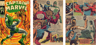
There's a lot more going on in Roy Thomas' take on Captain Marvel - Mar-Vell gets a secret identity, we meet Carol Danvers and witness the return of Sentry 459.

And to be fair, Roy does a bit better than that. Though he has an expanded page count (increased to 20 from the previous issue's 15), he still manages to pack every page with action, plot advancement and menace ...

Colonel Yon-Rogg's enmity towards Mar-Vell accidentally becomes the means by which Captain Marvel acquires the human persona of Walter Lawson. Yon-Rogg tries to blast Mar-Vell with the Kree ship's laser cannon, only to destroy the light aircraft bringing Lawson to the US Army missile base to take up a post as head of research. Lawson is killed in the blast, allowing Mar-Vell to assume his identity. Entering the base as Lawson, Mar-Vell meets Carol Danvers, who will loom large in later iterations of the Captain Marvel saga. It's also revealed that the remains of Sentry 459 have been transported to the base from the Pacific island where it had its fatal encounter with The Fantastic Four.

The only thing I wasn't mad keen on was Paul Reinman's inking, ill-suited to Colan's punchy and atmospheric pencils and not a patch on Frank Giacoia's inks in the previous issue.

If you bought Marvel Super-Heroes 14 for the next episode of Captain Marvel, then you were destined for disappointment. You got an inventory Spider-Man story from Ross Andru and Bill Everett instead.

At the end of the instalment, there's the standard Next Issue blurb, telling us to expect more of the same in Marvel Super-Heroes 14 ... except that's not what we got. With the sudden and dramatic expansion of the Marvel line in the spring of 1968, Martin Goodman evidently felt that boosting Captain Marvel into his own title would further reinforce his claim to the character's name (and he was also looking to expand the comics line so he could get more money from the prospective new owner of Marvel, Marty Ackerman) ... so that's what happened. I've discussed the 1968 Marvel explosion elsewhere in this blog, so I won't go over the same ground again, but instead of putting the next Captain Marvel story in Marvel Super-Heroes, Goodman ordered Editor Stan Lee to prepare an additional title, Marvel's Space-Born Super-hero, Captain Marvel, which debuted on 8 Feb 1968, cover-dated May 1968, the same month that Iron Man and Sub-Mariner got their own titles.

Despite having a full two months to prepare Captain Marvel 1 (May 1968) for publication, the whole affair feels very rushed, both storywise and artwise.

Roy Thomas and Gene Colan continued the story started in Marvel Super-Heroes, though this time, Colan's pencils were inked by Vince Colletta, probably one of the least sympathetic inkers on Marvel's roster. But somehow, this time, there doesn't seem to be enough story the fill the 21 pages allocated to the last chapter of the story. Essentially, it mostly a battle against the Sentry, peppered with jump-the-shark lines like "He doesn't realise I modified my [jet] belt." and "I did indeed modify the uni-beam". There's also a quick scene back on the mother-ship where Medic Una tries and fails to escape her bonds, and in the latter half of the battle outside the missile base, Captain Mar-Vell once again meets Carol Danvers, the base's Head of Security.

Despite 16 pages out of the 21 pages being taken up with battle action, Roy Thomas still manages to squeeze in scenes with the two important female characters.

Needless to say, The Sentry is defeated, Mar-Vell is accepted as a hero and the title is on the schedule as a monthly. Given that Colan's art does looked awfully hurried , you have to wonder what issue 2 is going to look like.

Tick,tick,tick ... Mar-Vell must defeat the Super Skrull if he's to prevent his own nuclear briefcase from annihilating the US Army missile base and everyone on it.

Well, to be honest, it looked a lot like the previous issue. Vinnie Colletta was still there on inks, doing as little as he could get away with, but Roy Thomas was gamely trying to include more story and less fighting. The plot had the nosey night clerk from the motel "Walter Lawson" was staying at - the one who was snooping around in Mar-Vell's room and finding the standard-issue Kree attache case - deciding that he should turn the case over to the military. What he doesn't know is that in fiddling with the case, he's armed a nuclear device that will destroy everything in a ten mile radius within two hours. Meanwhile, the Skrulls are wondering what a high-profile Kree warrior like Mar-Vell is doing on a backwater planet like Earth, and despatch the Super-Skrull to find out. Yes, you guessed it ... the Super-Skull tries to force Mar-Vell to explain himself, preventing our hero from disarming the nuclear explosive in his attache case. So Roy wasn't altogether unsuccessful here. Penciller Gene Colan does some great action sequences, but there's a lot of three and four-panel pages, to stretch the still rather thin material out to 20 pages.

Mar-Vell finally defeats the Super-Skrull by using the same method Mr Fantastic used in FF2 ... (spoiler alert!) he hypnotises the alien into forgetting who he is ...

Captain Marvel 3 (Jul 1968) has more of the same ... capturing Mar-Vell, the Super-Skrull takes his prisoner to his Skrull ship and tries to extract the secret of Mar-Vell's mission - though it's little more than a three-page recap of the previous chapters of the Kree warrior's story. But Mar-Vell breaks free and leads his enemy up to the edge of Earth's atmosphere, where Mar-Vell's jet-belt begins to fail. Thinking his foe doomed, the Super-Skrull returns to Earth to recover Mar-Vell's attache case (remember that?), while Mar-Vell manages to reach the invisible Kree ship. There's some more obligatory argy-bargy with the mean Yon-Rogg, then Mar-Vell wins permission to return to Earth and beat down on the Super-Skrull some more.

Captain Marvel finally defeats the Super-Skrull - using the time-worm hypnosis trick -and disarms his nuclear briefcase. And that's it for another month.

The following month, in Captain Marvel 4, our hero finds himself trapped in an almost identical plot, except this time the one preventing him from saving the Earth is Prince Namor, the Sub-Mariner.

My guess is that at the beginning of the Captain Marvel run, Stan had mandated that he battle a few established Marvel characters first to help with sales and to show the readers where in the power pecking-order Mar-Vell stood ...

Namor is on his way to seek help tracking down his enemy Destiny from, of all people, Reed Richards (see Sub-Mariner 3, Jul 1968). At the same time, a test missile is being launched from the base where Mar-Vell poses as Dr Walter Lawson. The missile will carry bacteria into orbit to test their resilience to cosmic rays. But the missile goes off-course and crashlands in the sea close to New York. Mar-Vell hurries to destroy the payload before all of New York is drenched in deadly microbes, and The Sub-Mariner sort of gets in the way.

These last few issues have seemed a bit "by-the-numbers", as though Thomas and Colan were just trying to get a task off their to-do list as quickly as possible. I suspect Stan Lee may have mapped out the course for the first few issues, which Thomas just had to follow. Likewise, it's far from Colan's best work. Compare what he was doing over on Daredevil at the same time (issue 43 came out the same month as CM4) and it's a very different kettle of artwork. And adding to the pressure was the 25 pages of artwork Colan turned in for the Madame Medusa story in Marvel Super-Heroes 15 (Jul 1968). Colan had already dropped Iron Man from his workload a couple of months earlier, and Captain Marvel 4 would be his last issue. The following month he'd take over Doctor Strange from Dan Adkins and that was an assignment that really played to Colan's strengths. Besides, it would have sublime Tom Palmer inking.

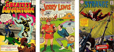
Just some of the highlights of Drake's stint at DC ... the Jerry Lewis comic with camp counsellors as Nazis caused less furore than you might imagine.

Captain Marvel was not to be stopped, though. Issue 5 came with a change of personnel. The scripting was assumed by Arnold Drake, who'd toiled for 15 years at DC on strips like Challengers of the Unknown, Bob Hope, Jerry Lewis and most notably Doom Patrol. It was Drake who had confronted Irwin Donenfeld back in the early 1960s, when Marvel was making inroads on DC's sales. Drake had tried to explain to the DC Editorial Director that times were changing and so were the comic audiences. DC needed to change with them if they were going to complete with Marvel Comics. The DC management still weren't listening as Marvel Comics overtook them in sales, and Drake left DC - quit or was shoved, accounts vary - and started working for Marvel around the beginning of 1968.

On paper, Drake probably looked like a good fit to Stan, who was in dire need of experienced writers to help with Marvel's virtually doubled-overnight output. But as I noted in my earlier piece, Drake had realised that Marvel were doing something right, but he struggled to articulate exactly what that was. "Pitch the books at an older readership" is a manifesto, not an instruction manual.

Experienced though Arnold Drake was, he couldn't quite put his (typing) finger on the authentic-sounding Marvel "tone", and as a result, his third scripting job under Stan's editorship rings a little bland.

So it's not surprising to me that Captain Marvel 5 (Sep 1968) could easily have been published by DC. I mean, there's nothing wrong with it ... the story moves along and the dialogue is serviceable, if a little ponderous in places, like a not-very-good pastiche of Stan's writing. But Drake is just finding his feet here - this is his third script for Marvel after Captain Savage 5 and X-Men 47 - so it wouldn't be fair to be too harsh, at this point.

On the other hand, the Don Heck art job was extremely serviceable. At this point in Marvel's history, poor Don had been abandoned to a certain extent. After losing his regular Avengers gig to John Buscema with issue 40 (May 1967), probably under the pretext that he had the 54 pages of Avengers Annual 1 (Sep 1967) to pencil. He returned to Avengers for a fill-in on issue 45 (Oct 1967) and was then assigned to X-Men, one of Marvel's poorest selling titles, from 37 - 55. We know this because when Marvel managed to hire Neal Adams, he asked Stan, "which is your worst selling title?" ... and when Stan said, "X-Men", Adams said, "I'll draw that, then." When Adams took over X-Men, Heck was left with pencilling Amazing Spider-Man 57-64 & 66 (Feb - Nov 1968) over John Romita layouts, Captain Marvel (reassigned to Gil Kane with issue 17, Oct 1969), Captain Savage (reassigned with issue 17, Nov 1969). It's almost as if someone had decided that Heck's services were no longer needed at Marvel. So by the end of 1969, Heck would pack up his pencil and head off to DC where he was better appreciated, drawing great female characters like Batgirl, Rose & Thorn and Wonder Woman.

The monsters come thick and fast in Captain Marvel 6 ... it reads a little like Drake delivered a story synopsis front-loaded with too much story and Stan added the action sequence to kick things off.

The following month, Captain Marvel 6 (Oct 1968) gave us not one, but two monsters of the month, behind the Don Heck cover. The first was featured in a spurious action sequence opener for the issue where Mar-Vell battled a simulated monster in a Kree virtual battle exercise. The second is the solar energy generated Solam, and energy beast created by a visiting scientist's ill-considered "tampering with the unknown" style experiment. Captain Marvel defeats the second monster by over-feeding it with energy, a tactic that's been used before in the Marvel Universe ... a No-Prize for the first reader who can identify where.

Captain Marvel's persistent thwarting of evil Yon-Rogg's plan are a bit more interesting than the battle with the obligatory monster ... this month, Quasimodo.

Captain Marvel 7 (Nov 1968) cover-starred Quasimodo (last seen battling the Silver Surfer in Fantastic Four Annual 5 (Nov 1967) drawn by John Romita, but Drake's script brought a bit more of Mar-Vell's melodrama to the proceedings. First, Captain Marvel faces the accusations of Yon-Rogg (again) for helping the Earthlings defeat last issue's Monster-of-the-Month. Yet, even Ronan the Accuser is unable to make the charges stick. Next up, Yon-Rogg, tiring of Carol Danvers' ongoing investigation of "Walter Lawson" resolves to disintegrate her with a blast of cosmic rays from his ship's cannons ... but Mar-Vell contrives to save her. The rest of the issue has Mar-Vell battle Quasimodo and thwart Yon-Rogg's orders to wipe out a random Earth community with a deadly virus, by appearing to "kill" Quasimodo's humanoid robots with the bacterial sample ...

This was the first issue where I felt that Drake was daring to develop the characters and the backstory a bit ... exposing the real Walter Lawson as a bit of a shady character. Nice to see Gene Colan back on the cover art.

Captain Marvel 8 (Dec 1968) opens with a battle between an interloping alien species called The Aarak and Yon-Rogg's Kree expeditionary force. Though Yon-Rogg is wounded in the battle and is recovered by Captain Mar-Vell, he shows little gratitude, relentlessly pursuing his vendetta against his junior officer. After the battle, Mar-Vell returns to Earth and begins to investigate the life of the Earth man he's impersonating, Dr Walter Lawson. Lawson's home is more lavish than a research scientist could aspire to. And beneath the house, Captain Marvel discovers an extensive and well-equipped laboratory. The evidence suggests Lawson had created a large robot, though for what purpose is not disclosed. The mystery deepens when two costumed gunmen enter Lawson's home and start shooting at Captain Marvel. It appears that Lawson had created the robot for some criminal organisation and now the murderous machine is on the loose, cuing up yet another battle between Captain Marvel and a monster. Inevitably, a five-page battle ensues and Captain Marvell apparently destroys the giant robot

Last issue the giant robot didn't seen to have a name, being referred to as "robot" or "cyberton" This time out, he calls himself "Cyberex" and everyone else follows suit. Sounds like an editorial correction to me. And another nice Colan cover.

But we're not done with the Aakon - or the robot - yet ... they're all back in the following issue. And because of Yon-Rogg's reckless attack, a retaliation by the Aakon threatens to expose Mar-Vell's Kree mission on Earth. So, here's an abbreviated version of the plot ... Carol Danvers goes snooping around "Walter Lawson's" motel room. The giant robot turns up and takes her as bait for "Lawson". The robot reveals that Lawson is not his creator. Inexplicably. Captain Marvel knows that the robot is holding Carol captive and rushes to rescue her. Yon-Rogg remotely activates Mar-Vell's wrist monitor so the Aakon know where he is ... and of course they attack. Cue the three-way battle between Captain Marvel, the Aakon and the giant robot (who now calls himself Cyberex) lasting a slightly excessive nine pages. It's all a bit humorless and po-faced. I'm not getting the sense, here, that Arnold Drake was able to grasp what it was that made Stan's scripts so memorable. Interestingly, that issue's Bullpen Bulletins bigs up the new Marvel scripters, Archie Goodwin and Arnold Drake. Stan (or maybe Roy) even touts some forthcoming work by Atlas veteran Ernie Hart. In the end that turns out to be the solitary dialoguing job Hart did on Nick Fury 8 (Jan 1969), before disappearing from Marvel for the final time.

Captain Marvel 10 plods its way through Arnold Drake's plot. But Heck delivers some nice work here. I really like his layout on page 10.

In Captain Marvel 10 (Feb 1969), we begin to learn a bit more about The Organisation, the criminal outfit that sent the Cyberex robot after "Walter Lawson", and its leader, Number One. Mar-Vell, too, is destined to discover more about his underhanded foes, as Ronan the Accuser orders him to gather information on The Organisation in case The Kree have to "deal with" them one day. However, The Organisation captures Carol Danvers and invites "Walter Lawson" to surrender to them. Captain Marvel goes in his place and initially pretends to be interested in an alliance, but slips a gas capsule to Carol that she can use to escape. Then all heck breaks loose and Mar-Vell finds himself facing an aging ray, apparently created by the real Lawson. Mar-Vell turns the ray on The Organisation and pretty much cleans their clock. But there's unexpected fallout from his victory. Yon-Rogg orders Captain Marvel's immediate execution.

And that pretty much closes the door on The Organisation, a kind of bargain-basement AIM, without the interesting bee-keeper outfits. I wasn't terribly sorry to see the back of them. I was a bit sorry to see Heck leave the book, though ...

Why the Barry Smith cover and the rushed Dick Ayers interior art? I'd speculate that the inexperienced Barry was supposed to do the insides but ran into scheduling problems and Ayers had to bail Marvel out. But pure guesswork on my part.

Captain Marvel 11 (Mar 1969) sported an interesting Barry Smith cover, one of his first works at Marvel. Channelling Kirby, Smith's art is is even more extreme, and it might have been more interesting if Smith had drawn the interior art. But what we got was a very rushed-looking Dick Ayers pencil job, not helped by Vinnie Colletta's usual slapdash inking. Arnold Drake's script takes Mar-Vell in a completely new direction. I don't know what went on behind the scenes. Perhaps sales weren't all that Stan was hoping for, but with this issue Drake brings in some sweeping changes. He kills off Medic Una, which I think was for the best. That storyline wasn't going anywhere. He also gets rid of Mar-Vell's weapon, the Uni-Beam, and gives our hero actual superpowers - through the agency of Zo and his conveniently lovely gaggle of handmaidens.

The way in which Captain Marvel gets a makeover is all a bit contrived ... can it be a coincidence that "Zo" is Oz backwards? Pay no attention to that man behind the curtain ...

The catch is that going forward, Captain Marvel will become a tool of the alien intelligence Zo and that may or may not involve some tough moral choices ... but I'm getting ahead of myself.

A hugely better art job from Dick Ayers in Captain Marvel 12, almost as if he's trying to blot out reader's memories of last month's lacklustre art, but the pace of Arnold Drake's storytelling is glacial.

So, as Captain Marvel 12 (Apr 1969) gets under way, Mar-Vell returns to Earth and tries to resume his Walter Lawson identity. I'm not sure why, as he's no longer under any obligation to carry out his Kree mission. And posing as Walter Lawson won't conceal his presence from Yon-Rogg .. but as "Lawson" returns to the missile base a plastic robot, The Manslayer, attacks and Captain Marvel ventures forward to defend the base. In another location, Natasha Romanova, The Black Widow, is stalking the controller of the robot, presumably on a SHIELD mission. Though The Widow manages to stop the robot, she's captured by the bad guy controlling the robot, to be held as a hostage against some future threat.

This would be the last issue from Arnold Drake and Dick Ayers. In fact, shortly after this, Drake would finish up his run of Captain Savage, with issue 16 (Sep 1969), pack up his typewriter and move over to Gold Key. It wasn't a memorable run, and I don't think Drake ever really understood the Marvel way of doing things.

Arnold Drake: 1 Mar 1924 - 12 Mar 2007

Drake would spend the rest of his comics career writing a variety of titles for Gold Key, contributing a long and memorable run on Little Lulu, and even returning to DC where he scripted Phantom Stranger and wrote a few stories to DC's war titles, most notably Weird War Tales. Drake had pretty much retired from comics around 1985, and died in 2007 after a short battle with pneumonia.

But that wasn't the end of Captain Marvel's publishing troubles. Marvel Comics would continue to struggle to find a strong commercial direction for Mar-Vell, and I'll be looking at the rest of his rocky early progress in the next instalment of this blog.

Next: A superhero in search of a USP


Saturday, 25 August 2018

Iron Man: Rivetting Stuff

IRON MAN'S THIRD ARMOUR REDESIGN in fifteen months was, in my view, a bit of a backwards step. I thought Steve Ditko's makeover for the first Red-And-Yellow suit, in Tales of Suspense 48 (Dec 1963), was brilliant - no improvements needed. But just six months later,  Don Heck redesigned the armour - or more accurately - the headpiece - yet again, this time giving Iron Man a line of rivets down his face.

The four faces of Iron Man, from Tales of Suspense 39, 43, 48 and 54. That's quite an evolution in a little over a year. And I'm actually not mad about the Don Heck "Rivet-Face" version. Was Heck just trying to come up with something that was easier to draw? Or did Stan think this was an improvement?
I think the design change Iron Man's faceplate was supposed to be a surprise to readers, the cover blurb certainly gives that impression. But for whatever reason, the Marvel production department included the upgraded mask on the corner box figure of Iron Man on the cover of Tales of Suspense 54 (Jun 1964).

"Wait till you see Iron Man's new protective head mask!" shouts Stan's coverline for Tales of Suspense 54. But of course, we didn't need to wait ... we just had to glance at the top left of the cover and see the new faceplate in the Marvel trademark box.
"The Mandarin's Revenge" is a bit misleading as a title for the story inside. Stark does indeed meet The Mandarin in this adventure, but not until page 7 of the 13-page story. And no revenge is actually meted out. But I'm getting ahead of myself.

Pentagon officials are concerned that Stark's observer missiles, deployed over Vietnam to track enemy troop movements, are falling out of the sky like flies. They blame Stark for supplying faulty technology. Yet Stark knows there's nothing wrong with the missiles. They're being brought down by some Sinister Force. And there's only one person in that part of the world that could be responsible. The Mandarin.

Someone's knocking Tony Stark's "observer missiles" out of the sky ... and it doesn't appear to be Dr Doom. Only one way to discover the culprit. Go to Vietnam and knock on a few castle gates.
It is a little surprising that the US military will allow their most valuable weapons manufacturer to jaunt over the border - illegally - into China to face a dangerous saboteur without an escort, but let's not dwell on that. Stark's plan to allow himself to be captured in his civilian identity might just work.

Inevitably, Stark is grabbed by The Mandarin's guards, who foolishly try to open his attache case and get a face-full of sleep gas for their troubles. Stark changes to Iron Man and crashes through a wall and advances menacingly towards The Mandarin - the Mandarin's rings can't stop Iron Man, the despot's electrical devices can't stop The Golden Avenger, not even The Mandarin's "karate" kicks can stop Iron Man. Swords, rockets ... no dice. In the end it's unbreakable steel bands that trap Iron Man and leave him helpless until the next instalment.

I strongly suspect this splash page was Heck's pitch to Stan to change the faceplate of the Iron Man armour. For surely only Heck would want to get rid of the Ditko-designed mask that Stark was wearing up till this point and replace it with this easier-to-draw version.
There are a couple of other interesting things about Iron Man's first two-part adventure, other than the fact of The Mandarin being old Shellhead's first recurring villain. The first is that after Steve Ditko's three pages introducing Iron Man's new-look armour back in Tales of Suspense 48, Heck doesn't spend even one panel on Stark re-designing his Iron Man helmet. He leaves Stan to explain it away in a bit of dialogue.

It's almost as though either Don Heck decided to change Iron Man's helmet himself - though that does seem unlikely, as Stan was a pretty tough editor - or Stan simply forgot to direct Heck to include a scene of Stark re-designed the armour's headpiece, and had to fudge the transition in the dialogue.
Then there's Stark's sudden interest in Pepper Potts. Up till this point, Pepper has been portrayed as having a bit of a schoolgirl crush on Stark and he's at best mildly amused by it, and reacting by engineering dates for her with Happy Hogan. Yet in this story, out of the blue, he acquires a romantic interest in his secretary. Stan would build on this as time went by, but this is where we saw it first.

After fifteen months of dating supermodels and actresses like a stoat, Tony Stark suddenly and inexplicably develops a romantic interest in his freckly secretary Pepper Potts. It's a little at odds with his established character, but romantic sub-plots seemed de rigeur for Stan's superhero books around this time.
Another first in this story is Iron Man referring to the blasts he projects from his hands as a "Magnetic Repellant" ray. He's used the repellant power of magnetism before, starting with issue 48 of Tales of Suspense, but the concept had always been less focussed - Iron Man used a hand-held device in ToS48 and radiated magnetic waves from his armour to break his fall in ToS49. After ToS54, Stan would refine this quite quickly in the more familiar Repulsor ray, and have Stark share the technology with other Marvel good guys like SHIELD, where the Repulsor rays were used in Nick Fury's flying Ferrari and later in keeping the Heli-Carrier aloft. 

Iron Man called the blasts from his gauntlets a "Magnetic Repellent". This would morph quite quickly into the now-familiar Repulsor ray, and Stark would later modify his armour's jet boots to use Repulsor technology rather than the less efficient jet fans.
The story closes with Iron Man helpless at the hands of the Mandarin, all trussed up with steel bands and refusing to beg for mercy. "I'll show you how an American faces death! I'll show that nothing can shatter the faith of a man who fights for freedom!" thinks Iron Man to himself, with steely resolve. And the readers would have to come back next month to find out how Iron Man escapes for [spoiler!] escape he will.

Tales of Suspense 55 featured one of those symbolic covers - a bit like X-Men 4, which came out a couple of months earlier - where the villain was show as a giant, looming menacingly over the hero. We all know that The Mandarin isn't actually thirty feet tall, don't we? Except this time, we'd be wrong ...
Tales of Suspense 55 (July 1964) gave us the 13-page second part of The Mandarin's Missile Crisis, titled "No One Escapes the Mandarin". The story picks up exactly where we left off last time, with Iron Man trussed up in The Mandarin's "unbreakable steel bands". The resolution to this inescapable death trap is a bit of a cop-out, brokered via the Mandarin's ability to see Stark's face beneath the Iron Man helmet. "Why are you smiling?" asks the Fu Manchu wannabe. "Because I know something you don't know," smirks Iron Man back at him.

Not only can The Mandarin see Iron Man smiling beneath his metal mask, but he can also apparently grow to thirty feet in height (as depicted on this issue's cover). Yet despite all these tricks, The Mandarin is not a match for Iron Man, giving lie to the story title, "No One Escapes The Mandarin!"
Iron Man then continues, "Why shouldn't I smile? While you waste time with me, Anthony Stark has probably found out where you keep your anti-missile missiles - and he could be destroying them this very minute." It doesn't occur to The Mandarin that Iron Man could be lying, and he hurries off to find out what Stark is up to, giving Iron Man the respite he needs to free himself. Iron Man follows and, discovering where The Mandarin controls his missile-snatching technology from, destroys the controls and recovers his missiles.

At the end of the story, Pepper seems a bit too happy to see Tony Stark and Happy is none-too-happy about it. Stan is still developing this new love triangle on the book and it'd be a few issues before he found the right note.
When Stark gets back from his adventures, he finds that Happy has struggled, in his absence, to keep Stark Industries on an even keel. And Stark's interest in Pepper hasn't diminished ... even Happy notices and remarks on it.

Since the beginning of the Iron Man series in Tales of Suspense, the page count has risen and fallen almost randomly. Click on the graph above to enlarge.
Interestingly, the final caption box announces that the page count on the Iron Man stories will be increased to 18 pages from next issue. However, this isn't really a new idea. The story-length on the Iron Man tales had risen and fallen all the way through the series. Once Captain America became a regular in Suspense, there wouldn't be room for 18-page Iron Man tales, but this wasn't something Stan saw coming at this point.

And right on the heels of the main story, there's a handy three page guide to Iron Man, presumably for late-comers. As I've mentioned before, Marvel Comics were gaining sales during this period, and many readers were late to the party. Stan has mentioned more than once that in the early days of the Marvel superhero comics, there was a large upswing in fan letters, many of which were asking for back issues. And in the later letter columns, Stan would regularly remind readers that the Marvel offices didn't have space to store supplies of their earlier issues.

"All About Iron Man" does what it says on the tin ... provides a condensed guide to Iron Man's powers, the Tony Stark identity and supporting cast in just four pages. Stan would include a similar guide to Giant-Man two months later in Tales to Astonish 59.
There are a couple of examples of Stan providing catch-up features for readers who were less familiar with Iron Man and Giant-Man than they would have been with Superman and Batman during 1964. I can't recall such features in Journey into Mystery or Strange Tales, but this sort of "How it works" piece would also be a feature of some of the Marvel annuals. And the Marvel Tales and Marvel Collectors' Item Classic titles were a more organised attempt to provide back-story for readers who'd missed the initial Marvel issues.

Oh, and Tales of Suspense 55 was also the issue in which Don Heck (or maybe Stan) got rid of the little row of rivets down the centre of Iron Man's faceplate.

"Iron Man has never been more exciting, or more dramatic, than in his never-to-be-forgotten battle with The Uncanny Unicorn!" Yes he has, Stan. On many occasions.
It was interesting that Stan decided to up the story-length in Tales of Suspense 56 (Aug 1964) ... for if ever there was a villain that deserved five pages less, it was The Unicorn.

There are elements to the story that are great. The opening scene in which Stark blows a gasket because he's tired of being cooped up in a metal chest plate has a ring of truth to it. Then, when he decides to be a selfish twat (for a change of pace), Happy Hogan is hospitalised and Pepper is kidnapped by the villain, The Unicorn. Stan also includes a flashback in which we see that The Unicorn's "Power Horn" was created by Ivan Vanko, The Crimson Dynamo, which is a neat bit of fledgling continuity.

For me, Tales of Suspense 56 is the least memorable of the 1964 issues - mostly because The Unicorn is such an uninteresting villain ... mediocre powers, sketchy backstory and no sign of any real motivation for battling Iron Man. I'm thinking deadline crisis filler issue; how about you?
As for the Unicorn himself ... well, he's just a bit dull. The costume is clunky and his power is a bit limited. The idea that he can only direct the force beam in his headpiece by turning is head would be handicap enough, but the rigid neckbrace approach to the costume means that he would have to turn his whole body to direct the power beam. Not the best design to come from the otherwise great Don Heck, and definitely not deserving of the allotted 18 pages. Luckily, the following month's Suspense was a big improvement, and introduced an important new supervillain.

It does seem likely that Stan had some considerable confidence in his new character judging by the multiple images on the cover and the tone of the cover-copy. This is also the first Don Heck art on a Suspense cover for quite some time, after a long run of Jack Kirby-pencilled covers.
Tales of Suspense 57 (Sept 1964) featured the return of the deadly Soviet agent The Black Widow, and this time she had a new ally. We first see Clint Barton - unnamed in this story - as a sideshow marksman, failing to impress the Coney Island crowd. Witnessing Iron Man preventing a fairground ride accident, Hawkeye decides that he too can have adulation if he becomes a superhero. But his first case, a botched jewel robbery, ends with him mistaken by police for the robber and forced to flee. 

With his deadly aim and trick arrows, Hawkeye made for an unusual villain, in that he really wanted to be a superhero. But circumstances conspired against him, and he ended up in the thrall of the beautiful but deadly Black Widow, who set him against Iron Man for her own purposes. Any similarity to DC's Green Arrow is purely coincidental.
By no small coincidence, the glamorous Black Widow is driving past at just the right moment and helps Hawkeye escape the cops. And that's pretty much the end for our Hawkeye, as he falls under the alluring spell of the Red spy and becomes entangled in The Widow's plot to exact her revenge on Iron Man.

Whether it was the increased page count, or a flair for the dramatic on Don Heck's part, this story included some rather large frames, at a time when most Marvel pages consisted of six or more panels per page ... even Jack Kirby's. How about the neat way Heck's layout in page 17 above shows cause and effect in the first two panels. Pretty cool, eh?
There follows an eight-page battle in which Hawkeye's trick arrows almost get the better of Iron Man and it's Hawkeye's coup de grace on his armoured foe that catches The Black Widow in an explosion, and renders the beautiful Russian spy unconscious. Just when he has Iron Man beaten, Hawkeye scoops up the woman he loves and gets the heck out of Dodge. 

Hawkeye must have been a hit with readers because just about as soon as he could, Stan would bring the maverick archer back, along with The Black Widow, in Tales of Suspense 60, just three months later. But first, Iron Man had the obligatory Battle Issue to deal with.

Tales of Suspense 58 (Oct 1964) would be the last to feature Iron Man as the star attraction. Starting with Suspense 59, he'd share the spotlight with fellow Avenger Captain America, a run I've covered in an earlier blog entry. But first, in the time-honoured tradition of Marvel superhero mash-ups, the two would have to slug it out in an epic-length story ... well, it seemed epic-length to me back in 1964.

It's hard to describe just how excited I was to see this comic advertised in the other Marvels of the period. I wouldn't track a copy down until 1966 or so, but it wasn't for lack of trying. My copy (above) you can see is a pence edition, so some did make it through the T&P blockade.
Tales of Suspense 58 (Oct 1964) was a pretty important one for my ten-year-old self. It was a tricky one for me to get hold of back in 1965, as it was one of the issues caught up in the Great Thorpe & Porter Distribution Snafu of 1964. I would later track down a copy after I'd already read the later Jack Kirby Cap stories in Suspense, so at the time, I wasn't mad about Don Heck's version of Captain America.

Again, Don Heck is using big panels on the page to maximise the impact of the battle scenes. I also really liked the way Sam Rosen rendered the Captain America logo in a Stars-and-Stripes motif, something that wouldn't be adopted on the Suspense covers until some time after the Captain America series started.
The plot's a little contrived ... After their defeat in Amazing Spider-Man 15, Kraven the Hunter and his partner-in-crime The Chameleon sneak back into the U.S. only to be apprehended by Iron Man. The Golden Avenger drags Kraven off to jail, but fails to notice The Chameleon skulking in the shadows. Out of the blue, The Chameleon gets the idea to impersonate Captain America and foment a battle between Iron Man and the real Cap. If I had to choose another hero to trick Iron Man into fighting (for no good reason), I'd probably choose Thor, who'd have a better chance of beating the armoured guy ... but then Thor wasn't going to be co-starring in the next issue of Suspense, was he?

It all comes out in the wash, though, when fellow Avenger Giant-Man shows up to explain to Iron Man that he's been fighting the real Captain America and not an impersonator as he'd first thought. It quite key that it was Giant-Man who does the big Reveal as he was busy the same month over in Tales to Astonish, having his own Battle Issue with another Avenger, The Incredible Hulk.

And for the first time since the beginning of Don Heck's work on Iron Man he's inked here by Dick Ayers, an embellisher I've never thought terribly well-suited to Heck's fine pencils. I'm guessing this was to free up some of Heck's time for taking over as penciller on The Avengers with issue 9 (also Oct 1964), where he was inked by Ayers as well, but for what it's worth, I've always preferred Heck inked by Heck.

From Tales of Suspense 59 onwards, the page count of the Iron Man stories would drop back down to 13 pages, with the Captain America solo stories - drawn by Jack Kirby - taking up the remaining 10 pages of story space. I couldn't have been happier, as I've always rated Cap as my all-time fave Marvel character, especially when illustrated by his co-originator, Jack Kirby.

Tales of Suspense 59 was one of those Marvel issues denied to UK readers because of the dispute between Martin Goodman and Thorpe & Porter distributors. It would be a few years after 1964 before I'd find one of these, but it's a milestone issue and one of my all-time favourites.
I'll take a look at the Iron Man stories in the "split" Tales of Suspense another time, as I wouldn't want Iron Man to outstay his welcome here.


Next time I want to return to the earliest days of Marvel Comics. I was reading my old chum Kid Robson's blog in which he revisits the old Stan versus Jack and Steve issue. I was astonished at how many readers still cite the Jack Kirby interview in Comics Journal 134 (Feb 1990) as hard evidence of Stan Lee's "perfidy". So I want to take a closer look at the interview to assess how much of it is reliable testimony.

Next: Follow the Money!