Monday, 10 July 2023

What If: Da Vinci drew comic covers?

MY A-LEVEL ART TEACHER, MR HUSSEIN, would always talk about the importance of composition when it came to paintings and drawings. In fact he went to far as to spend one entire lesson showing us how to find the geometrical shapes in classical paintings, then he encouraged us to use the same techniques in our artwork.

Da Vinci's Vitruvian Man can be used to demonstrate how the Golden Rectangle works.

There was also much talk of Golden Triangles, and Golden Rectangles, and even something called the Fibonacci Spiral, but I'd stopped listening by that point. It wasn't until I became involved in the magazine industry years later that I began to grasp the basic building blocks of design and was astounded to realise how this all played back into Mr Hussein's art class back in 1971.

You can even apply the Fibonacci Spiral - another way of interpreting the Golden Rectangle - to the Vitruvian Man - but we'll get into that a bit more later.

Then, when I started writing this blog and looking back at comic covers throughout the history of the medium (who hasn't thrilled to Separated at Birth - A comic covers interlude and Separated at Birth 2 - Another comic covers interlude?), I began to notice similar patterns beginning to emerge.

These were most noticeable, at first, on some of the DC covers, possible because they are simple and direct. But as I became aware of it, the geometric shapes the artists were using to create their covers around just leapt off the page.

I think this was the first comic cover where I noticed a strong geometric shape - c'n you tell what it is, yet?

At DC, during the early Silver Age, the editors mostly dictated what they wanted the covers to show. Often, the covers would be created before the interior story and art, and the covers would dictate the interior content. Some editors would recycle cover ideas, Julius Schwartz probably being the worst offender. But to the best of my knowledge, there wasn't an Art Editor laying out cover designs and handing them to the cover artists. Some artists had a good nose for design, and some didn't.

Over at Marvel, in the early part of the 1960s, there was no formal art editor, either. Stan Lee would check over covers - which were usually drawn after the interior art - as they came from the art department (headed by Sol Brodsky) and make suggestions, order changes or even reject cover art. It wasn't until later that first Marie Severin and then John Romita would create design layouts for cover artists to follow.

So I think it's fair to conclude that at least in the early part of the Silver Ager, cover artists at both DC and Marvel were just trying to create striking and attention-grabbing cover art, and probably were adopting these geometric cover layouts without much conscious thought.

Here then, without too much comment from me, are some of the more obvious examples. You can probably have a lot of fun looking for the hidden layout shapes among your own collection, and see whether you can spot any trends.

TRIANGLES

For me, I think, the easiest shape to spot behind the layout of a single image, like a painting or a comic cover, is the Triangle.

The Canigiani Holy Family by Renaissance superstar artist Raffaello Sanzio da Urbino (better known as Raphael), painted between 1507 and 1508.

This is one of the strongest and most common layout configurations. Often used to convey a sense of strength, balance or stability, it's so predominant that I doubt the artists knew, in many cases, that they were using it.

Three DC covers with strong triangular layouts. Cover artist Curt Swan always had a strong sense of design, so I'm not sure that anyone handed him a hasty pencil sketch and said, "Do it like this." Click to enlarge.

Meanwhile, over at Marvel, Jack Kirby would often use a triangular layout on his covers, most noticeable on some of his most powerful cover designs. The earliest example I could find was the cover of Journey into Mystery 85 (Oct 1962), which introduced Thor's arch-enemy Loki in an eye-grabbing example ...

The triangular layout definitely brings a touch of power and dominance
to the scene of Loki's challenge.

And look at this Kirby cover, depicting Thor in a simple, but powerful, take on the triangular design.

Journey into Mystery 125 (Feb 1966) shows a powerful image of Thor ... graceful, stable, the classic immoveable object.

On the Captain America title, Kirby would return again and again to the triangular layout, conveying a variety of different moods ...

Once Captain America took over Tales of Suspense, Kirby cut loose with some wonderfully arresting covers, some of his best ...

It was so effective that Kirby's successor on Captain America, Jim Steranko, would also use the same geometric layout style.

Jim Steranko has always displayed an eye for graphic layout. Here, his deceptively simple covers would have just leapt off the newsstands.

And on Fantastic Four, too Kirby was working that triangle. Look at these fabulous covers, for examples of how strong the layout can be.

The Thing cover on Fantastic Four 51 (Jun 1966) is considered a classic. Kirby like it so much he more or less re-used the image as the splash page of the story, too, and revisited the idea a few more times during his run on the title.

But the technique wasn't exclusive to Jack Kirby ... others also, besides Steranko, used strong triangle configurations in their cover art. 

Here's Gene Colan, John Romita and Herb Trimpe all grabbing a piece of the triangle-shaped cover fun.

Beyond the simple triangle, there's also a more complex shape, often referred to by classical art scholars as The Golden Triangle ... 

Dogs Fighting in a Wooded Clearing by Frans Snyders (1579-1657) demonstrates the more complex Golden Triangle layout.

... and I found a few examples of comic covers that fit that class of geometric layout, as well. Here's a Superboy from the early 1960s:

The mighty Curt Swan makes this cover design look deceptively simple, but when the Golden Triangle shape is overlaid, you can see how clever the design is.

Here's an example from Jack Kirby ... I wonder if Jack even knew that this was a Golden Triangle. Probably, as he did briefly attend The Pratt Institute in New York, though I've not been able to figure out which department of the School of Art Kirby was in. 

Unconscious or deliberate use of the Golden Triangle ... you decide.

And here's a later example from Marvel, John Buscema on the cover for Avengers 51 (Apr 1968):

I think its fair to say that John Buscema more than any other comic artist (except maybe Burne Hogarth) was the most influenced by classical art.

And finally, remember that Superboy cover I showed at the start of this section? Well, that uses two triangles as its basic layout, just one example of how shapes can be repeated, or even combined to produce something a little more complicated or interesting.

Although I'm sometimes critical of the content of DC's covers, I've always loved Curt Swan's draftsmanship. On Superboy 109 (Dec 1963), he also demonstrates that he's a master of design.

No one ever said you couldn't have more than one geometric shape underlying a picture's composition. In fact, artist will often repeat shapes, or even combine different ones to achieve a striking visual design ... but more on that later.

CROSSES

Another common type of layout is where the major elements in a picture follow the lines of a cross. It's not hard to find strong examples of a cross composition in classical art.

The Swing was commissioned from Jean-Honere Fragonard, to depict the mistress of a member of the French Court. I don't think it's a coincidence that the lines intersect where they do ...

Once it has been pointed out, you can quickly apply the same principle to comic book covers, where it's often (but not always) used to evoke a sense of conflict.

I found a couple of early Silver Age examples of the cross composition from DC ... and wouldn't you know it? The artist is Carmine Infantino ...

I think these two examples from early issues of The Flash make a good illustration of the concept.

But it's Marvel that I'll focus on ... and where better to start with a conflict-based concept than Sgt Fury and His Screaming Ab-Dabs, and these classic early covers by Jack Kirby?

I can see a circle in the layout of Sgt Fury 6 as well, and I'll offer some examples of compound compositions later on in this entry.

Kirby would also apply the cross composition to superheroes comics, as well. Here's a couple of examples from Journey into Mystery with Thor.

In JiM 95 (Aug 1963) you can see that the attack line runs from Thor's evil duplicate to the real Thor ... the line that goes through the real Thor's body is the defence line ... the concept isn't used in quite the same way in JiM 104 (May 1964), but still a strong design.

How about these Fantastic Four covers, all showing a strong element of conflict, or threat of conflict?

All quite similar in concept to JiM 95 ... with a clear attack line and defence line in each case. Interesting how on FF 58 (Jan 1967), Wyatt is not the quite the same line as the rest of the FF ... because he's not actually part of the team.

To round off, here's a couple of Amazing Spider-Man covers by the first two artists to draw the series, the late great Steve Ditko, and his worthy successor John Romita.

It's quite remarkable how two artists who'd never worked together, and probably hadn't even met, could come up with two such strong cross-based designs for the same character.

And because my classical art example at the beginning of this section was a bit cheeky, here's a stronger version of the cross-composition by Renoir, where all the eyelines quite literally line up.

The Luncheon of the Boating Party by Pierre Auguste Renoir, painted around 1881, is a hugely influential painting and a keystone work of the Impressionist movement.


CIRCLES

In this context, not all the circles I'll show you will be perfect circles ... some will be more oval. But let's not quibble ... for a design which swirls around a central point is probably one of the most effective, and probably my favourite. Let's start, as always, with some examples from classical art ... something a bit newer, this time.

Henri Matisse painted "Dance" in 1910, a commission for Russian businessman Segei Shchukin. It's considered a key milestone in Matisse's career and in the development of the Modern Art movement.

Looking first at the DC comics of the first half of the 1960s, I came across quite a few that showed a strong circular composition. Look at these covers from Gil Kane and Sid Greene (who's probably better known for his inking).

While you'd expect Gil Kane to turn in a well-designed cover - and he did many - who knew that inker Sid Greene was such a deft draftsman?

And, of course, it wasn't hard to find examples from the top two DC artists of the day, Curt Swan and Carmine Infantino.

I did like Curt Swan's Superfamily covers of the early 1960s ... such a shame that DC's Dark Overlord Mort Weisinger plastered them with inane speech balloons.

And at Marvel, we find Jack Kirby leading the charge, using the technique to great effect on the first Marvel team books.

The first three covers on The Avengers series from 1963 look nothing alike ... until you realise that all use a circle as their underlying design ...

It's almost like there's no other way to go, when you have a large number of characters to feature and limited space to do it in.

And it's the same with the first three covers on The X-Men, which came out at exactly the same time as The Avengers ...

But Kirby would happily use the same composition on the solo character books. Here's a run of Captain America from later in the silver age ... just one circle after another.

Three cracking Captain America covers from 1968 ... we know that Kirby rushed the art for CA 112 through when Stan was afraid Steranko would miss his deadline, but that cover is a masterclass in composition.

Then, though I'm not drawing any conclusions from this, I came across the pencils for a Kirby Captain America cover that were heavily reworked into a circular composition by John Romita ... a rare example of Kirby missing an opportunity.

I can see why Stan might have rejected the first version ... it's hard to see that it's Captain America sliding down the zip-wire. The fact that the reworked version just happened to fall into a satisfying circular composition may just be a happy bonus.

Just so we're clear, John Romita was no stranger to the circular design concept when it came to comic covers. Here's a few he did during his extraordinary run on Amazing Spider-Man ...

It's quite difficult to find a bad John Romita cover, as he was a natural designer, but these covers are among his best, ranging from 1966 to 1968.

And to end on, a random sampling of Jack Kirby through the years, working that circle like there's no tomorrow.

And if any more proof were needed, here's a gaggle of Kirby covers that span the years 1963 to 1966, all effortlessly crafted for maximum impact.

It may be that I find the circle the most appealing of these layouts because that shape is the most organic, occurring naturally both in our world's ecosphere (see what I did there?) and in the wider universe.

COMBINATION COMPOSITIONS

While I was trawling through my collection and the Internet, looking for covers that demonstrated the use of the geometry in laying out a piece of art, I kept coming across illustrations that didn't fit comfortably into any of the three pigeonholes I've described above. There were even pictures that seemed to fit into more than one category. But classical artists have been using combinations of shapes to lay out their art since the Renaissance, pretty much. 

Speaking of the Renaissance, let's use a famous painting by Botticelli as our example of combination shapes underlying a picture's structure.

Nascite di Venere was painted by Sandro Botticelli some time during the 1480s, and is probably one of the most popular examples of Renaissance art.

There may well be a few covers I've shown above that you might think could be used to illustrate combination compositions ... but here's a few I've singled out as the better examples.

What could be more bonkers than a later Silver Age Superman cover? But forget that, and concentrate on how the simplicity of the design makes a complex artwork accessible.

Towards the end of his tenure, it seemed that Weisinger's editorship resulted in ever-more outlandish situations. One is among the best (or worst) examples of that, was Superman 184 (Feb 1966), where primitive humanoids wave doritos-on-sticks at the Man of Steel. This was why, by 1966, I was a full-on Marvel reader.

Meanwhile, though DC editors struggled to understand what the fuss was about, Marvel were using the same techniques to creat more arresting and - to be fair - saleable covers for their comics. Here's a couple of early Avengers that would have made my ten-year old self part with his pocket money.

Could it be any clearer? The goodies are in the oval shape and the baddies are in the triangle. Shut up and take my money.

The art for Avengers 9 (Oct 1964) demonstrates how effortlessly Kirby was able to knock out a cover that told you exactly who was in the story (all you really cared about when you were ten) and gives you a pretty broad hint at who is on which side.

Kirby is once more using the geometry of the cover to show you who is fighting who is fighting whom. Good and clear, great sense of danger.

A couple of issues later, Stan put his top solo hero Spider-Man up against The Avengers (or, spoiler alert, so it seemed). Yes, I know diverse hands were involved in tinkering with the art - names from Steve Ditko to Bob Powell have been accused on being involved, but it's reasonable to say that the basic composition of the cover is Kirby's.

SO ... ABOUT THE FIBONACCI SPIRAL

Leonardo Bonacci, also know is Fibonacci, was a mathematician of the Middle Ages, credited with bringing the arabic numeral system to Europe and introducing the concept of zero to modern mathematics. The Fibonacci Sequence is a series of numbers where each successive number is the sum of the previous two. Omitting zero for clarity, the sequence goes:

1, 1, 2, 3, 5, 8, 13, 21, 34, 55, 89, etc ...

You might be thinking, "Yes, and?"

Well here's the thing. The Fibonacci numbers also appear in biological settings, such as branching in trees, the arrangement of leaves on a stem, the fruit sprouts of a pineapple, the flowering of an artichoke, an uncurling fern, and the arrangement of a pine cone's bracts. Spooky, huh? And the sequence also turns up elsewhere in maths - computer algorithms such as the Fibonacci search technique and the Fibonacci heap data structure, and graphs called Fibonacci cubes used for interconnecting parallel and distributed systems.

But wait ... the sequence also shows up in classical art as a basic for the composition of many pieces of art, from different parts of the world, possibly - though I can't confirm this - without the artists even knowing they were using it. The sequence has been used to create the "perfect" rectangle, sometimes referred to as the Divine (or Golden) Rectangle. Here's an illustration of it (nicked from WIKIpedia):

The longer edge is 34 units and the shorter edge is 21 units. But look how you can start drawing lines and each smaller square is part of the Fibonacci Sequence. Now, to create the Fibonacci Spiral, you open your compass to 21 units, place the point in the bottom right corner and draw a quarter circle from bottom left to top right. The make your compass 13 units and draw another quarter circle from top left to bottom right. Carry on like that and you end up with:

And that is the shape that turns up again and again in the composition of classic art pieces. Here's a classic (no pun intended) example:

La Grande Odalisque by Jean Auguste Dominique, 1814.

But you can go back and apply it to Renaissance pieces like:

Mona Lisa by Leonardo Da Vinci, c.1506

And even paintings from completely different cultures, like Tsunami.

The Great Wave off Kanagawa - more popularly referred to as "Tsunami" - by Katsushika Hokusai, 1831.

Admittedly, when it comes to finding comic covers that look like they are based on the principles of Fibonacci, it's a bit more challenging. Is that because comic covers are by definition simple and direct? Possible, but even with a fairly casual search, I managed to find a few examples that look like a pretty good fit.

The first one I found was an early Ditko Spider-man cover ...

Amazing Spider-Man 10 (Mar 1964), by Steve Ditko.

What do you think? Convincing? How about this one?

Amazing Spider-Man 15 (Aug 1964), by Steve Ditko.

I thought these two Daredevil covers, both by John Romita, made a pretty convincing example, as well.

Daredevil 12 (Jan 1966) and 15 (Apr 1966).

And I think the classic cover for Fantastic Four 48 (Mar 1966) is a strong contender as well.

This is probably the most convincing example I found ... and it's Jack Kirby, which surprised me a little. Look how the family members of the FF are grouped together in the lower right rectangle, with Ben Grimm on the outside. Can't be coincidental.

And finally, these two covers from different periods of the Silver Age ...

I always loved the cover to Strange Tales 142 (Mar 1966), and now I think I know why. The cover for Thor 182 (Nov 1970), just at the outer edge of the Silver Age, is a nice example, as well.

None of these are exact fits to the Fibonacci Spiral, but they are pretty darn close. I could spend ages working my way through the Grand Comicbook Database, scouring for ever-more convincing examples of covers that conform to classical art composition ... but I do have things I need to do, like eating and sleeping.

WHO SAYS COMICS AREN'T ART?

There's no hard rules about any of this. You could argue that I'm just seeing structure where none was intended. But at the same time, I think it's not an unreasonable position to say that artwork that follows some kind of underlying geometric design is more attractive, effective and easier for us to decipher than a picture that is just a chaotic collection of artefacts on the page.

That said, I'm conscious that not all the components of any of the about art fits perfectly to the geometric designs I've been looking at. And I think that's an important point. If the artist did try to place the elements exactly to a geometric shape, then I think the artwork wouldn't work as well, perhaps becoming a bit mechanical in the rendering. It's those little overlaps and deviations that make the final piece arresting.

So that's it. I don't want to labour the point, but you can have loads of fun, trawling through the covers reproduced on the Grand Comicbook Database, and spotting all the various shapes for yourself.

Next: So what does an Editor actually do?


Monday, 1 May 2023

Captain Marvel: Part 3

A YEAR ON FROM THE GREAT MARVEL EXPLOSION OF 1968 and it was becoming noticeable that Martin Goodman's grand plan to increase Marvel's output wasn't going to be sustainable.

When Marvel's total monthly page output went up from around 280 pages per month to about 400 pages, Editor Stan Lee needed to find more creators to produce the extra 120 pages of original story art he'd need just to keep the Marvel machine fed. He already had Roy Thomas and Gary Friedrich helping out on scripting. He'd added Archie Goodwin and Arnold Drake in 1968 - both looked great on paper, Goodwin with long experience at Warren magazines and Drake with a wealth of experience at DC, but by mid-1969, Drake had left Marvel and Captain Marvel needed a new writer.

As it turned out, Gary Friedrich was able to step in for a few issues, while editor Stan cast around for a permanent replacement. Also incoming was new Marvel recruit, Frank Springer, replacing Dick Ayers who'd pencilled the last couple of issues. Springer had pencilled at Dell until the end of 1967, then joined DC for about eight months - I'd particularly enjoyed his work on Secret Six - before hopping over to Marvel to draw SHIELD 4 (Sep 1968).

Though my 14 year old self wasn't best pleased to see Frank Springer take over from SHIELD artist Jim Steranko, I had enjoyed his work on DC's Secret Six. He also delivers a splendid job on Captain Marvel, diminished only a little by Vince Colletta's indifferent inking.

Captain Marvel 13 (May 1969) kind of re-hashes issue 12, with an unnecessary second battle against the Manslayer and a punch-up between Mar-Vell and Yon-Rogg. Incredibly, Yon-Rogg knocks Mar-Vell down during the fight, despite Captain Marvel's hugely enhanced physical strength (courtesy of the cosmic entity Zo). It's almost as if Friedrich hadn't read the previous issue. Or maybe he was just dialoguing an Arnold Drake plot ... either way, it added up to an unmemorable story.

Although touted as a crossover with Avengers 64 and Sub-Mariner 14, Iron Man's appearance in this issue of Captain Marvel seemed more like marketing opportunity than a story necessity.

Captain Marvel 14 (Jun 1969) featured a guest-appearance by Iron Man, a sure sign that sales on Mar-Vell's book weren't all that Editor Stan Lee had been hoping for. But this shouldn't have been much of surprise for Stan. Both art and scripts on the title had been distinctly second-tier up till this point ... and something had to be done. The introduction of Iron Man didn't make a great deal of sense, as guest villain. The Puppet Master (not looking like a ventriloquist's dummy any more, he had plastic surgery in Strange Tales 133, Jun 1965) takes possession of Iron Man and forces him to seek out and battle Captain Marvel for no reason that is ever explained.

But for me, now as then, the plot ("Captain Marvel battles Iron Man") is the least important part. The character development has always been more interesting to me. This issue moves it forward a little. Captain Marvel returns to the orbiting Kree ship and has a showdown with Yon Rogg - though Mar-Vell inexplicably allows his enemy to live - and then Zo decides Mar-Vell has had enough freedom and must now return to the Kree homeworld, for reasons yet to be explained.

Tom Sutton had been working steadily at Warren for a couple of years, then drew quite a bit of the later issues of Not Brand Echh. This was one of his few superhero jobs for Marvel. He'd later carve a niche on Marvel's Planet of the Apes, and at Charlton.

And that's exactly what happens in Captain Marvel 15 (Aug 1969). Working with incoming newcomer Tom Sutton, Gary Friedrich takes Mar-Vell off in a far more cosmic direction. It's almost a foretaste of what Jim Starlin would do with the character just a few years later. Zo begins by showing Mar-Vell his past and his future, revealing that Mar-Vell is destined to destroy his own people. Unable to accept that his fate is inevitable, Mar-Vell resolves to follow the path set out by Zo but plans to thwart Zo's predictions at the first opportunity. When he does arrive on the Kree homeworld, he's embroiled in a battle against the invading followers of Tam-Bor.

I quite like Sutton's groovy, cosmic layouts here, but you can see that his draftsmanship isn't quite as slick as more seasoned artists like his predecessors Dick Ayers and Frank Springer. Even Dan Adkins' usually deft inks can't quite punch this up.

Then, just when it looks like Gary Friedrich is taking this book in an interesting direction, he's replaced by incoming scripter Archie Goodwin, who makes a pretty good fist of tying up all the disparate events and situations created by all the previous scripters on the series.

Captain Marvel 16 (Sep 1969) is a complicated issue, as Goodwin tries to sort out and make sense of the various plot threads dangling since the beginning of the series.

So ... it turns out that the Kree Supreme Intelligence (introduced in this issue) is behind almost everything that's happened. Two Kree traitors have been scheming to take over the Kree Empire, second-in-command Zarek - who also posed as cosmic entity Zo - and his henchman Ronan the Accuser. The appointment of Yon-Rogg as Mar-Vell's superior officer was all part of the plot, and Mar-Vell - because he was a straight-arrow hero-type - was selected by Zarek as the fall-guy to blame it all on. Poor Medic Una was just so much collateral damage. The Supreme Intelligence was aware of the plot and simply bided his time till it came to a head, knowing that Mar-Vell would do the right thing. For his heroic actions, Captain Marvel is promoted to warrior and is given a new uniform. And he gets to keep his Zo-given cosmic powers. Yes, some of the resolutions are wobbly, but it's pretty obvious that this is a clearing-of-the-decks for a major change in direction.

It's great to see Heck back on pencils, with some fine finishing by Syd Shores on inks. But it's only for a moment, as next issue, Editor Stan brings in the big guns to try to get the title up on its hind legs, assigning Roy Thomas as scripter and DC Comics stalwart Gil Kane as artist.

WHO THE HECK IS GIL KANE?

Gil Kane (born Eli Katz, 6 Apr 1926) began his career at MLJ (later Archie Comics) in 1942 where he worked in the production department erasing pencils, ruling panel borders and outlining speech balloons. Fired after three weeks, Kane got a job at the Jack Binder Studio doing pencilling work. "They weren't terribly happy with what I was doing. But when I was rehired by MLJ three weeks later, not only did they put me back into the production department and give me an increase, they gave me my first job, which was Inspector Bentley of Scotland Yard in Pep Comics, and then they gave me a whole issue of The Shield and Dusty, one of their leading books," he told The Comics Journal in 1996. By 1944 he was freelancing for Simon and Kirby, who were supplying material to DC, and drawing for other publishers like Hillman, Rural Home and Aviation Press. Kane was drafted into the Army the same year, not returning to civilian life until 1945. He began drawing directly for DC under editor Sheldon Mayer, while contributing art to a range of Prize Comics titles. By 1949 Kane was working on Julius Schwatz's stable of titles, notably Jimmy Wakely, Rex the Wonder Dog and All-Star Western.

Western comics were big sellers for DC during the 1950s and Kane's work was much in demand. Later, he'd also draw sf and romance strips for the company.

Kane continued at DC throughout the 1950s, drawing anything he was asked to - science fiction, romance and westerns - but as these genres began to flounder, DC was looking for other avenues and turned their attention to superheroes once more. 

With the DC superhero revival in full swing, Kane was their star artist on two important books, but even the occasional job on DC mystery titles wasn't enough to fill his schedule.

Kane got the job of pencilling the revived Green Lantern, but found with the loss of his other titles, he hadn't enough work to keep him busy. "By the end of the '50s, everything began to collapse and, little by little, I lost all of my work," Kane told The Jack Kirby Collector in 1998. "I lost Rex, the Wonder Dog and all the westerns. I lost everything and had nothing going. I would occasionally get a science-fiction story from Julie. I went over to Western/ Gold Key and worked with Russ Heath as a partner for a while; I penciled and he inked. So I picked up work wherever I could. Green Lantern filled in a lot but not completely; it was every six weeks and not a monthly book." Kane pitched a revival of The Atom to DC and began pencilling that, as well. "I designed the character and the costume and everything else, and showed them my drawings and sketches and they decided to build a magazine around it," said Kane in an interview with Comic-Art.com. "It was very much like a character done by my favourite artists Louie Fine and Reed Crandall [Doll Man] ... I must admit that it was sort of boring doing it. I really didn't enjoy it ... because I longed to ink my own pencils, which they wouldn't let me do."

Stan started Gil Kane off on covers, but soon found some interior pencilling for him on The Hulk and Captain America.

Towards the end of 1966, after trying to get in at Tower Comics, Kane went to Stan Lee and picked up some work pencilling The Hulk in Tales to Astonish, where he was allowed to ink his own work. A month or two later, Kane was also pencilling and inking Captain America in Tales of Suspense. That and some cover work from Stan seemed to help, but Kane's first Marvel tenure only lasted a short while. After about three months, Kane was back at DC. 

Maybe the prospect of losing one of their star artists focussed DC's attention and they found him more work, adding regular work on Detective Comics. Throughout 1968 and 1969, Kane was also pencilling on Hawk and Dove, Captain Action, Batman and Teen Titans. The Atom was merged with Hawkman in mid-1968, but Kane didn't draw the new title. Then, in mid-1970, Neal Adams took over the art on Green Lantern, and although Kane drew The Flash for a few months, it was looking like DC were struggling to hang on to Gil Kane. 

Gil Kane: 6 Apr 1926 - 31 Jan 2000

By mid 1971, Gil Kane was working pretty much exclusively for Marvel, drawing Amazing Spider-Man and most of their covers.

AND BACK TO CAPTAIN MARVEL

Captain Marvel 17, cover dated Oct 1969, was on the newsstands 15 Jul 1969. It was pretty obvious that this was a completely different approach to the character.

The whole idea of a youngster miraculously transforming into a superhero on demand did seem awfully familiar. Rick Jones was even given Billy Batson's signature blue trousers and red top.

Roy Thomas ditched most of the backstory and re-tooled Marvel's Captain Marvel to vaguely resemble the classic Fawcett version. Rick Jones, former partner of both The Hulk and Captain America, was drafted in as the Billy Batson stand-in. Rick only had to clash his wristbands together to swap places with Captain Marvel in the Negative Zone. And their first order of business is to rescue Carol Danvers, who we saw kidnapped by Yon-Rogg in the previous issue. 

The only slight glitch I saw was where Captain Marvel claims that he now has no powers, except for those that the Nega-wristbands give him (Rick's wristbands don't give him any powers). Yet in Captain Marvel 16, Captain Marvel explicitly tells us he retains the power bestowed on him by "Zo". I'm confused ...

But whatever powers Captain Marvel now has, they're not enough to keep Yon-Rogg from making off with his captive, Carol Danvers. And hot on his trail ... Rick Jones.

This issue, Captain Marvel battles another monster-on-the-month and Rick meets Mordecai P. Boggs, who bears a passing resemblance to Uncle Dudley Marvel, I think. Oh, and Carol Danvers gets genetically altered ...

Captain Marvel 18 (Nov 1969) takes a little time to get going. First there's an unexplained incident where Rick Jones is nearly run over by a random motorist. Then there's a strange sequence at a diner in a nearby town where Rick sings a song, gets into a bar-fight and is offered a recording contract by Mordecai P. Boggs. Captain Marvel then "deduces" where Yon-Rogg is hanging out, though no explanation is ever given as to how he did it. The confrontation with Mar-Vell's mortal enemy is drawn by John Buscema, and during the fracas Carol Danvers is exposed to radiation from a Kree Psyche-Magnitron ... this is important because this is what causes the genetic transformation that allows Carol to gain super-powers and become Ms (later, Captain) Marvel.

Captain Marvel is at the mercy of a mad sociologist, trapped in a death-trap apartment block with hundreds of terrified tenants. Not your usual superhero tale.

The following month, Captain Marvel 19 (Dec 1969) finally gave us a story that wasn't just tying up loose ends from previous issues and setting the scene for this new version of Mar-Vell. Rick Jones needs a job and somewhere to live and answers an ad in The Daily Bugle offering accommodation in a luxury high-rise. But the landlord Cornelius Webb is a crazed sociologist who wants test the work of behavourist Burrhus Skinner to see if humans can be conditioned in the same way that rats can. As Webb conjures up illusions and deadly physical traps, Captain Marvel tries to protect the tenants while finding and stopping Webb. But it's Auschwitz survivor, the kindly Mr Weiss, who literally pulls the plug on Webb and causes his downfall.

It's a little heavy-handed in places, but it does seem to be a genuine attempt to offer a slightly different take on Marvel's usual super-hero tale. The letters page of the issue reveals that the plot came from Gil Kane. And though there's no advance warning on this issue's letters page, the title would be going on hiatus for six months, though no reason was ever given.

Strangely, there's no mention of The Hulk on the over of Captain Marvel 20 (Jun 1970), which is odd, considering it's been six months since the last issue came out, and the title can probably use all the hype it can get.

When Captain Marvel did return in late March 1970, it was the same creative team and the story picked up without a blip. Rick and Mar-Vell decide that the one person who can help them both out of the Negative Zone trap is Dr Bruce Banner, and the pair resolve to track him down. There is a side plot with some organised looters taking advantage of a natural disaster, but the main part of the tale is the inevitable collision with The Hulk.

There's still no satisfying explanation given by Marvel for just why the title went on a break. On the letters page, Roy insisted that the last few issues were "sales blockbusters" (really, Roy?) ... but it doesn't seem terribly likely that Marvel would suspend a successful title on a whim.

Also, I don't think it likely that Gil Kane sat around waiting for Captain Marvel to start up again. My guess would be that all the Kane issues were drawn at the same time and the art to Captain Marvel just sat in a drawer until they were ready to publish it.

In attempt to beef up interest in the title, Roy and Gil feature The Incredible Hulk for the final two issues of the title's second "trial period", but ass it turns out, this wouldn't be enough to convince Marvel to continue the series.

Captain Marvel 21 (Aug 1970) would signal the swansong of the title for a while. The entire issue is pretty much a battle royale with the mighty Hulk. Mar-Vell is outmatched from the get-go and the fighting only comes to an end when Rick returns to our universe and confronts The Hulk. Some part of the monster remembers his young friend and the creature's anger evaporates ...

The idea of asking for Banner's help in freeing Captain Marvel from the Negative Zone is left unresolved - deliberately according to Roy Thomas' comment in the issue's letter column - so there wouldn't be a change to the concept of Rick Jones and Mar-Vell trading atoms in the immediate future.

Marvel kept Captain Marvel in front of readers by making him an important player in the classic Kree-Skrull war storyline in The Avengers ... much of it drawn by superstar artist Neal Adams.

Roy Thomas wasn't about to give up on Captain Marvel ... he reintroduced the character in a pivotal role in the Kree-Skrull war that would play out in The Avengers from issue 89 (Jun 1971) to 97 (Mar 1972). This would give Marvel the confidence to re-start the Captain Marvel title a couple of months later with Thomas editing Gerry Conway on script and veteran Superman artist Wayne Boring on pencils. 

Quality-wise, the third stab at reviving the Captain Marvel title just sort of matched what had gone before. But the bi-monthly was just setting up the debut of writer-artist Jim Starlin who would shake things up with the introduction of uber-villain Thanos.

In the haitus, though, DC Comics must have sensed an opportunity. Thinking Marvel's Captain Marvel gone for good - at least in his own title - they entered into a licensing agreement with Fawcett to start publishing a new Captain Marvel comic, on sale just before Christmas 1972, and managed to get the original creator C. C. Beck out of retirement to draw the book. Marvel got wind of their plans and made sure DC didn't nurse any notions of calling the book "Captain Marvel". So DC titled the comic Shazam, and used the Captain Marvel name smaller on the cover. On paper it might have seemed like a great workaround, but Marvel hit DC with a cease and desist order pretty promptly and though the litigation dragged on a bit, by Shazam 14 (Nov 1973), DC were forced to remove the "Original Captain Marvel" sub-line from the Shazam covers.

I'm not sure what DC were thinking ... the project feels more like a spoiler than a serious attempt to revive a character whose time was up two decades earlier.

Meanwhile, back at Marvel's Captain Marvel book, it was just more of the same with a not-great storyline and art from a skilled but ultimately unsuitable artist. If Marvel was going to make a go of Marvel, something drastic had to happen. Fortunately, a newcomer, Jim Starlin was just a couple of months way from making his debut pencilling the series, then plotting and finally writing and drawing the whole thing himself. He brought his Thanos character with him and that run was to set the character up for a hugely successful six-year run in his own title and numerous spinoffs, including making Carol Danvers a superhero, first as Ms Marvel, then as Captain Marvel in her own right.

Now it gets good ... Jim Starlin brought a fresh and different take to the character of Captain Marvel and pretty much made it his own.

But that all took place in the Bronze Age of Marvel Comics and is a subject for another time ... and probably another blog.

Next: Classical Art and Comic Covers


Saturday, 4 March 2023

Captain Marvel: Part 2

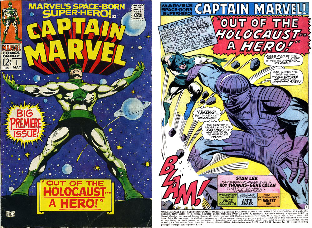
MARVEL COMICS MIGHT HAVE OWNED THE NAME CAPTAIN MARVEL, but I'm not entirely sure writer Stan Lee quite knew what to do with the character, after publisher Martin Goodman insisted the superhero be added to the company's lineup. After writing the first appearance himself, with the ever-capable Gene Colan on art, he handed the reins over to Roy Thomas, for me an indication that Stan didn't have a great deal of faith or interest in the project.

The first appearance of Captain Marvel in Marvel Super-Heroes 12 was scripted by Stan Lee. With the second appearance, Roy Thomas took over as writer.

For the origin and background of Captain Mar-Vell, Stan drew on the concepts of the Kree, an alien race first mentioned in Fantastic Four 64 (Jul 1967). And in setting up the background for Mar-Vell's story, he fell back on one of his favourite devices, the three-way romantic triangle - The Captain, his love interest Medic Una and the dastardly commanding officer Colonel Yon-Rogg. 

There's not a great deal of plot in the first Captain Marvel story ... what there is is pretty well outlined in the above two pages.

The Captain's here to investigate the destruction of Kree Sentry 459 at the hands of the Fantastic Four, and if necessary, punish the guilty. But the Captain's presence inadvertently interferes with a missile test and within moments he has the US Army hunting him. He disguises himself as a human and registers at a nearby seedy motel under the name of "Marvel" ... and that's pretty much it. Make something of that, if you can, Roy Thomas.

There's a lot more going on in Roy Thomas' take on Captain Marvel - Mar-Vell gets a secret identity, we meet Carol Danvers and witness the return of Sentry 459.

And to be fair, Roy does a bit better than that. Though he has an expanded page count (increased to 20 from the previous issue's 15), he still manages to pack every page with action, plot advancement and menace ...

Colonel Yon-Rogg's enmity towards Mar-Vell accidentally becomes the means by which Captain Marvel acquires the human persona of Walter Lawson. Yon-Rogg tries to blast Mar-Vell with the Kree ship's laser cannon, only to destroy the light aircraft bringing Lawson to the US Army missile base to take up a post as head of research. Lawson is killed in the blast, allowing Mar-Vell to assume his identity. Entering the base as Lawson, Mar-Vell meets Carol Danvers, who will loom large in later iterations of the Captain Marvel saga. It's also revealed that the remains of Sentry 459 have been transported to the base from the Pacific island where it had its fatal encounter with The Fantastic Four.

The only thing I wasn't mad keen on was Paul Reinman's inking, ill-suited to Colan's punchy and atmospheric pencils and not a patch on Frank Giacoia's inks in the previous issue.

If you bought Marvel Super-Heroes 14 for the next episode of Captain Marvel, then you were destined for disappointment. You got an inventory Spider-Man story from Ross Andru and Bill Everett instead.

At the end of the instalment, there's the standard Next Issue blurb, telling us to expect more of the same in Marvel Super-Heroes 14 ... except that's not what we got. With the sudden and dramatic expansion of the Marvel line in the spring of 1968, Martin Goodman evidently felt that boosting Captain Marvel into his own title would further reinforce his claim to the character's name (and he was also looking to expand the comics line so he could get more money from the prospective new owner of Marvel, Marty Ackerman) ... so that's what happened. I've discussed the 1968 Marvel explosion elsewhere in this blog, so I won't go over the same ground again, but instead of putting the next Captain Marvel story in Marvel Super-Heroes, Goodman ordered Editor Stan Lee to prepare an additional title, Marvel's Space-Born Super-hero, Captain Marvel, which debuted on 8 Feb 1968, cover-dated May 1968, the same month that Iron Man and Sub-Mariner got their own titles.

Despite having a full two months to prepare Captain Marvel 1 (May 1968) for publication, the whole affair feels very rushed, both storywise and artwise.

Roy Thomas and Gene Colan continued the story started in Marvel Super-Heroes, though this time, Colan's pencils were inked by Vince Colletta, probably one of the least sympathetic inkers on Marvel's roster. But somehow, this time, there doesn't seem to be enough story the fill the 21 pages allocated to the last chapter of the story. Essentially, it mostly a battle against the Sentry, peppered with jump-the-shark lines like "He doesn't realise I modified my [jet] belt." and "I did indeed modify the uni-beam". There's also a quick scene back on the mother-ship where Medic Una tries and fails to escape her bonds, and in the latter half of the battle outside the missile base, Captain Mar-Vell once again meets Carol Danvers, the base's Head of Security.

Despite 16 pages out of the 21 pages being taken up with battle action, Roy Thomas still manages to squeeze in scenes with the two important female characters.

Needless to say, The Sentry is defeated, Mar-Vell is accepted as a hero and the title is on the schedule as a monthly. Given that Colan's art does looked awfully hurried , you have to wonder what issue 2 is going to look like.

Tick,tick,tick ... Mar-Vell must defeat the Super Skrull if he's to prevent his own nuclear briefcase from annihilating the US Army missile base and everyone on it.

Well, to be honest, it looked a lot like the previous issue. Vinnie Colletta was still there on inks, doing as little as he could get away with, but Roy Thomas was gamely trying to include more story and less fighting. The plot had the nosey night clerk from the motel "Walter Lawson" was staying at - the one who was snooping around in Mar-Vell's room and finding the standard-issue Kree attache case - deciding that he should turn the case over to the military. What he doesn't know is that in fiddling with the case, he's armed a nuclear device that will destroy everything in a ten mile radius within two hours. Meanwhile, the Skrulls are wondering what a high-profile Kree warrior like Mar-Vell is doing on a backwater planet like Earth, and despatch the Super-Skrull to find out. Yes, you guessed it ... the Super-Skull tries to force Mar-Vell to explain himself, preventing our hero from disarming the nuclear explosive in his attache case. So Roy wasn't altogether unsuccessful here. Penciller Gene Colan does some great action sequences, but there's a lot of three and four-panel pages, to stretch the still rather thin material out to 20 pages.

Mar-Vell finally defeats the Super-Skrull by using the same method Mr Fantastic used in FF2 ... (spoiler alert!) he hypnotises the alien into forgetting who he is ...

Captain Marvel 3 (Jul 1968) has more of the same ... capturing Mar-Vell, the Super-Skrull takes his prisoner to his Skrull ship and tries to extract the secret of Mar-Vell's mission - though it's little more than a three-page recap of the previous chapters of the Kree warrior's story. But Mar-Vell breaks free and leads his enemy up to the edge of Earth's atmosphere, where Mar-Vell's jet-belt begins to fail. Thinking his foe doomed, the Super-Skrull returns to Earth to recover Mar-Vell's attache case (remember that?), while Mar-Vell manages to reach the invisible Kree ship. There's some more obligatory argy-bargy with the mean Yon-Rogg, then Mar-Vell wins permission to return to Earth and beat down on the Super-Skrull some more.

Captain Marvel finally defeats the Super-Skrull - using the time-worm hypnosis trick -and disarms his nuclear briefcase. And that's it for another month.

The following month, in Captain Marvel 4, our hero finds himself trapped in an almost identical plot, except this time the one preventing him from saving the Earth is Prince Namor, the Sub-Mariner.

My guess is that at the beginning of the Captain Marvel run, Stan had mandated that he battle a few established Marvel characters first to help with sales and to show the readers where in the power pecking-order Mar-Vell stood ...

Namor is on his way to seek help tracking down his enemy Destiny from, of all people, Reed Richards (see Sub-Mariner 3, Jul 1968). At the same time, a test missile is being launched from the base where Mar-Vell poses as Dr Walter Lawson. The missile will carry bacteria into orbit to test their resilience to cosmic rays. But the missile goes off-course and crashlands in the sea close to New York. Mar-Vell hurries to destroy the payload before all of New York is drenched in deadly microbes, and The Sub-Mariner sort of gets in the way.

These last few issues have seemed a bit "by-the-numbers", as though Thomas and Colan were just trying to get a task off their to-do list as quickly as possible. I suspect Stan Lee may have mapped out the course for the first few issues, which Thomas just had to follow. Likewise, it's far from Colan's best work. Compare what he was doing over on Daredevil at the same time (issue 43 came out the same month as CM4) and it's a very different kettle of artwork. And adding to the pressure was the 25 pages of artwork Colan turned in for the Madame Medusa story in Marvel Super-Heroes 15 (Jul 1968). Colan had already dropped Iron Man from his workload a couple of months earlier, and Captain Marvel 4 would be his last issue. The following month he'd take over Doctor Strange from Dan Adkins and that was an assignment that really played to Colan's strengths. Besides, it would have sublime Tom Palmer inking.

Just some of the highlights of Drake's stint at DC ... the Jerry Lewis comic with camp counsellors as Nazis caused less furore than you might imagine.

Captain Marvel was not to be stopped, though. Issue 5 came with a change of personnel. The scripting was assumed by Arnold Drake, who'd toiled for 15 years at DC on strips like Challengers of the Unknown, Bob Hope, Jerry Lewis and most notably Doom Patrol. It was Drake who had confronted Irwin Donenfeld back in the early 1960s, when Marvel was making inroads on DC's sales. Drake had tried to explain to the DC Editorial Director that times were changing and so were the comic audiences. DC needed to change with them if they were going to complete with Marvel Comics. The DC management still weren't listening as Marvel Comics overtook them in sales, and Drake left DC - quit or was shoved, accounts vary - and started working for Marvel around the beginning of 1968.

On paper, Drake probably looked like a good fit to Stan, who was in dire need of experienced writers to help with Marvel's virtually doubled-overnight output. But as I noted in my earlier piece, Drake had realised that Marvel were doing something right, but he struggled to articulate exactly what that was. "Pitch the books at an older readership" is a manifesto, not an instruction manual.

Experienced though Arnold Drake was, he couldn't quite put his (typing) finger on the authentic-sounding Marvel "tone", and as a result, his third scripting job under Stan's editorship rings a little bland.

So it's not surprising to me that Captain Marvel 5 (Sep 1968) could easily have been published by DC. I mean, there's nothing wrong with it ... the story moves along and the dialogue is serviceable, if a little ponderous in places, like a not-very-good pastiche of Stan's writing. But Drake is just finding his feet here - this is his third script for Marvel after Captain Savage 5 and X-Men 47 - so it wouldn't be fair to be too harsh, at this point.

On the other hand, the Don Heck art job was extremely serviceable. At this point in Marvel's history, poor Don had been abandoned to a certain extent. After losing his regular Avengers gig to John Buscema with issue 40 (May 1967), probably under the pretext that he had the 54 pages of Avengers Annual 1 (Sep 1967) to pencil. He returned to Avengers for a fill-in on issue 45 (Oct 1967) and was then assigned to X-Men, one of Marvel's poorest selling titles, from 37 - 55. We know this because when Marvel managed to hire Neal Adams, he asked Stan, "which is your worst selling title?" ... and when Stan said, "X-Men", Adams said, "I'll draw that, then." When Adams took over X-Men, Heck was left with pencilling Amazing Spider-Man 57-64 & 66 (Feb - Nov 1968) over John Romita layouts, Captain Marvel (reassigned to Gil Kane with issue 17, Oct 1969), Captain Savage (reassigned with issue 17, Nov 1969). It's almost as if someone had decided that Heck's services were no longer needed at Marvel. So by the end of 1969, Heck would pack up his pencil and head off to DC where he was better appreciated, drawing great female characters like Batgirl, Rose & Thorn and Wonder Woman.

The monsters come thick and fast in Captain Marvel 6 ... it reads a little like Drake delivered a story synopsis front-loaded with too much story and Stan added the action sequence to kick things off.

The following month, Captain Marvel 6 (Oct 1968) gave us not one, but two monsters of the month, behind the Don Heck cover. The first was featured in a spurious action sequence opener for the issue where Mar-Vell battled a simulated monster in a Kree virtual battle exercise. The second is the solar energy generated Solam, and energy beast created by a visiting scientist's ill-considered "tampering with the unknown" style experiment. Captain Marvel defeats the second monster by over-feeding it with energy, a tactic that's been used before in the Marvel Universe ... a No-Prize for the first reader who can identify where.

Captain Marvel's persistent thwarting of evil Yon-Rogg's plan are a bit more interesting than the battle with the obligatory monster ... this month, Quasimodo.

Captain Marvel 7 (Nov 1968) cover-starred Quasimodo (last seen battling the Silver Surfer in Fantastic Four Annual 5 (Nov 1967) drawn by John Romita, but Drake's script brought a bit more of Mar-Vell's melodrama to the proceedings. First, Captain Marvel faces the accusations of Yon-Rogg (again) for helping the Earthlings defeat last issue's Monster-of-the-Month. Yet, even Ronan the Accuser is unable to make the charges stick. Next up, Yon-Rogg, tiring of Carol Danvers' ongoing investigation of "Walter Lawson" resolves to disintegrate her with a blast of cosmic rays from his ship's cannons ... but Mar-Vell contrives to save her. The rest of the issue has Mar-Vell battle Quasimodo and thwart Yon-Rogg's orders to wipe out a random Earth community with a deadly virus, by appearing to "kill" Quasimodo's humanoid robots with the bacterial sample ...

This was the first issue where I felt that Drake was daring to develop the characters and the backstory a bit ... exposing the real Walter Lawson as a bit of a shady character. Nice to see Gene Colan back on the cover art.

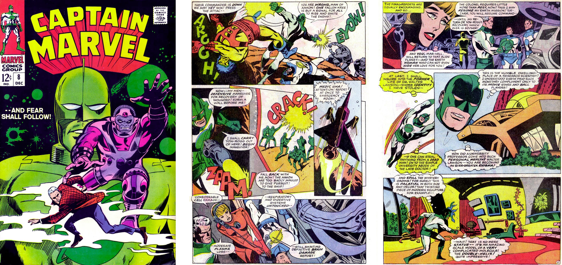
Captain Marvel 8 (Dec 1968) opens with a battle between an interloping alien species called The Aarak and Yon-Rogg's Kree expeditionary force. Though Yon-Rogg is wounded in the battle and is recovered by Captain Mar-Vell, he shows little gratitude, relentlessly pursuing his vendetta against his junior officer. After the battle, Mar-Vell returns to Earth and begins to investigate the life of the Earth man he's impersonating, Dr Walter Lawson. Lawson's home is more lavish than a research scientist could aspire to. And beneath the house, Captain Marvel discovers an extensive and well-equipped laboratory. The evidence suggests Lawson had created a large robot, though for what purpose is not disclosed. The mystery deepens when two costumed gunmen enter Lawson's home and start shooting at Captain Marvel. It appears that Lawson had created the robot for some criminal organisation and now the murderous machine is on the loose, cuing up yet another battle between Captain Marvel and a monster. Inevitably, a five-page battle ensues and Captain Marvell apparently destroys the giant robot

Last issue the giant robot didn't seen to have a name, being referred to as "robot" or "cyberton" This time out, he calls himself "Cyberex" and everyone else follows suit. Sounds like an editorial correction to me. And another nice Colan cover.

But we're not done with the Aakon - or the robot - yet ... they're all back in the following issue. And because of Yon-Rogg's reckless attack, a retaliation by the Aakon threatens to expose Mar-Vell's Kree mission on Earth. So, here's an abbreviated version of the plot ... Carol Danvers goes snooping around "Walter Lawson's" motel room. The giant robot turns up and takes her as bait for "Lawson". The robot reveals that Lawson is not his creator. Inexplicably. Captain Marvel knows that the robot is holding Carol captive and rushes to rescue her. Yon-Rogg remotely activates Mar-Vell's wrist monitor so the Aakon know where he is ... and of course they attack. Cue the three-way battle between Captain Marvel, the Aakon and the giant robot (who now calls himself Cyberex) lasting a slightly excessive nine pages. It's all a bit humorless and po-faced. I'm not getting the sense, here, that Arnold Drake was able to grasp what it was that made Stan's scripts so memorable. Interestingly, that issue's Bullpen Bulletins bigs up the new Marvel scripters, Archie Goodwin and Arnold Drake. Stan (or maybe Roy) even touts some forthcoming work by Atlas veteran Ernie Hart. In the end that turns out to be the solitary dialoguing job Hart did on Nick Fury 8 (Jan 1969), before disappearing from Marvel for the final time.

Captain Marvel 10 plods its way through Arnold Drake's plot. But Heck delivers some nice work here. I really like his layout on page 10.

In Captain Marvel 10 (Feb 1969), we begin to learn a bit more about The Organisation, the criminal outfit that sent the Cyberex robot after "Walter Lawson", and its leader, Number One. Mar-Vell, too, is destined to discover more about his underhanded foes, as Ronan the Accuser orders him to gather information on The Organisation in case The Kree have to "deal with" them one day. However, The Organisation captures Carol Danvers and invites "Walter Lawson" to surrender to them. Captain Marvel goes in his place and initially pretends to be interested in an alliance, but slips a gas capsule to Carol that she can use to escape. Then all heck breaks loose and Mar-Vell finds himself facing an aging ray, apparently created by the real Lawson. Mar-Vell turns the ray on The Organisation and pretty much cleans their clock. But there's unexpected fallout from his victory. Yon-Rogg orders Captain Marvel's immediate execution.

And that pretty much closes the door on The Organisation, a kind of bargain-basement AIM, without the interesting bee-keeper outfits. I wasn't terribly sorry to see the back of them. I was a bit sorry to see Heck leave the book, though ...

Why the Barry Smith cover and the rushed Dick Ayers interior art? I'd speculate that the inexperienced Barry was supposed to do the insides but ran into scheduling problems and Ayers had to bail Marvel out. But pure guesswork on my part.

Captain Marvel 11 (Mar 1969) sported an interesting Barry Smith cover, one of his first works at Marvel. Channelling Kirby, Smith's art is is even more extreme, and it might have been more interesting if Smith had drawn the interior art. But what we got was a very rushed-looking Dick Ayers pencil job, not helped by Vinnie Colletta's usual slapdash inking. Arnold Drake's script takes Mar-Vell in a completely new direction. I don't know what went on behind the scenes. Perhaps sales weren't all that Stan was hoping for, but with this issue Drake brings in some sweeping changes. He kills off Medic Una, which I think was for the best. That storyline wasn't going anywhere. He also gets rid of Mar-Vell's weapon, the Uni-Beam, and gives our hero actual superpowers - through the agency of Zo and his conveniently lovely gaggle of handmaidens.

The way in which Captain Marvel gets a makeover is all a bit contrived ... can it be a coincidence that "Zo" is Oz backwards? Pay no attention to that man behind the curtain ...

The catch is that going forward, Captain Marvel will become a tool of the alien intelligence Zo and that may or may not involve some tough moral choices ... but I'm getting ahead of myself.

A hugely better art job from Dick Ayers in Captain Marvel 12, almost as if he's trying to blot out reader's memories of last month's lacklustre art, but the pace of Arnold Drake's storytelling is glacial.

So, as Captain Marvel 12 (Apr 1969) gets under way, Mar-Vell returns to Earth and tries to resume his Walter Lawson identity. I'm not sure why, as he's no longer under any obligation to carry out his Kree mission. And posing as Walter Lawson won't conceal his presence from Yon-Rogg .. but as "Lawson" returns to the missile base a plastic robot, The Manslayer, attacks and Captain Marvel ventures forward to defend the base. In another location, Natasha Romanova, The Black Widow, is stalking the controller of the robot, presumably on a SHIELD mission. Though The Widow manages to stop the robot, she's captured by the bad guy controlling the robot, to be held as a hostage against some future threat.

This would be the last issue from Arnold Drake and Dick Ayers. In fact, shortly after this, Drake would finish up his run of Captain Savage, with issue 16 (Sep 1969), pack up his typewriter and move over to Gold Key. It wasn't a memorable run, and I don't think Drake ever really understood the Marvel way of doing things.

Arnold Drake: 1 Mar 1924 - 12 Mar 2007

Drake would spend the rest of his comics career writing a variety of titles for Gold Key, contributing a long and memorable run on Little Lulu, and even returning to DC where he scripted Phantom Stranger and wrote a few stories to DC's war titles, most notably Weird War Tales. Drake had pretty much retired from comics around 1985, and died in 2007 after a short battle with pneumonia.

But that wasn't the end of Captain Marvel's publishing troubles. Marvel Comics would continue to struggle to find a strong commercial direction for Mar-Vell, and I'll be looking at the rest of his rocky early progress in the next instalment of this blog.

Next: A superhero in search of a USP