It's fairly well-documented that Goodman was never a creative thinker, and mostly ordered Stan Lee to follow whatever trend seemed to be the most popular at the time. With the waning of the wartime superhero craze, Goodman wound down publication of his costumed characters, and began to look for other subjects for his line of comic books.
When his former employees Joe Simon and Jack Kirby had a massive success with Young Romance in 1947, Goodman instructed Stan Lee to come up with some romance books and was soon publishing My Romance.
 |
| The first issue of Joe Simon and Jack Kirby's ground-breaking love comic, Young Romance. Within a few months, Marty Goodman had his My Romance on the news stands - no coincidence there then ... |
 |
| The earliest Marvel romance titles used photos for covers, maybe in an effort to distance them from Simon & Kirby's love comics, but they very quickly reverted to using comic book style line art. |
 |
| As the superhero comics of the war years waned in popularity, Marvel publisher Marty Goodman started to look for other genres to exploit. Horror was doing well over at EC, so ... |
 |
| The early fifties saw a huge boom in horror comics, so though Marvel hadn't been able to turn Captain America into a successful horror title (like that was ever going to work), it didn't mean Goodman was going to give up. |
 |
| After the body blow to sales dealt by the introduction of the Comics Code Authority, Goodman had to come up with something else that would sell comics ... |
Kaiju is a reference to the popular Japanese genre of giant monsters which threaten civilisation - most famously Godzilla (Gojira, in the original 1954 Japanese movie). Godzilla had been released in the United States in 1956, with expository scenes starring Raymond Burr as a heroic reporter spliced in to the US prints to give Stateside audiences someone to identify with. Remember, WWII was still a little too recent to expect audiences to warm to Japanese heroes battling the monster.
 |
| ... the Godzilla movie had been pretty popular with the kids, so ... |
 |
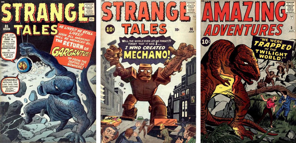
| The only trouble was, not enough titles to put giant monsters in. No problem, Goodman just launched Tales to Astonish and Tales of Suspense in 1959 - he added Amazing Adventures in 1960. |
 |
| If one superhero in a comic sold well, several heroes in a single book would sell better. Once DC had proved it with Justice League of America, Marty Goodman told Stan Lee to come up with a superhero team book starring Captain America, Sub-Mariner and The Human Torch ... only The Torch made it to the final cut. |
But in 1961, Stan was getting fidgety. In his autobiography, Excelsior, he admits that he'd had enough of simply putting out whatever genre of comics Goodman thought was going to be the next big thing. After repeating the same cycle for 15 years, Atlas/Marvel never did strike it big. Lee points out that no matter what type of books they published, the sales stayed pretty level.
In the end, rather than quitting, Lee decided he'd give Goodman what he wanted, but Stan would write it his own way. If Goodman fired him, so what? He was itching to leave, anyway.
WHAT'S IN A BRAND MARK?
While rival companies made a point of ensuring their branding was all over their comics - DC had their distinctive roundal, Fawcett had their triangular shield - Goodman's company struggled to find an identity. |
| The DC Comics emblem survived right through to the 1970s with no more than minor alterations. The Fawcett logo appeared on their earliest comics but sort of fizzled out. The Fiction House trademark was small and surprisingly similar to the DC one. |
The other thing that DC got right was branding all their anthology comics with a distinctive cover device. That way they could feature say Hawkman on the cover of Flash Comics, but add an insert of The Flash, so the reader would know that there were other characters in the book as well.
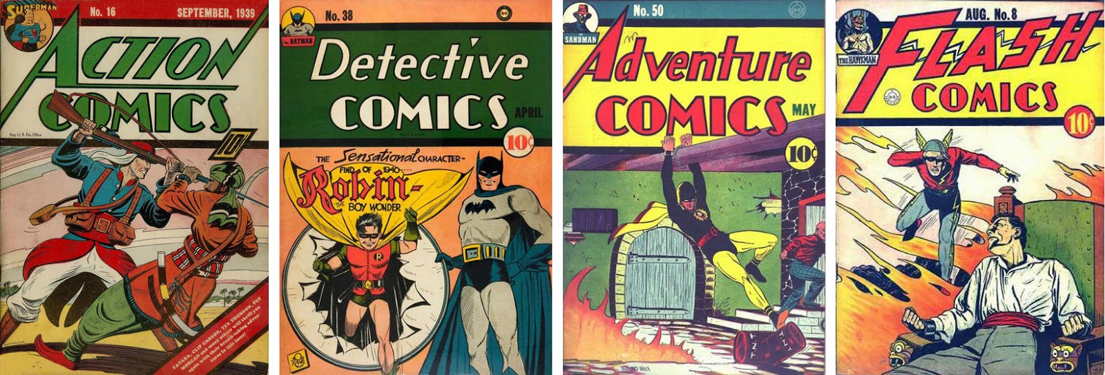 |
| The very first DC comic to feature this neat idea was Action Comics 16, even though this made more sense for the other anthology titles which didn't feature their top character on every cover. |
 |
| The last DC comics to feature this identifying tag were the December 1948 issues. |
 |
| There was no obvious way to tell these comics were all published by the same company. Maybe Marty Goodman wanted it that way, as each title was owned by a shell company. |
 |
| The turn-back motif did at least identify these comics as being "A Marvel Magazine", but it only lasted for two months towards the end of 1946. Not exactly a full-on marketing campaign. |
 |
| The Marvel roundal device made it first appearance towards the end of the comics boom. By 1948, publishers were seeing their sales decline sharply. They needed the new ideas that would arrive with the 1950s. |
 |
| There may have been earlier appearances of the Atlas insignia than Captain America 36, but I couldn't find them. All Marvel comics from November 1951 to September 1956 carried the more common b&w Atlas seal. |
MARVEL COMICS - THE MAKING OF A BRAND
After Atlas, Marvel floundered for a while. There was no clear direction for the eight titles a month Goodman was allowed to publish by DC's Jack Liebowitz. Stan Lee had an idea to build his line around the undoubted talents of artist Joe Maneely, and launched two new series featuring his art - Black Knight and Yellow Claw. But between the Atlas implosion of 1957 and his star artist's tragic and unexpected death in 1958, it wasn't to be. By the time Lee was able to regroup and start building a cohesive line of comics, it was already 1959, and his two new star talents were Jack Kirby and Steve Ditko. Taking the giant monster stories as a jumping off point, Lee had another try a creating a cohesive line of comics.When he put the continuing character Dr Droom in Amazing Adventures 1 (Aug 1960), he must have nursed the thought that ongoing characters are the way to gain and retain readers. Sneaking Dr Droom in under Marty Goodman's radar was Lee's first faltering step once again to attempt some of the ideas he'd tried out a couple of times already. At this point, the Marvel covers carried only the "IND" identification to let retailers know the books were distributed by Independent News Distributors. Then, around the middle of 1961, a small box with the letters "MC" began appearing on the covers.
 |
| The MC box started appearing on Marvel covers with no fanfare whatsoever. Obviously, it stood for Marvel Comics, but you'd only know that in retrospect. |
Nothing much changed for next year or so, except that the cover price went up to 12c in February 1962. DC's prices had risen with their December 1961 cover dated issues, but Marvel's were dated two months ahead of DC's so in reality the two companies increased their cover price at the same time - given that they were both distributed by the DC-owned Independent News, it can hardly have been a coincidence.
Then finally, with the April and May 1963 cover-dated comics, Lee revealed the meaning of the "MC" insignia. Every title in his line suddenly sported a distinctive box in the top left of the cover with the company name - "Marvel Comics Group" - and the cover price. But this wasn't about showing readers the star of the comic, like the DC cover device of the 1940s. This was very consciously demonstrating to customers that they were looking at a Marvel Comic.
On its own, this wasn't an especially seismic change, but coupled with the introduction of letters pages which rapidly evolved to showcase Stan Lee's casual, friendly style, and the introduction of cool and funny catchphrases, it added up to a major, and very deliberate, re-branding exercise.
 |
| Stan Lee started branding the Marvel range in earnest when he had Steve Ditko design the distinctive corner emblem that appeared on all Marvel Comics from the April 1963 issue onwards. |

|
Jack Kirby replaced the Ditko image of Thor on Journey into Mystery as soon as he reasonably could.
|
 |
| The first Strange Tales corner emblem featured a Human Torch illo by Ditko, but the following month a different image by Kirby I think, replaced it. |
Stan's rationale probably seemed sound at the time. "Pop Art" was the collective name for an immensely influential cultural movement during the 1950s and 1960s, which was having a revolutionary effect on both fine art and popular media. Art and entertainment were no longer the domain of serious-faced mature adults. Youth was a rising force in the world of creative media and Art was taking itself a little less seriously.
 |
| Lichtenstein's "Whaam!" cynically stole an Irv Novick panel from All-American Men of War 89 and passed it off as fine art. DC, nor Novick, ever saw a penny of the millions of dollars the painting sold for. Around the same time, Andy Warhol was offering Campbell's soup as art. |
 |
| The Marvel Pop Art Productions debacle started in September 1965 and lasted just four months. |
 |
| The howls of outraged Marvel fans caused Stan Lee to roll back to Marvel Comics Group. |
 |
| Two early costume changers were Iron Man and Daredevil ... so their corner boxes had to change, too. |
 |
| Of the anthology titles, the Tales of Suspense corner box was the one that changed least. |
 |
| The Strange Tales corner box underwent quite a few changes in the early Sixties but was consistent for the last part of the decade. |
 |
| Tales to Astonish was the most changeable of the anthology titles, with probably the most artists involved. |
 |
| The changing face(s) of the Tales to Astonish corner box. |
 |
| This montage was drawn by Jack Kirby during 1965 and was published in the January 1966 of Esquire magazine. The Sub-Mariner figure is unmistakably the same as that used in the Tales to Astonish 92 corner box, though it looks to have bee re-drawn for its later appearance, or possibly re-inked by a better inker. |
 |
| Adding the comic's title to the corner box and moving the price, issue and date to the top tends to indicate that Stan was trying to reach a wider audience than he'd previously enjoyed. |
This was a bit of a shame, because it seemed to me that Stan was abandoning his core idea of making Marvel feel like a club, where insiders were in the know, privy to the in-jokes, part of a tribe. Maybe as sales rose and the company became more successful, he was just under pressure to be more of a corporation and less of a fan club. But like it or not, corporatisation was coming to Marvel.
Just a few months later, a tiny but crucial alteration marked a major change in Marvel's fortunes. The IND distributors' mark, signifying the DC-owned Independent News Distribution deal that had so constrained Marvel's output over the previous ten years, was replaced with CCC, for Curtis Circulation Company. As part of the PF&CC deal Marvel was no longer restricted to a handful of titles and could begin the expansion that would unleash a tidal wave of titles over the next couple of years and establish Marvel as the undisputed brand leader in the comics market.
And with that expansion came the inevitable dilution of the brand. Even though he was still credited in all the comics as Editor, Stan was having less and less to do with the day-to-day running of the comics. Because of this, it's hard to say how much he had to do with the plan to make all Marvel titles 52-pagers and raise the cover price from 15c to 25c across the board. That resulted in - among other things - the complete revision of the cover format and the loss of the defining Marvel Corner Box, that had been the company's unique identifier for the previous ten years. Now the star of the comic just floated in the top left of the cover looking, if truth be told, a little lost.
 |
| The corner box evolved, went and returned in the decade from 1971 to 1981. |
But these and other minor changes aside, the corner box survived until 2001 ... not bad for a device that began in 1963. And even today, the corner box makes infrequent guest appearances, see for example X-Men 476, 529 and 536.
It's a testament to the marketing savvy of Stan Lee that the most minor additions to the overall branding of Marvel Comics resonated so strongly with the readers that even years after he left, his legacy continues to shape the company he built from nothing.
Next: The sincerest form of flattery
Regarding that Thor corner illustration, Al, which you say is by Ditko: I'm going by your pic as I can't be bothered digging out my comics to check a larger image, but could it have been drawn by Kirby and only inked by Ditko? The hair looks more like Jack would draw it than Steve, although it's definitely the latter's inking style.
ReplyDeleteYou might be right, Kid. Your eye is probably better than mine. We could try asking Nick Caputo, he's usually pretty good with stuff like that ...
DeleteAlso, the smile is almost identical to Reed Richard's in the FF corner box. You're right - Nick's bound to know for sure,
DeleteAnd I'm finally here! First, I loved the discussion of the genesis of the corner box, since, as you know, I obsess over such minutiae on my blog. While reading I was thinking that Kirby actually drew all the corner boxes himself, with the exception of Spidey and Dr. Strange. The Thor and other head shots look like they were both penciled and inked by Kirby, probably very quickly. Compare the Thor face with the inking on the cover of Journey into Mystery # 92, which I believe to be an instance of Kirby inking. The lines on the helmet and hair are the same style. Kirby also drew the second Dr. Strange figure, although I'm not sure if he inked it. That may be Brodsky inks. As far as the revolving Tales to Astonish faces: # 80-Colan/Kirby; # 82, Colan/Everett; # 87 both Everett; # 88, Everett/Kane; # 90, Kane/Kirby; # 92, Colan/Kirby (sheesh!).
ReplyDeleteThe addition of the title at the top didn't bother me; this was likely designed so that the comics were easy to identify for kids and dealers, particularly on spinner racks that obscured much of the cover. I never really liked the change to the MCG banner and the floating characters. The design never worked, and although it appeared the initial idea in creating a box that encased the artwork was intended to separate copy from art it was rarely followed up on, as word balloons invaded that part of the cover as well. All in all the Marvel cover design exemplified circa 1962-1970 was pleasing to the eye and caught the attention of the buying public.
Thanks for the additional info, Nick ... glad you're here. For what it's worth, I've figured out where the full-figure Sub-Mariner shot on Tales to Astonish comes from, so I'll add that to the blog when I get a moment.
DeleteBoth the original Thor and FF corner boxes look to me very much like Ditko. Ditko draws very distinctive mouths. Which makes sense, since he designed the corner box in the first place.
ReplyDeleteIt's interesting that Marvel's stock-in-trade in the early '60s was kaiju monsters, and they even put a giant monster on the cover of FF#1.
Like you, Iggy, I also think the Thor corner box looks like Ditko's work, but esteemed expert Nick Caputo credits it to Kirby. I guess we'll never know for sure, but I really enjoy discussing and dissecting this kind of trivia ...
DeleteThis is a really enjoyable and informative post... thanks very much!
ReplyDeleteJust one thing I want to discuss:
The Lichtenstein painting Whaam! is based on three different panels from two different issues of All American Men At War, one by Irv Novick, one by Jerry Grandenetti, and one by Russ Heath. Paul Gravett has full details here: http://www.paulgravett.com/articles/article/the_principality_of_lichtenstein
Also, Whaam! never sold for millions. The Tate Gallery in Britain bought it in 1966 for about $6,000. I know Russ Heath did a comic strip about it a few years back which mentions some figure in the millions. He is thinking of some other painting. Some Lichtensteins have sold for large sums, especially after the artist’s death in 1997.
Thanks for the corrections and additional info , Guy.
DeleteIs the corner box a registrated trademark?
ReplyDeleteI have seen some vert similar in some Archie Comics titles. Can any other co.pany use the corner box?
I don't think you can copyright or trademark a design concept. The only way Marvel could defend an infringement is by claiming the offender was "passing off" ... that is, trying to fool the customers that they were buying a Marvel comic by making their design so similar it was misleading customers.
DeleteLoved the description of the early branding of Marvel.
Delete