Showing posts with label corner emblem. Show all posts

Friday, 7 March 2014

Visual merchandising of a brand

DURING THE 1950s, Marty Goodman's Marvel Comics were published under the Atlas trademark, though this was in reality the name of Goodman's own distribution company. During this time, he also put out a wide range of detective, movie and men's magazines, and considered the comics as no more than a mildly lucrative sideline, leaving most of the day-to-day decisions to his nephew-by-marriage and editor, Stan Lee.

It's fairly well-documented that Goodman was never a creative thinker, and mostly ordered Stan Lee to follow whatever trend seemed to be the most popular at the time. With the waning of the wartime superhero craze, Goodman wound down publication of his costumed characters, and began to look for other subjects for his line of comic books.

When his former employees Joe Simon and Jack Kirby had a massive success with Young Romance in 1947, Goodman instructed Stan Lee to come up with some romance books and was soon publishing My Romance.

The first issue of Joe Simon and Jack Kirby's ground-breaking love comic, Young Romance. Within a few months, Marty Goodman had his My Romance on the news stands - no coincidence there then ...
That My Romance lasted just three issues didn't seem to phase Goodman at all and he'd soon replaced it with Love Romances, My Own Romance, Romance Diary, Romance Tales and even Cowboy Romances. And in the interests of giving Love an equal chance, there was Best Love, Love Adventures, Love Classics, Love Drama, Love Secrets, Love Trails, Loveland, Lovers, My Love, Our Love and even Rangeland Love. And that was just the titles launched in 1948-49.

The earliest Marvel romance titles used photos for covers, maybe in an effort to distance them from
Simon & Kirby's love comics, but they very quickly reverted to using comic book style line art.
Then, with the rising success of EC Comics, Goodman saw horror as a looming trend and turned his ailing Captain America title into Captain America's Weird Tales.

As the superhero comics of the war years waned in popularity, Marvel publisher Marty Goodman
started to look for other genres to exploit. Horror was doing well over at EC, so ...
Undeterred by the cancellation of his first horror comic after two issues, he launched even more horror comics including:  Adventures into Terror, Adventures into Weird Worlds, Astonishing, Journey into Unknown Worlds, Marvel Tales (repurposed as a horror comic from the superhero title Marvel Mystery Comics), Mystic, Spellbound, Strange Tales, Suspense and Uncanny Tales.

The early fifties saw a huge boom in horror comics, so though Marvel hadn't been able to turn Captain America into a successful horror title (like that was ever going to work), it didn't mean Goodman was going to give up.
The weirdest trend-following by Marty Goodman came much later in the 1950s, when he launched a range of comics that offered tales of giant monsters. Some of his established horror titles switched to telling stories about oddly named creatures like "Taboo" and "Monstro". 

After the body blow to sales dealt by the introduction of the Comics Code Authority,
Goodman had to come up with something else that would sell comics ... 
I had always thought this had been something to do with incoming artist Jack Kirby, who had burnt all his bridges at most other comic publishers, notably DC, and really had no place else to go. I had figured that the giant monster genre was invented by Kirby as a way to get horror material published under the noses of the notoriously stringent Comics Code Authority. But after seeing a mention of "kaiju" monsters under Marty Goodman's Wikipedia entry, I began to wonder if this wasn't another of Goodman's "creative" edicts, handed down to editor Stan Lee.

Kaiju is a reference to the popular Japanese genre of giant monsters which threaten civilisation - most famously Godzilla (Gojira, in the original 1954 Japanese movie). Godzilla had been released in the United States in 1956, with expository scenes starring Raymond Burr as a heroic reporter spliced in to the US prints to give Stateside audiences someone to identify with. Remember, WWII was still a little too recent to expect audiences to warm to Japanese heroes battling the monster.

... the Godzilla movie had been pretty popular with the kids, so ...
The movie was a huge hit, so it makes sense, given the history, that Goodman would have instructed Lee to follow this new trend and insert giant monsters in as many books as possible. At this point he didn't listen to Stan Lee's opinions, so he certainly wouldn't have listened to freelancer Kirby's ideas. 

The only trouble was, not enough titles to put giant monsters in. No problem, Goodman just launched Tales to Astonish and Tales of Suspense in 1959 - he added Amazing Adventures in 1960.
Which leads us right up to 1961 and the now-familiar story of Marty Goodman playing golf with Jack Liebowitz of DC Comics - the arch-rival he was forced to do business with to get his comics distributed to the newsstands - and, upon hearing how well Liebowitz was doing with his Justice League of America title, Goodman rushing back to the office to tell Lee to start prepping a superhero team book to cash-in on DC's success.

If one superhero in a comic sold well, several heroes in a single book would sell better. Once DC had proved it with Justice League of America, Marty Goodman told Stan Lee to come up with a superhero team book starring Captain America, Sub-Mariner and The Human Torch ... only The Torch made it to the final cut.
So ... my point here is that all through the late 1940s and 1950s, Marty Goodman was very much a hands-on Publisher, instructing his editor Stan Lee to put out the types of books Goodman thought would sell, because the subject matter already had a proven track record.

But in 1961, Stan was getting fidgety. In his autobiography, Excelsior, he admits that he'd had enough of simply putting out whatever genre of comics Goodman thought was going to be the next big thing. After repeating the same cycle for 15 years, Atlas/Marvel never did strike it big. Lee points out that no matter what type of books they published, the sales stayed pretty level.

In the end, rather than quitting, Lee decided he'd give Goodman what he wanted, but Stan would write it his own way. If Goodman fired him, so what? He was itching to leave, anyway.


WHAT'S IN A BRAND MARK?

While rival companies made a point of ensuring their branding was all over their comics - DC had their distinctive roundal, Fawcett had their triangular shield - Goodman's company struggled to find an identity.

The DC Comics emblem survived right through to the 1970s with no more than minor alterations. The Fawcett logo appeared on their earliest comics but sort of fizzled out. The Fiction House trademark was small and surprisingly similar to the DC one.
The main problem was the company never really knew what to call itself. Marty Goodman had a sneaky way of publishing every comic through a shell company, so Captain America was technically published first by "Timely Comics" then later by "Complete Photo Story Corp", USA Comics was published by "USA Comic Magazine Corp" and Marvel Mystery Comics was initially credited to "Timely Comics", then later to "Marvel Comics Inc".

The other thing that DC got right was branding all their anthology comics with a distinctive cover device. That way they could feature say Hawkman on the cover of Flash Comics, but add an insert of The Flash, so the reader would know that there were other characters in the book as well. 
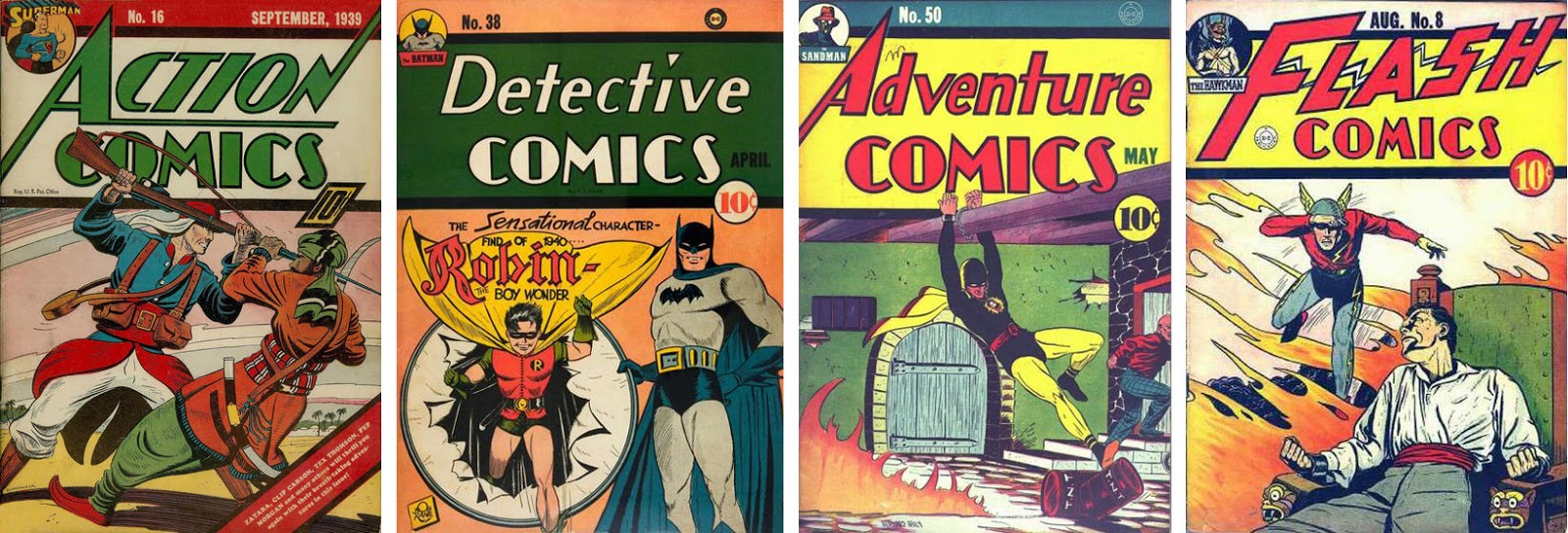
The very first DC comic to feature this neat idea was Action Comics 16, even though this made more sense for the other anthology titles which didn't feature their top character on every cover.
This graphic device must have worked for them, as DC stuck to this branding from 1939 all the way through to 1948, when the fortunes of all comics, DC included, began to wane.

The last DC comics to feature this identifying tag were the December 1948 issues.
Timely - as Marvel was known at the beginning of the 1940s - didn't put anything on the covers to tell the reader which company had published the comic.

There was no obvious way to tell these comics were all published by the same company. Maybe Marty Goodman wanted it that way, as each title was owned by a shell company.
Then, very late in the comics game, for a few months in 1946, Marvel made a cursory attempt to brand their comics, by including a "fold-back" device in the top right corner of the cover, but this lasted just a couple of issues. You might wonder if this wasn't Stan's idea, that Goodman squashed as soon as he saw it. As history played out, this seems a reasonable speculation.

The turn-back motif did at least identify these comics as being "A Marvel Magazine", but it only lasted for two months towards the end of 1946. Not exactly a full-on marketing campaign.
The most distinctive attempt at branding was a kind of colour version of the DC roundal, which lasted for the final eighteen months or so of Marvel's 1940's output.

The Marvel roundal device made it first appearance towards the end of the comics boom. By 1948, publishers were seeing their sales decline sharply. They needed the new ideas that would arrive with the 1950s.
Very shortly after this, Goodman took to putting the logo of his distribution company, Atlas, on the covers of his comics - though the Atlas emblem had appeared on Marvel comics as early as 1944, on the cover of Captain America Comics 36.

There may have been earlier appearances of the Atlas insignia than Captain America 36, but I couldn't find them. All Marvel comics from November 1951 to September 1956 carried the more common b&w Atlas seal.
Then came the crash of Atlas and the distribution woes that I detailed in the blogpost, "Why were Silver Age Marvels so much better than Silver Age DCs?" Overnight, the Atlas trademark disappeared, the range of titles was slashed by 70%, and the company went from being one of the largest publishers of comics to one of the smallest. This was the atmosphere when Stan Lee rightly decided he no longer had anything to lose and the media giant Marvel Comics was truly born.

MARVEL COMICS - THE MAKING OF A BRAND

After Atlas, Marvel floundered for a while. There was no clear direction for the eight titles a month Goodman was allowed to publish by DC's Jack Liebowitz. Stan Lee had an idea to build his line around the undoubted talents of artist Joe Maneely, and launched two new series featuring his art - Black Knight and Yellow Claw. But between the Atlas implosion of 1957 and his star artist's tragic and unexpected death in 1958, it wasn't to be. By the time Lee was able to regroup and start building a cohesive line of comics, it was already 1959, and his two new star talents were Jack Kirby and Steve Ditko. Taking the giant monster stories as a jumping off point, Lee had another try a creating a cohesive line of comics.

When he put the continuing character Dr Droom in Amazing Adventures 1 (Aug 1960), he must have nursed the thought that ongoing characters are the way to gain and retain readers. Sneaking Dr Droom in under Marty Goodman's radar was Lee's first faltering step once again to attempt some of the ideas he'd tried out a couple of times already. At this point, the Marvel covers carried only the "IND" identification to let retailers know the books were distributed by Independent News Distributors. Then, around the middle of 1961, a small box with the letters "MC" began appearing on the covers.
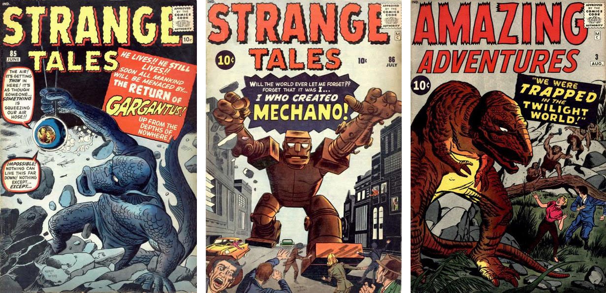
The MC box started appearing on Marvel covers with no fanfare whatsoever.
Obviously, it stood for Marvel Comics, but you'd only know that in retrospect.
Readers were left to speculate about what the letters stood for, if they even noticed them at all. It would several months before Stan would reveal the answer. It's unclear whether Stan was doing this deliberately. A couple of years later he would use the same trick with the MMMS - trailing the initials for months before revealing their meaning. So it's possible this was an early form of teaser marketing.

Nothing much changed for next year or so, except that the cover price went up to 12c in February 1962. DC's prices had risen with their December 1961 cover dated issues, but Marvel's were dated two months ahead of DC's so in reality the two companies increased their cover price at the same time - given that they were both distributed by the DC-owned Independent News, it can hardly have been a coincidence.

Then finally, with the April and May 1963 cover-dated comics, Lee revealed the meaning of the "MC" insignia. Every title in his line suddenly sported a distinctive box in the top left of the cover with the company name - "Marvel Comics Group" - and the cover price. But this wasn't about showing readers the star of the comic, like the DC cover device of the 1940s. This was very consciously demonstrating to customers that they were looking at a Marvel Comic.

On its own, this wasn't an especially seismic change, but coupled with the introduction of letters pages which rapidly evolved to showcase Stan Lee's casual, friendly style, and the introduction of cool and funny catchphrases, it added up to a major, and very deliberate, re-branding exercise.

Stan Lee started branding the Marvel range in earnest when he had Steve Ditko design the distinctive
corner emblem that appeared on all Marvel Comics from the April 1963 issue onwards.
In a later Fantastic Four letter column, Lee revealed that the corner emblem was the work of artist Steve Ditko. So it's likely that Ditko originally supplied the artwork for all the corner flashes, though some were replaced before publication. I can't think of another reason why the Journey into Mystery corner box had a Ditko-drawn Thor, when Kirby was drawing the cover art for the title. The Ditko Thor stayed in the cover corner box until March 1965, when it was finally replaced with a Kirby-drawn version. 

Jack Kirby replaced the Ditko image of Thor on Journey into Mystery as soon as he reasonably could.
You can see that Strange Tales 108, the first of that title to carry the corner box, also had art by Ditko, which was replaced the following month with a Kirby-drawn Human Torch. I liked Ditko's better, and would speculate that all of Ditko's original corner emblem illustrations were close-ups, which would make way more sense than the tiny full-figure Human Torch the title ended up with. There were other changes like this along the way, but I'll get to those in a moment ...

The first Strange Tales corner emblem featured a Human Torch illo by Ditko,
but the following month a different image by Kirby I think, replaced it.
A more significant change had quite a bit more impact, and was roundly loathed by Marvelites everywhere. Stan decided, presumably with Martin Goodman's blessing, to change the name of the company to "Marvel Pop Art Productions", starting with the September 1965 comics.

Stan's rationale probably seemed sound at the time. "Pop Art" was the collective name for an immensely influential cultural movement during the 1950s and 1960s, which was having a revolutionary effect on both fine art and popular media. Art and entertainment were no longer the domain of serious-faced mature adults. Youth was a rising force in the world of creative media and Art was taking itself a little less seriously.

Lichtenstein's "Whaam!" cynically stole an Irv Novick panel from All-American Men of War 89 and passed it off as fine art. DC, nor Novick, ever saw a penny of the millions of dollars the painting sold for. Around the same time, Andy Warhol was offering Campbell's soup as art.
In this climate, with Stan finding himself the object of attention from renowned arthouse film directors, like Frederico Fellini and Alan Resnais, and university students identifying themselves as Marvel fans because it was "cool", it probably seemed like a good idea to align Marvel Comics with the Pop Art zeitgeist.

The Marvel Pop Art Productions debacle started in September 1965 and lasted just four months.
The uproar was instantaneous and deafening. I think most Marvel readers were smart enough to spot that people like Lichtenstein appeared to be opportunistic, untalented chancers who had nothing but contempt for the artform they were plundering. To align Marvel with Pop Art was a bit of an insult to the fans. So, after four issues, the corner box was changed back to "Marvel Comics Group" and a sheepish Stan apologised to the readers in the new Marvel Bullpen Page in the January 1966 issues.

The howls of outraged Marvel fans caused Stan Lee to roll back to Marvel Comics Group.
This slight misstep notwithstanding, Stan managed to keep his vision for the branding of Marvel on course. Over the years, though, from 1964 through to 1971, the various corner boxes across the Marvel range continued to evolve and change, at first just when the character's costumes changed ...

Two early costume changers were Iron Man and Daredevil ... so their corner boxes had to change, too.
Other times the corner emblems changed when lineups in the anthology books changed. Tales of Suspense, Strange Tales and especially Tales to Astonish were revolving doors of lineup changes in the mid-1960s, and by 1967, the characters were taking turns in being depicted as full-figure/head shots to update and modernise the look.

Of the anthology titles, the Tales of Suspense corner box was the one that changed least.
On Tales of Suspense, Captain America was added to the line-up in issue 59 (November 1964) then, with issue 83 (May 1967), Iron Man and Cap began rotating as full figure images. The full figure of Iron Man was an amended version of the image from the front cover of Suspense 60, by Jack Kirby. The Captain America figure was a modified version of the front cover art from Fantasy Masterpieces 5 (Oct 1966), by Jack Kirby and Frank Giacoia.

The Strange Tales corner box underwent quite a few changes in the early Sixties but was consistent for the last part of the decade.
Dr Strange had already been appearing in Strange Tales for about a year before he was added to the corner box, and with The Thing it was about six months. Swapping out The Torch for Nick Fury happened at issue 135, then just seven issues later, the image of Dr Strange was revised to a half-figure - very likely by Jack Kirby - that lasted until Dr Strange took over the title at 169.

Tales to Astonish was the most changeable of the anthology titles, with probably the most artists involved.
Tales to Astonish was a virtual merry-go-round of cast and costume changes. The Wasp joined Ant Man in the corner box with issue 48, Ant Man added "Gi" to his name with issue 49, Hulk rocked up for issue 60, Sub-Mariner came on board with Astonish 70, then the alternating full-figure and head shots began with 91. The Hulk and Subby heads were lifted from Kirby drawings and ran with no alterations until Astonish 82. But then the art started changing every couple of issues ...

The changing face(s) of the Tales to Astonish corner box.
Tales to Astonish 80 had Subby and Hulk heads that looked like they were drawn by Kirby. Then, for no good reason, the images were replaced on 82 - these looked suspiciously like John Buscema art (though it'd make more sense if it turned out to be Sub-Mariner artist Gene Colan). With 87, the Namor head was swapped out for an unmistakable Bill Everett drawing. The following issue the Colan Hulk became a Gil Kane one. Then, when the alternating full-figures started with Astonish 92, the art was supplied by Jack Kirby again. ***EDIT*** It took me a little while, but my friend Steve Cook (check out his pop-culture blog, Secret Oranges) gave me a great book for my recent birthday - The Silver Age of Comic Book Art - and in there was a Jack Kirby illustration for Esquire magazine. And that's where the Sub-Mariner figure came from ...


This montage was drawn by Jack Kirby during 1965 and was published in the January 1966 of Esquire magazine. The Sub-Mariner figure is unmistakably the same as that used in the Tales to Astonish 92 corner box, though it looks to have bee re-drawn for its later appearance, or possibly re-inked by a better inker.
By 1968 Martin Goodman had sold Marvel to Perfect Film and Chemical Corporation, leaving Stan as Publisher and Editor-in-Chief. Consequently, Stan didn't have to seek anyone's permission for the next minor tweak. Across the Marvel line, some December 1968 and all the January 1969 cover-dated Marvels sported a corner box with the price/issue number box sitting above the character image. 

Adding the comic's title to the corner box and moving the price, issue and date to the top tends to indicate that Stan was trying to reach a wider audience than he'd previously enjoyed.
Presumably, Stan thought this would make each Marvel title more readily identifiable on the spinner racks. For me, this is an indication of Marvel trying to widen its accessibility to those outside the hardcore fanbase. After all, if you don't recognise the Silver Surfer from his image alone in the corner box, you're certainly not a regular Marvel reader.

This was a bit of a shame, because it seemed to me that Stan was abandoning his core idea of making Marvel feel like a club, where insiders were in the know, privy to the in-jokes, part of a tribe. Maybe as sales rose and the company became more successful, he was just under pressure to be more of a corporation and less of a fan club. But like it or not, corporatisation was coming to Marvel.

Just a few months later, a tiny but crucial alteration marked a major change in Marvel's fortunes. The IND distributors' mark, signifying the DC-owned Independent News Distribution deal that had so constrained Marvel's output over the previous ten years, was replaced with CCC, for Curtis Circulation Company. As part of the PF&CC deal Marvel was no longer restricted to a handful of titles and could begin the expansion that would unleash a tidal wave of titles over the next couple of years and establish Marvel as the undisputed brand leader in the comics market.

And with that expansion came the inevitable dilution of the brand. Even though he was still credited in all the comics as Editor, Stan was having less and less to do with the day-to-day running of the comics. Because of this, it's hard to say how much he had to do with the plan to make all Marvel titles 52-pagers and raise the cover price from 15c to 25c across the board. That resulted in - among other things - the complete revision of the cover format and the loss of the defining Marvel Corner Box, that had been the company's unique identifier for the previous ten years. Now the star of the comic just floated in the top left of the cover looking, if truth be told, a little lost.

The corner box evolved, went and returned in the decade from 1971 to 1981.
This situation lasted for about five years, until the corner box made a stuttering re-appearance on some, but not all, April and May 1976 dated Marvels. On Fantastic Four, the box appeared on just the July 1976 issue, then disappeared again as the comic went back to floating heads of The Thing and The Torch. With other titles, like Doctor Strange, the box stuck. There followed minor tweaks in format in February 1981, when the date and issue were enclosed in a diamond, and again in October 1982, when the price and issue number were placed inside a stylised "M".

But these and other minor changes aside, the corner box survived until 2001 ... not bad for a device that began in 1963. And even today, the corner box makes infrequent guest appearances, see for example X-Men 476, 529 and 536.

It's a testament to the marketing savvy of Stan Lee that the most minor additions to the overall branding of Marvel Comics resonated so strongly with the readers that even years after he left, his legacy continues to shape the company he built from nothing.

Next: The sincerest form of flattery


Saturday, 14 December 2013

From "Dear Editor" to "Face front, fearless ones"

BACK IN THE MID-1960s, when I first started reading comics, like other kids I was mostly interested in the stories. I'd always had a fascination with Science Fiction since my Mum had taken me to the cinema to see a re-release of Forbidden Planet (1956) when I was about six or so. The movie kept me up all night for weeks afterwards with nightmares about glowing disembodied eyes that roved the landscape at night destroying esoteric buildings like lighthouses. I'm sure Freudians could have a field day with that one ... but then I was only six years old.

To my six year old way of thinking, the Monster from the ID was the ultimate
in horror, though to most people today, I suppose it just looks like a
large Disney cartoon dog, which is pretty much what it is.
The other reason that same movie also caught my attention was because of Anne Francis as Altaira. I guess we don't need any Freudians to explain why that might have been ...

Anne Francis was certainly a lot prettier than the Monster from the ID ...
but at just six years old, I didn't do that much dreaming about her back then.
So it's no surprise that the first American comic that caught my eye featured a science fiction monster on the cover (see the first post in this blog).

But like any other kid of my age, patience wasn't a virtue I valued. When I got my hands on a new comic, I'd tear through the story at breakneck pace, giving scant attention to the other features and fillers in the magazine. I knew that I liked Marvel Comics better than the DC mags of the same era, but I hadn't really thought about why. Yet, the Spider-Man and Fantastic Four stories were better than the Batman and Superman tales. The Marvel characters talked more like real people and seemed to inhabit a world that looked quite like the world I lived in. But that was what started me reading the Marvel product. But it didn't explain what kept me reading Marvels well into my teenage years and up to the present day. I didn't figure that out until much later.

DCs were the first comics I was reading in the 1960s. The format of these books hadn't changed much since the 1940s - only the page count had dropped in an effort to maintain that 10c cover price. The typical Superman comic would feature as many as three Superman tales, often a single-page of little-known facts to demonstrate that comics were really quite educational, and a half (or full) page humorous strip by Henry Boltinoff, featuring Casey the Cop or Super-Turtle.

Henry Boltinoff (brother of DC editor Murray) contributed fillers like this 
Super-Turtle half-pager to DC comics through the 1960s and into the 1970s.
Not all DC comics had letters pages - for example, I have a copy of Blackhawk 170 which has no letters, but does have a one-page historical text piece about remarkable survival stories of World War Two. The letters pages there were, mostly in the Mort Weissinger-edited Superman Family books, pretty stodgy. They read like they'd been written by your English teacher, all a bit stiff and formal. There wasn't much real communication going on, no connection with the readers. 

This letters page features the results of the Great DC Contest (readers had
to count how many times the letters D and C appeared in issue 169 of

Superman) and four letters, apparently selected for their collective dullness.
The Editor's replies to readers were even duller than the letters selected for print. Small wonder, then, that I skipped over these tiresome text pages.

An aside - there's a great story in the second volume of Steranko's History of Comics. It tells how, sometime in 1943, Fawcett Comics editor Will Lieberson went into a barber shop and noticed a kid in the chair next to him reading a comic. A Fawcett comic. Lieberson smiled and listened as the kid read the comic out loud to himself, across the top two panels, skipping the lower two-thirds of each page. Lieberson leaned over to the kid and explained kindly that to get the best from the story, he should read all the way down the page before moving to the next. The kid stopped, looked Lieberson straight in the eye and said, "I know, but this way it's faster."

Back to the main subject - It was a tradition, in the comics published by Marty Goodman, that the magazines would always carry at least two pages of text material. As I understand it now, this was so the publications qualified for Second-Class postage rates, which meant Marty could mail at the subscriptions copies at a cheaper price, saving himself a cent or two per subscription copy. For that very reason, Stan Lee would be obliged to run a two-page text story in every book he edited from the 1940s right through to 1962, so that the comics qualified as magazines under the law. And it didn't have to be new material, so the text tales were recycled on a regular basis. Some Marvel books as late as Suspense 58 and Astonish 57 were still reprinting those text stories in 1964. I ignored those too.

Around 1962, though, Lee hit on an idea. His new superhero team book Fantastic Four was generating mail from readers. Stan is quoted in Ronin Ro's Tales to Astonish as saying, "We had never gotten fan mail, maybe one letter a year about some stupid subject. But all of a sudden we got fan mail from readers saying 'We love this [Fantastic Four] book', 'We can't wait for the next issue'. I knew we were onto something."

So Stan decided to use this sudden outpouring of reader sentiment to his advantage and introduced the Fantastic Four Fan Page in FF3 - as far as I can tell, the first lettercol in a Silver Age Marvel. The earliest FF lettercol I have in my meagre collection of comics is from FF5 ...
This Fantastic Four Fan Page, in issue 5 of FF, features a letter from a young
Roy Thomas. It also signs off with Stan's first use of the phrase, "Face Front!"
Not surprisingly, this early collection of fan letters wasn't really any different to what was going on in the DC books of the period. Each letter begins "Dear Editor" and Stan Lee isn't identified anywhere as being the author of the replies. Though there are faint glimmers of Stan Lee's personality in the replies to the letters - "Aw, Bill, don't be mad" and "Well, mebbe some day" - the letters themselves are quite unremarkable.

There was no letters page in Fantastic Four 6, but it was back in issue 7, and Stan managed to squeeze in a plug for Strange Tales 101 which featured the first solo outing for Johnny (Human Torch) Storm, and the word "Echh" makes its first appearance.

Although it's still early days, the readers' letters continue to focus on silly mistakes
made by the production team rather than any discussion of the content of the comics.
Issue 8's Fan Page contained an interesting letter that suggests the rest of the team stop addressing Ben Grimm as "Thing", a point I also picked up on in an earlier blog-post. Even as a kid, it struck me as bit callous that Reed, Sue and Johnny called each other by name yet insist on addressing Ben as "Thing". Given that the character was supposed to be sensitive about his monstrous appearance, the team couldn't be any more cruel if they tried. Stan explains that this is for the benefit of new readers who might not know why the others are calling a monster by the name Ben. But it wouldn't be long before the penny dropped for Stan and he began having the others refer to Ben as "Ben" ...

Fantastic Four 10's Fan Page was the first big step change to the Marvel voice. Stan kicks off the page by announcing that they've enough of that "'Dear Editor' jazz from now on" and that as he and Jack read every letter, they're changing the salutation of every letter on the page to "Dear Stan and Jack" to demonstrate how much friendlier this sounds. And of course, Stan was right ... it reads way better. Also, Stan here began to pepper the page with announcements about this and that - including Stan telling fans that the letters page would be a two-pager starting next issue, that Marvel didn't have any issues of FF1-9 to hand, so couldn't supply back issues, and that Amazing Fantasy 15 was a big success so there would be more Spider-Man tales coming in December 1962, which sounds about right for the on-sale date of Amazing Spider-Man 1 (cover-dated March 1963).

The Fantastic Four Fan Page from issue 10 was the first to include news items
about what was happening in the Bullpen and with other Marvel titles.
By the time issue 13 of Fantastic Four (Apr 63), came out, Stan was gathering his announcements and placing them in a block at the end of the Fan Page - a kind of embryonic Bullpen Bulletins. FF14 carried some notable announcements that must've had budding Marvel fans in a lather. The most visible of these was the inauguration of the iconic Marvel corner trademark emblem. I'll be devoting a future post entirely to the origins and history of this unique identifier.

This collection of announcements from Fantastic Four 14 revealed that a 
Fantastic Four Annual was in the works and that a new war comic, Sgt Fury
and his Howling Commandos, was due at the newsstands soon ...
But here Stan also mentioned that he reads every letter from fans and because of that, he's not able to have lettercols in the other Marvel titles, but encouraged readers to send their letters about Thor and Iron man to the FF Fan Page. Spider-Man, of course had his own letters page.

The Fan Page continued pretty much in this vein, with Stan releasing snippets of information about upcoming Marvel magazines, like the imminent Fantastic Four Annual 1 and Strange Tales Annual 2. Issue 16 mentioned the many letters they received congratulating them on the new trading name Marvel Comics Group, and the launch of Dr Strange in Strange Tales, and in FF17 Stan promised to bring back the Hulk somehow. The letters page for FF18 plugged the Annuals again, and announced the release of the first issues of The Avengers and The X-Men. One reader asked why Stan didn't print more flattering letters, he replied that he'd rather print controversial letters readers could argue about, the strongest signal yet that he considered the readers partners in this grand enterprise. When another reader asked who devised the idea for the cover corner emblem, Stan revealed that it was Steve Ditko who came up with it. And this column also featured the first use of the phrase, "The Marvel Age Comics", signifying the beginnings of Lee's tongue-in-cheek brand-aggrandisement.

This house ad from Fantastic Four 18 also mentions the "Marvel Age of Comics"
and plugs the newest team to appear in the ever-expanding Marvel Universe.
It's significant that the types of new book Lee and Kirby were putting out that this time were variations on the Fantastic Four formula. It's possible that Lee was serving Marty Goodman's agenda to put out the sort of comics he thought could compete with DC's uber-successful Justice League of America. But rather than just spit out clone books, Stan was careful to give each of these team books its own Unique Selling Point. 

Where Fantastic Four was a dysfunctional family (with Ben Grimm as the grumpy uncle), Sgt Fury was a kind of United Colours of Benetton, decades before anyone else thought of the idea. In this war book, Lee was able to give voice to his liberal world-view where people weren't judged on the colour of their skin or their racial origins. He was careful to include a black man, a jew and an Italian in the original line-up, but quite rightly didn't make a big deal of it. 

Certainly The Avengers were much more of a direct response to The Justice League. In this book, Stan just gathered all the available heroes (barring Spider-Man who had already been established as not being much of a joiner) and put them all in a single comic. But the X-Men was something different. By making his X-heroes mutants - essentially a science fiction version of a separate human racial type - he was able to bring his liberal beliefs into his comic stories. Something I've never had an issue with.

On the Fan Page in FF19, Stan shared a Bullpen in-joke. He explained that whenever Jack Kirby drew crowd scenes, the same faces would crop up again and again. The Marvel staff called them "Kirby's Kast of Kharacters". By bringing the readers in on the joke, he was engaging in classic team-building. He would go even further down that route in a few months but even here we can see that none of this was an accident. Stan knew exactly what he was doing, and he was doing it very well. 

"Kirby's Kast of Kharacters" from Fantastic Four 20. By comparison, here's a crowd scene from the 1936 Fritz Lang movie, Fury, a film Kirby would almost certainly have been familiar with, though this type of character imagery was common in pre-war Hollywood movies.
FF20 included a letter from "George R. Martin" (he only had one R at this point), who would later go on to write the acclaimed Games of Thrones series of novels. Martin praised Marvel for fitting "so much action into so few pages" - a quality all too sadly lacking in today's comics with their notoriously decompressed storylines.

By the time we get to FF21, the Special Announcements section is taking up a quarter of the Fan Page, mostly plugging the dozen other Marvel mags Stan is putting out.


This issue of Fantastic Four started a run of guest star spots that would run up to
issue 29, featuring The Avengers, Dr Strange, X-Men and The Watcher.
These Special Announcements would continue right up until FF37, with issue 32's section mentioning the MMMS for the first time. Issue 34 had the plugs for the other Marvels separated out into its own box and a letter from "George R. R. Martin" (there's that second R) complaining that the Special Announcements section had become just a plug-fest for all the other Marvel mags. Issue 37's lettercol had a note from letter-hack Guy H. Lillian III complaining about Stan shortening letter-writers' names in his replies: "For instance," writes Guy, "'Jackie boy' for Jack, 'Stevie' twice and 'Jer' for Jerry." In FF38, the Special Announcements are gone from the Fan Page, leaving only the Mighty Marvel Checklist. Issue 39 had Stan's first use of the catchphrase "Make Mine Marvel", and by issue 42, the Announcements are sneaking back in as separate items in yellow boxes dotted through the two-page lettercol. But this was only temporary ... in issue 45 of Fantastic Four, Stan included the first of what would become a Marvel institution for the next twenty years or so - The Bullpen Bulletin page.


Fantastic Four 45 was the culmination of Stan's mission. He'd made comics cool, cemented his reputation as a leader the youth looked up to and had a lot of fun in the process. 
The transformation was complete. In just three years, Stan Lee had taken Marvel Comics from an also-ran comic company grinding out formulaic stories and art to a pop culture phenomenon. Though some have tried to undermine Stan's claim to being the architect of Marvel, they're simply wrong. Yes, Kirby and Ditko helped Marvel's rise to market dominance with their imaginative plotting, but it was Stan who created the affable personalities for the Marvel characters and more importantly, wove the whole thing into a complete and fully realised package. It wasn't just the Marvel stories we were buying into here. It was a lifestyle and an aspirational brand. And it was this mature approach to branding and packaging that kept me reading Marvels way beyond 1965 and my eleventh birthday.

But of course, Stan wasn't done yet. For Marvel some of their greatest achievements were still ahead. Stan's liberal world-view wasn't yet fully communicated to his readers, and it was the next three years that would have a profound effect on me and shape my life, both in my own world-view and my professional ambitions. But that's a subject for another time.

Next: More Marvel Bullpen Bulletins ...