Tuesday 31 December 2013

Separated at Birth - a comic covers interlude

SOMETHING THAT'S ALWAYS FASCINATED me is the way comic artists have re-used various conventions and imagery from what has gone before. I'm not judging. Having worked in the Business, I know that it's a hungry beast, gobbling up ideas faster than most can provide them. So now and again, it's entirely forgivable if an artist might have cause to "reference" earlier ideas - his own or those of others - when a dreaded deadline looms.

And sometimes, ideas can be thrust upon an unfortunate artist (or writer) by an over-enthusiastic editor. Goodness knows, I've found myself on both sides of that particular fence.

Sometimes an editor would recycle an idea over and over - for example, a hero behind bars, and sometimes an artist would re-use something that had been especially effective for them in the past, like a "camera" angle or a particular layout.

Here, then, is a quick dash through several examples of ideas that have cropped up on more than one comic cover over the last 40 or 50 years ...


COVER TROPES AND OTHER CLICHES

Back in the late 1950s and early 1960s, king-of-the-hill DC Comics used to use a system whereby their editors would dream up a cover idea and have their chosen artist render it. Then, they'd have a story conference with their writer and end up with a story based on the (hopefully) dynamic and intriguing idea depicted in the cover. Sometimes this worked, sometimes it didn't. And nowhere was this more evident than in the Superman line of titles edited by the infamous Mort Weisinger.


One of Weisinger's obsessions was with the idea of his characters evolving into "Future Men". When I
was a kid, I was convinced that this was the true future awaiting the human race - giant, bald domed heads. These three covers from 1957, 1959 and 1961, respectively. Click on the images to enlarge.
Over the 20 or so years that Weisinger ruled over the empire of Superman, he would often commission covers then have a story written to fit. It's probably this process that contributed mightily to the recurring themes and ideas that cropped up time and again in the Superman family of titles. 


Another device that was used more than once was the giant insect motif - though to be fair
giant insects - while scientifically impossible - have long been a staple of science fiction. And sf was Weisinger's background, before he got into comics. Covers dated 1957, 1961 and 1965.
By today's standards and sensitivities, some of the ideas behind the covers and stories might  seem a tad ... inappropriate today.

In DC's world, it seemed perfectly acceptable to make obesity a laughing matter. The 1958 Lois Lane
was the earliest I could find,
The Flash cover is 1960 and the JLA one is 1961.
In a way that Stan Lee would never do with his Marvel characters, DC editors thought it was fine to turn their heroes into figures of fun on a regular basis. Or at least, what passed for fun in the late 1950s and early 1960s.


In fact the weight card must have been pretty successful for DC because they played it over and over 
again. Jimmy Olsen and Adventure Comics from 1962, and Superman from 1969 (yep, 1969). 
It seems to me that the creators were trying to play on the primal fears we all share. I think using the overweight motif was quite inconsiderate, even for the early 1960s, because there would have been kids who were overweight and probably already had to put up with teasing and worse from their immediate circle of acquaintances. The DC editors should have known that and been a bit more responsible. But there were other fears to play up in order to generate dramatic threats for the heroes. Premature ageing was a common one ...


Getting old is something we all worry about, but I wonder if it wasn't more of a concern to the DC editors than it was to their ten-year old readers. Action Comics from 1959 and Jimmy Olsen and Lois Lane both from 1963.
And rejection and alienation is something we all understand ...


Heroes being rejected by the citizens they're trying to help was a common cover trope in 1960s DCs.
Pelting with rubbish seems to be a common way of expressing dissatisfaction back then.
These covers from 1964, 1969 and 1970.
But Superboy seemed to have to put up with rejection more than most. In fact, rejection was a prevalent theme in the Superman mythos, stemming, I assume, from his "rejection" by Jor-El and Lara when they shot him off into space in a small rocket.


There are numerous other examples of Superman/Superboy being rejected by those around him,
but these three are most in keeping with the other examples here. The cover layouts are all quite
similar, too. Cover dates 1967, 1969, and 1970.
Pointing out these recurring themes in DC comic covers is a bit like shooting fish in a barrel. So let me leave further examples for another post and finish up with a look at a cover concept that has been used by almost every player in the comics business across several decades ...


IN THE MOUTH OF MADNESS

There's no doubt that dinosaurs fire the imagination of every kid. So it's no surprise that comics editors have never been shy about putting dinosaurs on comic covers since the genre began. But putting the hero, literally, in the mouth of the dinosaur is a pretty common cover design. Here's a few I've come across on my travels ...


During the 1960s, DC Comics and Dell would return often to dinosaurs in the series and on their covers. 
But in the 1970s, it was Marvel who dominated the dinosaur stakes.
In the 1980s, the hero-in-the-dinosaur's-mouth situation could
happen in the distant past or in the far-flung future.
In the 1990s, there were Equal Opportunities for heroines and heroes to be devoured.
And by the time we reached the 21st Century, it was open season on comic characters.
There's probably other examples of cover cliches and tropes that you can think of. I have a couple more to share in some future post. But until then, I'll get back to the main theme of this series ... Marvel in the Silver Age. 

Next: The Mighty Marvel cover corner box


Tuesday 24 December 2013

Bullpen Bulletins and the Merry Marvel Marching Society

BACK IN LATE 1965, while my reading interests were firmly focussed on Stan Lee's burgeoning Marvel Comics line, there were other distractions for a typical eleven-year-old like myself. The prevailing cultural phenomenon on both sides of the Atlantic was the spy craze, kickstarted primarily by the movie adaptations of Ian Fleming's James Bond books, which began in 1963 with Dr No. The first Bond movie I saw was Goldfinger, released in September 1964 in the UK. This movie introduced several concepts that would go on to be genre staples - the cool sports car with in-built ordnance, the laser death-ray and the exotic murder techniques, like death by hat and execution by paint.

The iconic poster for Goldfinger. Inset: Bond discovers the body of Jill
Masterson, while Oddjob prepares for some millinery mayhem.
It really didn't matter that these plot devices were absurd, because when you're 11, you don't care about stuff like that. It turns out that covering someone in gold paint doesn't kill them at all, despite the movie's publicity machine claiming that Shirley Eaton had to leave a small area of her back open to the air so she didn't die of "skin suffocation". I also think it unlikely that Oddjob could kill anyone by flinging his hat at them, steel rim not withstanding. The air drag on the crown of the hat would slow it down in a few metres, severely limiting its effective range.

Bond's choice of an Aston Martin caused the sales of the car to leap 50% overnight.
But I don't think the production models had extending over-riders and concealed machine-
guns. Cutting Bond in half with a laser was an improvement over the novel,
where Goldfinger used a circular saw.
Anyhow, the movie was a massive hit, both in the UK and in the US, and the picture recouped its budget in a couple of weeks, spawning all kinds of imitators. Even though kids loved James Bond, the movies were pitched very much at an adult audience. So it was a bit of a surprise when UK toy manufacturer Corgi released a die-cast metal model of the Bond DB5, complete with extending machine guns, rear bulletproof shield and passenger ejector seat. Obviously, I had to have it and eventually persuaded my parents to buy me one.

Is this the coolest toy on the planet? Even though my original was long-gone, I tracked
one down on eBay, because no one should have to live without a Corgi James Bond car.
The massive success of James Bond in the cinema created a public demand for spies, so it wasn't long before television caught up. US broadcaster NBC contacted Ian Fleming and asked him to come up with a format for a spy series. The result was The Man from U.N.C.L.E. which featured the adventures of Napoleon Solo, an operative for a United Nations sponsored task force that would battle the machinations of a criminal organisation called THRUSH. With its science fiction plots and its hi-tech gadgetry, The Man from U.N.C.L.E. rapidly became my favourite tv show.

Something that U.N.C.L.E. had that Bond didn't was a really cool logo. This is one of
my all-time favourite logos and is instantly recognisable at whatever size you see it.
As U.N.C.L.E. was pitched at a younger audience than Bond, there was much more in the way of merchandising. Fans could buy U.N.C.L.E. toy guns, toy cars as well as comics and board games. But the best bit of merchandising was the membership card which you could get for free by writing off to The Daily Express. A schoolfriend of mine had something even better. His mum worked for the newspaper and managed to get him a THRUSH membership card. Boy, was I jealous ...

Here, Solo models the elegant U.N.C.L.E. gun while Illya handles the scary THRUSH rifle like he
was born to it. Inset: The U.N.C.L.E. membership card, and the car which debuted in the fourth season.
But the key thing here was that the very concept of the show, even down to the cool end-credit that read "We wish to thank the United Network Command for Law and Enforcement, without whose assistance this program would not have been possible" and all the marketing, was geared towards making us think U.N.C.L.E. was real and, more importantly, that we could actually join it. That was certainly my ambition at 11.
What has all this to do with Stan Lee's Marvel Comics? Well, so far-reaching was the influence of espionage organisations with cool acronyms that Stan decided that Marvel, too, should have a team of super-spies, and drafted the now-promoted Sgt Fury (of Howling Commandos fame) to spearhead a new counter-espionage division called S.H.I.E.L.D. The hi-tech gadgetry would initially be supplied by Tony Stark, and Fury and his team would battle rogue organisations like Hydra and A.I.M.


Nick Fury first appeared in 1963, as the tough Sergeant of a team of commandos, The Howlers. Two
years later, he was seconded from the CIA to head up SHIELD. By the late 1960s Fury was in full
psychedelic mode courtesy of comics' coolest creator, Jim Steranko.
I remember my first S.H.I.E.L.D. comic as being Strange Tales 139. I was coming in in the middle of a story and so was understandably confused by the storyline. But here was a comic that bore more than a passing resemblance to my beloved U.N.C.L.E. show ... and it had even cooler gadgets. I quickly tracked down the earlier issues of Strange Tales and thrilled to the exploits of Fury as he - along with the rest of us - discovered the wonders of L.M.D.s, the jaw-dropping S.H.I.E.L.D. heli-carrier and a Porche 904 with anti-grav wheels.


From the first instalment of Nick Fury Agent of S.H.I.E.L.D. - Fury learns the name of the
outfit looking to hire him and gets a taste of the equipment they have at their disposal.
But there was one more Marvel acronym in Stan Lee's lexicon, and that was one organisation we could join, if we only had one dollar ... the M.M.M.S.

The Merry Marvel Marching Society

The earliest mention of the MMMS that I could find was in the November 1964 issue of Fantastic Four. Right at the very end of the Announcements section, Stan posed the question, "While you're counting the minutes till F.F.#33, see if you can guess what M.M.M.S. stands for?" Okay, technically not actually a query, question mark notwithstanding, but an effective teaser. I wouldn't have seen this clue at the time, as FF32 wasn't distributed in UK newsagents for the reasons explained in my 7 September post. The following month, Stan revealed what the initials stood for and added, "It's a new club we're forming in answer to all you congenital joiners who've been asking for it." There was an update in FF34, when Stan included a box to the letters page that revealed more.


Then finally, in FF35, Marvel took the wraps off its grand endeavour. In retrospect, it looks like a pretty good deal. That's a lot of stuff you get for "one measly buck". I didn't know that earlier comic clubs had charged just the price of a comic to join. But at the time, I didn't really have a burning desire to be a Merry Marcher, even if I could have found a way to send Stan a dollar.

This tantalising ad appeared in FF 36 and listed all the goodies you got for your
"hard-earned buck" - badge, stickers, certificate, membership card and - intriguingly
- a record of the Bullpen welcoming you to the MMMS.
Of course, comic-based fan clubs weren't entirely a new idea. There were many clubs and other premiums available via the popular radio shows of the 1930s. For example, it was possible to send off for a Shadow ring that tied in with the Blue Coal-sponsored radio show of the legendary pulp hero. The first comic club I'm aware of is the Supermen of America. This was started in 1939 by DC to capitalise of the phenomenal success of the Superman strips in Action Comics. For 10c (the same price as a comic book) you got a certificate, a ring, a decoder and a badge. But I think that was it. I don't think DC thought to foster any kind of ongoing cameraderie, other than the coded messages in the comics ...

This is what you got for your ten cents way back in 1939. Pretty good deal,
considering that the ring alone goes for over $10,000 in mint condition.
Then, in Issue 13 of All-Star Comics (Oct-Nov 1942) DC offered readers the chance to join the Junior Justice League of America. This club also had a secret code, so again the editors took the time to put secret messages in comics so that club members felt they were part of something exclusive.

The Junior Justice Society was a bit more activity-based, urging members to collect
war stamps, and to organise "Victory Clubs" to help with the war effort.
The other major comic fan club - and the one that most resembled Stan Lee's M.M.M.S. - was the EC Fan-Addicts Club. Unlike DC, the younger, brasher EC Comics was distinguished by a hip, irreverent editorial style. Jokers Bill Gaines and Al Feldstein ran both the company and the comics with a tongue-in-cheek humour that defused even the most gruesome of the horror stories that appeared in Crypt of Terror and Vault of Horror. This house style would later be crystallised as the phenomenally successful MAD Magazine, which would allow EC to survive the horror comic purges of the mid-1950s.

The EC Fan-Addicts kit, characterised by the same (jugular) vein
of humour that ran through the comics.
So the Merry Marvel Marching Society kicked off officially in Fantastic Four 35 and the other Marvel Comics of February 1965. In addition to the Membership card, certificate and stickers you also got a floppy vinyl record of Stan and the Bullpen (minus Steve Ditko, who shunned any kind of public appearance) clowning around in a studio from a terminally corny script by Lee.

The different between this and other fan clubs was that the monthly Marvel Bullpen Bulletins Page in the comics became the club's unofficial monthly newsletter - and you didn't even have to join the club to enjoy it.

The first Bulletins pages were in the December 1965 issues and were tailored to the individual comics they appeared in, so the FF Bulletins was slightly different to the Strange Tales one.

Play "Spot the Difference" - the page on the left is from FF45 and one the left is from Strange Tales 139.
Each page has been slightly altered for its title and the
FF page doesn't list FF45 in the Checklist.
But these are minor details. The main function of the Bullpen page was to make all Marvel readers feel like part of the gang. By announcing interesting snippets about the comings and goings of the artists and giving them all backstories, Stan was making his team as much characters in a story as Spider-Man and The Hulk were. This first Bullpen page begins with the announcement that Joe Sinnott was joining the FF book as permanent inker, which was a big relief to me as I was never a fan of fill-in inker Vince Colletta. Stan also teased readers by revealing that Sub-Mariner and Iron Man penciller "Adam Austin" was really someone else (Gene Colan, in case you're wondering).

The Bullpen page is from Strange Tales again. But in FF46, Stan included a dedicated 
merchandising page for the tee-shirts, the Marvel stationery and the life-size Spidey poster.
The following month, Stan moved most of the merchandising off the Bullpen page to leave more room for announcements, the first of which was Lee's contrite apology for thinking that Marvel fans would ever want to read "Marvel Pop Art Productions" rather than Marvel Comics. It had been a step too far and Marvel readers were quick to let Lee know - and to his credit, Stan was quick to fix it. The "Didja Know Department" gave capsule backgrounds on Bullpenners who didn't normally get their names in the comics ... Sol Brodsky, Flo Steinberg and even Marty Goodman.

The third Bullpen page, published in the February 1966 Marvels, made one small change. It was no longer tailored to each individual comic title. Stan must have realised that it was way too much bother to customise each incarnation of the page. It's doubtful that most Marvelites (for that is what we were being called by this time) even realised each title's Bulletins page was different. The giveaway is that the Checklist is now the same in every title, so FF47 contained a Checklist entry for FF47, and so on.

By this time (Feb 1966) the Announcements have squeezed everything else off the page.
And the Checklist is the same whichever Marvel book the page appears in.
The page leads with the news that Marvel Collectors Item Classics is going down a storm with readers who missed the earliest Marvel books (me included). That's followed up with an introduction to Roy Thomas, newest member of the Bullpen, and Stan explaining that while he razzes on letterers Artie Simek and Stan Rosen all the time, they really are the backbone of Marvel.

And for me, the genius of Stan Lee wasn't so much in the cracking stories, the unique characterisation or the dynamic storytelling - it was the editorial package that surrounded the stories. Lee instinctively knew that success lay in making all his readers feel part of a tribe, that their voices were listened to and that affable and jokey was exactly what his customers were looking for. In fact, today's management consultants could learn a lot from how Marvel became a 1960s publishing phenomenon. Stan always insisted this wasn't cynical planning on his part. He was just giving readers what he'd want if he'd been a comics reader.

In an interview in 2000, Stan Lee explained the rationale for this approach. When asked if he was consciously trying to foster a personal involvement in the books among his readers he replied, "That's what I wanted. I realized later – I wasn't conscious of it at the time – that I had treated the whole thing like an advertising campaign. I mean, we had catchwords like 'Make Mine Marvel', 'Marvel Marches On', 'Welcome to the Marvel Age of Comics', and the club – the Merry Marvel Marching Society – 'We don't know where we're marching to, but we're on the way'. It was all done tongue-in-cheek with a little humor, and I wanted the readers to feel as though we're all sharing an in-joke together that the outside world just isn't even aware of. It was almost the same feeling as Mad magazine – we obviously weren't a group of humor books, but I think we had that same feeling."

It wasn't a difficult concept to understand. And Stan was very open about it, in the replies to the readers' letters and on the Marvel Bullpen Bulletins pages. It was all geared towards making the reader feel like a part of the gang, a tribal thing, something DC, Tower Comics or the lamentable Mighty Comics Group didn't seem able to grasp.

And for those of us who couldn't join the M.M.M.S., we still had the Bullpen pages in the comics. I enjoyed them so much that, by the late 1960s, I would actually turn to the Bullpen page first, a stark contrast to how I would approach a comic when I first started reading them.

Next: Separated at Birth - a comic covers special


Saturday 14 December 2013

From "Dear Editor" to "Face front, fearless ones"

BACK IN THE MID-1960s, when I first started reading comics, like other kids I was mostly interested in the stories. I'd always had a fascination with Science Fiction since my Mum had taken me to the cinema to see a re-release of Forbidden Planet (1956) when I was about six or so. The movie kept me up all night for weeks afterwards with nightmares about glowing disembodied eyes that roved the landscape at night destroying esoteric buildings like lighthouses. I'm sure Freudians could have a field day with that one ... but then I was only six years old.


To my six year old way of thinking, the Monster from the ID was the ultimate
in horror, though to most people today, I suppose it just looks like a
large Disney cartoon dog, which is pretty much what it is.
The other reason that same movie also caught my attention was because of Anne Francis as Altaira. I guess we don't need any Freudians to explain why that might have been ...


Anne Francis was certainly a lot prettier than the Monster from the ID ...
but at just six years old, I didn't do that much dreaming about her back then.
So it's no surprise that the first American comic that caught my eye featured a science fiction monster on the cover (see the first post in this blog).

But like any other kid of my age, patience wasn't a virtue I valued. When I got my hands on a new comic, I'd tear through the story at breakneck pace, giving scant attention to the other features and fillers in the magazine. I knew that I liked Marvel Comics better than the DC mags of the same era, but I hadn't really thought about why. Yet, the Spider-Man and Fantastic Four stories were better than the Batman and Superman tales. The Marvel characters talked more like real people and seemed to inhabit a world that looked quite like the world I lived in. But that was what started me reading the Marvel product. But it didn't explain what kept me reading Marvels well into my teenage years and up to the present day. I didn't figure that out until much later.

DCs were the first comics I was reading in the 1960s. The format of these books hadn't changed much since the 1940s - only the page count had dropped in an effort to maintain that 10c cover price. The typical Superman comic would feature as many as three Superman tales, often a single-page of little-known facts to demonstrate that comics were really quite educational, and a half (or full) page humorous strip by Henry Boltinoff, featuring Casey the Cop or Super-Turtle.


Henry Boltinoff (brother of DC editor Murray) contributed fillers like this 
Super-Turtle half-pager to DC comics through the 1960s and into the 1970s.
Not all DC comics had letters pages - for example, I have a copy of Blackhawk 170 which has no letters, but does have a one-page historical text piece about remarkable survival stories of World War Two. The letters pages there were, mostly in the Mort Weissinger-edited Superman Family books, pretty stodgy. They read like they'd been written by your English teacher, all a bit stiff and formal. There wasn't much real communication going on, no connection with the readers. 


This letters page features the results of the Great DC Contest (readers had
to count how many times the letters D and C appeared in issue 169 of

Superman) and four letters, apparently selected for their collective dullness.
The Editor's replies to readers were even duller than the letters selected for print. Small wonder, then, that I skipped over these tiresome text pages.

An aside - there's a great story in the second volume of Steranko's History of Comics. It tells how, sometime in 1943, Fawcett Comics editor Will Lieberson went into a barber shop and noticed a kid in the chair next to him reading a comic. A Fawcett comic. Lieberson smiled and listened as the kid read the comic out loud to himself, across the top two panels, skipping the lower two-thirds of each page. Lieberson leaned over to the kid and explained kindly that to get the best from the story, he should read all the way down the page before moving to the next. The kid stopped, looked Lieberson straight in the eye and said, "I know, but this way it's faster."

Back to the main subject - It was a tradition, in the comics published by Marty Goodman, that the magazines would always carry at least two pages of text material. As I understand it now, this was so the publications qualified for Second-Class postage rates, which meant Marty could mail at the subscriptions copies at a cheaper price, saving himself a cent or two per subscription copy. For that very reason, Stan Lee would be obliged to run a two-page text story in every book he edited from the 1940s right through to 1962, so that the comics qualified as magazines under the law. And it didn't have to be new material, so the text tales were recycled on a regular basis. Some Marvel books as late as Suspense 58 and Astonish 57 were still reprinting those text stories in 1964. I ignored those too.

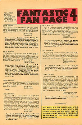
Around 1962, though, Lee hit on an idea. His new superhero team book Fantastic Four was generating mail from readers. Stan is quoted in Ronin Ro's Tales to Astonish as saying, "We had never gotten fan mail, maybe one letter a year about some stupid subject. But all of a sudden we got fan mail from readers saying 'We love this [Fantastic Four] book', 'We can't wait for the next issue'. I knew we were onto something."

So Stan decided to use this sudden outpouring of reader sentiment to his advantage and introduced the Fantastic Four Fan Page in FF3 - as far as I can tell, the first lettercol in a Silver Age Marvel. The earliest FF lettercol I have in my meagre collection of comics is from FF5 ...
This Fantastic Four Fan Page, in issue 5 of FF, features a letter from a young
Roy Thomas. It also signs off with Stan's first use of the phrase, "Face Front!"
Not surprisingly, this early collection of fan letters wasn't really any different to what was going on in the DC books of the period. Each letter begins "Dear Editor" and Stan Lee isn't identified anywhere as being the author of the replies. Though there are faint glimmers of Stan Lee's personality in the replies to the letters - "Aw, Bill, don't be mad" and "Well, mebbe some day" - the letters themselves are quite unremarkable.

There was no letters page in Fantastic Four 6, but it was back in issue 7, and Stan managed to squeeze in a plug for Strange Tales 101 which featured the first solo outing for Johnny (Human Torch) Storm, and the word "Echh" makes its first appearance.


Although it's still early days, the readers' letters continue to focus on silly mistakes
made by the production team rather than any discussion of the content of the comics.
Issue 8's Fan Page contained an interesting letter that suggests the rest of the team stop addressing Ben Grimm as "Thing", a point I also picked up on in an earlier blog-post. Even as a kid, it struck me as bit callous that Reed, Sue and Johnny called each other by name yet insist on addressing Ben as "Thing". Given that the character was supposed to be sensitive about his monstrous appearance, the team couldn't be any more cruel if they tried. Stan explains that this is for the benefit of new readers who might not know why the others are calling a monster by the name Ben. But it wouldn't be long before the penny dropped for Stan and he began having the others refer to Ben as "Ben" ...

Fantastic Four 10's Fan Page was the first big step change to the Marvel voice. Stan kicks off the page by announcing that they've enough of that "'Dear Editor' jazz from now on" and that as he and Jack read every letter, they're changing the salutation of every letter on the page to "Dear Stan and Jack" to demonstrate how much friendlier this sounds. And of course, Stan was right ... it reads way better. Also, Stan here began to pepper the page with announcements about this and that - including Stan telling fans that the letters page would be a two-pager starting next issue, that Marvel didn't have any issues of FF1-9 to hand, so couldn't supply back issues, and that Amazing Fantasy 15 was a big success so there would be more Spider-Man tales coming in December 1962, which sounds about right for the on-sale date of Amazing Spider-Man 1 (cover-dated March 1963).


The Fantastic Four Fan Page from issue 10 was the first to include news items
about what was happening in the Bullpen and with other Marvel titles.
By the time issue 13 of Fantastic Four (Apr 63), came out, Stan was gathering his announcements and placing them in a block at the end of the Fan Page - a kind of embryonic Bullpen Bulletins. FF14 carried some notable announcements that must've had budding Marvel fans in a lather. The most visible of these was the inauguration of the iconic Marvel corner trademark emblem. I'll be devoting a future post entirely to the origins and history of this unique identifier.


This collection of announcements from Fantastic Four 14 revealed that a 
Fantastic Four Annual was in the works and that a new war comic, Sgt Fury
and his Howling Commandos, was due at the newsstands soon ...
But here Stan also mentioned that he reads every letter from fans and because of that, he's not able to have lettercols in the other Marvel titles, but encouraged readers to send their letters about Thor and Iron man to the FF Fan Page. Spider-Man, of course had his own letters page.

The Fan Page continued pretty much in this vein, with Stan releasing snippets of information about upcoming Marvel magazines, like the imminent Fantastic Four Annual 1 and Strange Tales Annual 2. Issue 16 mentioned the many letters they received congratulating them on the new trading name Marvel Comics Group, and the launch of Dr Strange in Strange Tales, and in FF17 Stan promised to bring back the Hulk somehow. The letters page for FF18 plugged the Annuals again, and announced the release of the first issues of The Avengers and The X-Men. One reader asked why Stan didn't print more flattering letters, he replied that he'd rather print controversial letters readers could argue about, the strongest signal yet that he considered the readers partners in this grand enterprise. When another reader asked who devised the idea for the cover corner emblem, Stan revealed that it was Steve Ditko who came up with it. And this column also featured the first use of the phrase, "The Marvel Age Comics", signifying the beginnings of Lee's tongue-in-cheek brand-aggrandisement.

This house ad from Fantastic Four 18 also mentions the "Marvel Age of Comics"
and plugs the newest team to appear in the ever-expanding Marvel Universe.
It's significant that the types of new book Lee and Kirby were putting out that this time were variations on the Fantastic Four formula. It's possible that Lee was serving Marty Goodman's agenda to put out the sort of comics he thought could compete with DC's uber-successful Justice League of America. But rather than just spit out clone books, Stan was careful to give each of these team books its own Unique Selling Point. 

Where Fantastic Four was a dysfunctional family (with Ben Grimm as the grumpy uncle), Sgt Fury was a kind of United Colours of Benetton, decades before anyone else thought of the idea. In this war book, Lee was able to give voice to his liberal world-view where people weren't judged on the colour of their skin or their racial origins. He was careful to include a black man, a jew and an Italian in the original line-up, but quite rightly didn't make a big deal of it. 

Certainly The Avengers were much more of a direct response to The Justice League. In this book, Stan just gathered all the available heroes (barring Spider-Man who had already been established as not being much of a joiner) and put them all in a single comic. But the X-Men was something different. By making his X-heroes mutants - essentially a science fiction version of a separate human racial type - he was able to bring his liberal beliefs into his comic stories. Something I've never had an issue with.

On the Fan Page in FF19, Stan shared a Bullpen in-joke. He explained that whenever Jack Kirby drew crowd scenes, the same faces would crop up again and again. The Marvel staff called them "Kirby's Kast of Kharacters". By bringing the readers in on the joke, he was engaging in classic team-building. He would go even further down that route in a few months but even here we can see that none of this was an accident. Stan knew exactly what he was doing, and he was doing it very well. 


"Kirby's Kast of Kharacters" from Fantastic Four 20. By comparison, here's a crowd scene from the
1936 Fritz Lang movie,
Fury, a film Kirby would almost certainly have been familiar with, though this
type of character imagery was common in pre-war Hollywood movies.
FF20 included a letter from "George R. Martin" (he only had one R at this point), who would later go on to write the acclaimed Games of Thrones series of novels. Martin praised Marvel for fitting "so much action into so few pages" - a quality all too sadly lacking in today's comics with their notoriously decompressed storylines.

By the time we get to FF21, the Special Announcements section is taking up a quarter of the Fan Page, mostly plugging the dozen other Marvel mags Stan is putting out.


This issue of Fantastic Four started a run of guest star spots that would run up to
issue 29, featuring The Avengers, Dr Strange, X-Men and The Watcher.
These Special Announcements would continue right up until FF37, with issue 32's section mentioning the MMMS for the first time. Issue 34 had the plugs for the other Marvels separated out into its own box and a letter from "George R. R. Martin" (there's that second R) complaining that the Special Announcements section had become just a plug-fest for all the other Marvel mags. Issue 37's lettercol had a note from letter-hack Guy H. Lillian III complaining about Stan shortening letter-writers' names in his replies: "For instance," writes Guy, "'Jackie boy' for Jack, 'Stevie' twice and 'Jer' for Jerry." In FF38, the Special Announcements are gone from the Fan Page, leaving only the Mighty Marvel Checklist. Issue 39 had Stan's first use of the catchphrase "Make Mine Marvel", and by issue 42, the Announcements are sneaking back in as separate items in yellow boxes dotted through the two-page lettercol. But this was only temporary ... in issue 45 of Fantastic Four, Stan included the first of what would become a Marvel institution for the next twenty years or so - The Bullpen Bulletin page.


Fantastic Four 45 was the culmination of Stan's mission. He'd made comics cool, cemented 
his reputation as a leader the youth looked up to and had a lot of fun in the process. 
The transformation was complete. In just three years, Stan Lee had taken Marvel Comics from an also-ran comic company grinding out formulaic stories and art to a pop culture phenomenon. Though some have tried to undermine Stan's claim to being the architect of Marvel, they're simply wrong. Yes, Kirby and Ditko helped Marvel's rise to market dominance with their imaginative plotting, but it was Stan who created the affable personalities for the Marvel characters and more importantly, wove the whole thing into a complete and fully realised package. It wasn't just the Marvel stories we were buying into here. It was a lifestyle and an aspirational brand. And it was this mature approach to branding and packaging that kept me reading Marvels way beyond 1965 and my eleventh birthday.

But of course, Stan wasn't done yet. For Marvel some of their greatest achievements were still ahead. Stan's liberal world-view wasn't yet fully communicated to his readers, and it was the next three years that would have a profound effect on me and shape my life, both in my own world-view and my professional ambitions. But that's a subject for another time.

Next: More Marvel Bullpen Bulletins ...


Sunday 3 November 2013

Marvel Comics: Second-Hand Memories

BACK IN THE MID-1960s, when I first became interested in reading as many Marvel Comics as I could lay my hands on, there wasn't the perfect distribution network today's comic fans enjoy. I was reliant on the spotty delivery of American comics to the many independent newsagents in my local area and what I could salvage from the piles of second-hand comics in the various unlikely shops I'd stumble across. Once I realised that there were shops that would sell second-hand comics, I began to explore the area in earnest, ranging far and wide on my bicycle, stashing my new-found treasures in the saddlebag I'd acquired especially for that purpose.

In general, these second-hand shops charged 6d (that's 2.5p in today's money - though adjusting for inflation it's actually about 30p). My pocket money was 2/6, so I could afford to buy five comics for that. Or three if I was buying them new from a newsagent. Caution was often called for.

Of course, I didn't spend all my money on comics. Another favourite pastime for kids back in the 1960s was to go to Saturday Morning Pictures. My local cinema was the ABC on Wellington Street, Woolwich, and every Saturday morning we'd all troop off for three hours of entertainment - a feature film, cartoons, a serial chapter and even birthday celebrations. All for sixpence. 

Top left: An ABC Cinema of the period. Top right: The Woolwich ABC as it is today (sad).
Bottom left: An ABC Minors birthday invite. Bottom right: The classic glow-in-the-dark ABC Minors badge.
If you were feeling particularly flush, you could sit upstairs in The Circle for 9d. The advantage of this was that you wouldn't have kids above you flicking gobs of ice cream at you during the performance. But before we got to see any films, there was a bit of housekeeping. The MC would ask if there were any birthday boys or girls in the audience. Each celebrant would have to come up on the stage and get a free ice lolly. One time my friend Roger Phair pretended it was his birthday. I felt sure he'd be found out, but he returned to his seat, beaming and holding his ill-gotten prize - a Zoom lolly. Then we'd sing the ABC Minors song while the words appeared on the screen. Finally, we got to watch the movies ...

Back in the 1960s a tribal custom was to sing your tribal song at the top of your lungs.
When it got to the last line, all the kids hollered "A-B-C" as loudly as they could.
In 1965, I was excited to hear that Batman would be featured in the following week's matinee. Even though I was a confirmed Marvel fan by that time, it was still a big deal to think that a superhero would be featured on the big screen. The previous year, Batman had undergone a revamp. DC Comics had got rid of the corny old science-fiction tales and remade Batman in the same sleek style they'd used for their Silver Age versions of Green Lantern and The Flash. The character even had a costume redesign ... they put a yellow circle around the bat emblem on Batman's chest, an allusion, I figured, to the famous "Bat Signal".

Though I didn't know it at the time, Batman's early 1964 revamp was
down to Julius Schwartz and Carmine Infantino, who'd so successfully
revived The Flash and Green Lantern five years earlier.
All the way to the cinema, I kept asking my friend Steve Rainey if he thought the Batman on the screen would have the yellow circle around the bat emblem. I don't think he had the faintest idea what I was talking about. As it turned out, the Batman on screen was the 1943 serial version, starring Lewis Wilson in a wrinkly costume. Once I got over my initial disappointment, I quite enjoyed the serial. It was black and white, and obviously very old because of the suits the characters were wearing and the cars they drove. But it was one of the better serials, given a decent budget by genre standards and directed by Lambert Hillyer, who also did the eerie Dracula's Daughter (1936) and went on to have a long career directing westerns and tv segments.

The Batman chapterplay was pretty action-packed and though Batman's costume was a bit saggy,
I enjoyed the serial immensely. There would be many more superhero serials in my future.
This was also my first sight of a superhero on screen. We never did get the George Reeves Superman tv show in London until much later (if at all - can anyone say for sure?). I'd have to wait a couple of years for Adam West to put on the famous cowl, which would be my next exposure to a live-action comic character. Boy, how I hated that tv show - but that's a story for a later post.

The other product that vied for the attention of the neighbourhood kids during 1965 was bubble gum cards. I somehow managed to miss out on the Mars Attacks series. And I didn't know anyone back then who had any. It may have been that they just didn't make it into our area. But we were very aware of the Civil War News series from AB&C. These were a set of pasteboard cards, about 80mm x 55mm, depicting often gory scenes from the American Civil War, rendered in glorious, full-colour painted artwork.

The Civil War News gum card set was much-loved by my generation of kids.
Extremely gory and painted, in part, by the
Mars Attacks artist Norman Saunders,
these images were deemed quite unsuitable for children by an outraged popular press.
With each wrap of cards you also got an reproduction Confederate banknote and a wafer of bubblegum with the taste and consistency of cardboard. As it was a bit of lottery as to what cards you got in a packet, you'd end up spending way more than you expected to to acquire the full set, though it was possible to swap "doubles" with your friends. 

As noted on the wrapper, Civil War News cards cost 2d
and came with a free Confederate Dollar banknote.
But at just 2d a pack, I quickly collected a full set and  ended up with a roll of Confederate bills that could have choked a horse.

So successful was the first Beatles set of cards that card company
AB&C immediately released a second set.
Other card sets that were popular during 1965 were The Beatles and Man from UNCLEIf anything, the Man from UNCLE cards were even more popular than The Beatles set. And in the couple of years that followed, there would be other sets of gum cards that we'd all collect like crazy - Battle (a WW2 set along the same lines as Civil War News), several sets of Batman cards,(riding the wave of that tv show) and The Monkees.

The Man from UNCLE cards were in the same format
as The Beatles cards - black and white photos with a
signature overprinted in blue.
If you came up short for money back in the mid-1960s, you could scour the area for empty lemonade bottles. Back then, glass bottles like those for Tizer and R Whites lemonade would net you 3d each if you returned them to the shop. Even cider bottles and some beer bottles had a deposit. Some shop owners were a bit suspicious if you came in with an armload of sticky empty pop bottles. "Did you buy those here?" they'd sometimes enquire. But there were some shopkeepers who'd happily accept anything you could find, because they too received money for bottles they returned to the beverage companies.

Two bottles would net you a used comic. Three would get you a new one off the newsagent's spinner rack. Money was just lying around next to dustbins in those days ...

But back to the main story ... by this point I was on my way to building a pretty good run of Tales of Suspense featuring my hero Captain America, along with a good run of The Avengers, also with Cap.

Most of these I had sourced in my immediate neighbourhood, in and around Woolwich, in south-east London. It wasn't the best area for finding American comics. The nearest newsagent to my house was an old-fashioned shop at the top of Frances Street, all dark wood interior with elderly proprietors. They would have no truck with any new-fangled American nonsense, so I couldn't get my Marvel Comics there. There was the paper shop on Kingsman Parade near the south end of Frances Street that did have a single spinner rack, but carried mostly DC Comics. And there was the newsagent behind Woolwich Arsenal Station that I mentioned in an earlier post. All in all, pretty slim pickings. Luckily, I had a bike.

Casting my net wider, I travelled westwards along Woolwich Church Street, through lower Charlton which was a dead loss for likely newsagents, until I hit Greenwich and found a small print shop that had a pile of American comics in the window. Leafing through the pile, under the watchful and distrustful eye of the elderly proprietor, I pulled out a few issues of Tales of Suspense that I needed.

The little print shop was somewhere about here on
Trafalgar Road in Greenwich during the 1960s - now long gone.
Then I found something much cooler - Amazing Spider-Man 11 and 12. Excited by my discovery I put both books on my "to buy" pile. 

A two-part Spider-Man extravaganza from Stan Lee and Steve Ditko -
featuring the return of Doctor Octopus (I hadn't been aware he went away at this point).
Finally, near the end of the stack, there was a copy of Amazing Spider-Man Annual 3. Now to my ten-year old mind, this was way better. For a start, it cost 6d, so it was cheaper than the two regular Spider-Man comics. It reprinted the entire story from Spider-Man 11 and 12. And it threw in an all-new tale about Spider-Man joining the Avengers. Easiest decision in the world. I put the two Spider-Man books back and went with the Annual.

Spider-Man battles the hulk as part of the Avengers joining process.
And fights Doc Ock in the back end of the book. Brilliant!
Of course, by today's standards, that was the worst possible decision. The Overstreet Price Guide price for Spider-Man 11 and 12 is about £190 apiece in fine. The fine price for Spider-Man Annual 3 is £32 - as an investor, I clearly hadn't got the hang of it yet.

Another Marvel I uncovered on my travels around south-east London was a copy of Fantastic Four 30. This one featured an alchemist called Diablo, a villain criticised by some fans because his potions never really worked very well. Buried in a vault beneath his medieval castle somewhere in Transylvania, Diablo manages to take control of Ben Grimm and turn him against his team-mates. Even by issue 30 of "The World's Greatest Comics Magazine", the idea of Ben turning again the rest of the FF - having already been pretty testy for the first six issues then actually going rogue in issues 8 - was getting a bit overworked. Yet Stan (or Jack) would return to this one again and again, notably in Fantastic Four 41-43, 51, 68-69, 111 - and that's just the Silver Age stories ...

Another beautifully composed cover from Kirby, enhanced by Chick Stone's
classy, smooth inking style. The premise - The Thing looking more human - is
immediately engaging. We
need to know what's happening.
Like some of the Captain America stories I was enjoying so much in Tales of Suspense, this FF also featured the inks of Chic Stone over Kirby pencils. I've mentioned before how much I liked Stone's inks both then and now, and I always wondered why other fans didn't seem to like his stuff.

Stone was active with Marvel for about a year during 1964-5, inking Kirby's work pretty much exclusively until mid 1965, when he suddenly disappeared from Marvel Comics. I've not been able to find an authoritative explanation for this and can only assume Stone was offered a better rate from another company. After Marvel he continued to ink for ACG and started producing artwork for Dell (The Flying Saucers), then did a long stint for Archie Comics through the 1970s, returning to Marvel as an inker around 1978 on the Thing team-up book Marvel Two in One.

But during that one year period, Stone turned in some exemplary work on just about all the pencil work Kirby did ... the key books he inked were:
  • Avengers 9 (Oct 64) - 14 (Mar 65), 15 (cover)
  • Fantastic Four 28 (Jul 64) - 38 (May 65), FF Annual 2 (Sep 64)
  • Journey into Mystery 102 (Mar 64) - 114 (Mar 65), 115 (cover)
  • Sgt Fury 18 (May 65)
  • Tales of Suspense 59 (Nov 64) - 66 (Jun 65)
  • Tales to Astonish 57 (Jul 64), 63 (Jan 65), 67 (May 65)
  • X-Men 6 (Jul 64) - 11 (May 65)
  • Patsy Walker 115 (Jun 64) - 116 (Aug 64)
I've read elsewhere that FF30 was completed in a bit of a rush, due to scheduling problems, but in the first half of the book, Stone's inks are as good as anything he ever did. Especially good are pages 2 and 3. The detail and the quality of the inks enhances Kirby's pencils beautifully, and unlike later inkers, all the faces Stone inked still look like Kirby faces. And also unlike later inkers, Stone took the time to ink the backgrounds fully, instead of just erasing stuff he didn't want to spend time inking.

Especially well done here is the inking on Johnny's and Reed's faces on page 2
and the Burgomeister's face on page 3. The backgrounds are beautifully filled in too.
Towards the end of the issue, you can see that there was some hurry to Stone's inking - or it may have been Kirby's pencils that were rushed. But it's still fine storytelling.

By this point in the story, you can see that Kirby and Stone's artwork isn't quite as detailed
as the earlier pages, but it's still very efficient storytelling, very slickly inked.
I'd love to know why Stone suddenly quit Marvel in mid-1965. I've not been able to find out, and I suspect the lack of information may be because Chic Stone was too much of an old-school gentleman to ever discuss the matter. But if you know anything about Stone's leaving Marvel at that time, please leave a comment ...

Next: How the Bullpen Bulletins made Marvel the Market Leader